
GOALS
Develop a complete visual identity system for Taylor Swift (Taylor’s Version) album launch campaign.
Design physical album packaging, including CD and vinyl editions, collector’s edition variants, album artwork, and custom logo design.
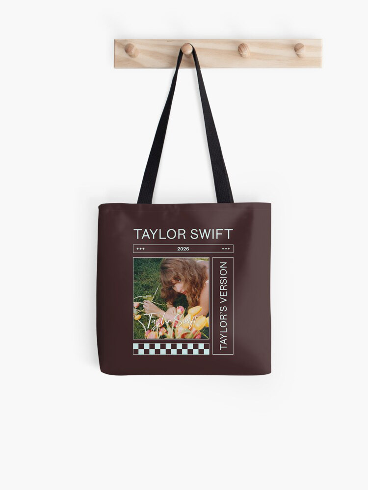
Create marketing assets, including billboards, streaming platform UI, social media advertising, and promotional merchandise.
Redesign Taylor Swift’s website to reflect the new Debut era and provide a cohesive fan experience.
Produce experiential and environmental campaign visuals to celebrate the album’s release.
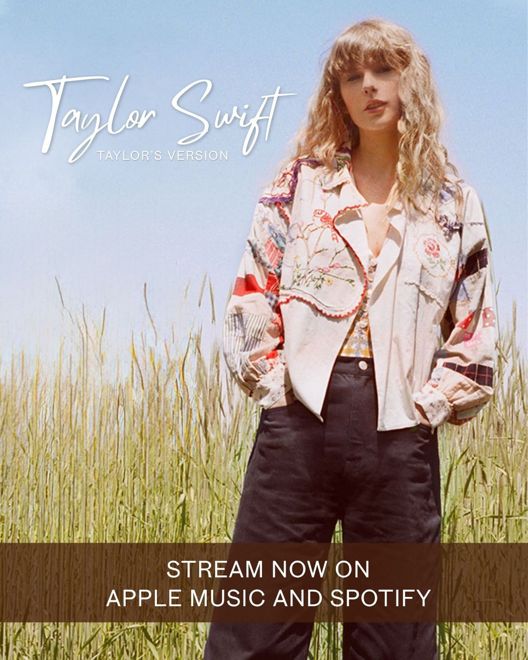
The goal was to modernize the visual language of the Debut era while preserving the authenticity, storytelling, and country roots that defined Swift’s introduction to the music industry. This campaign draws inspiration from the original album’s youthful optimism, small-town charm, and country aesthetic.
THE INSPIRATION
For the release of Toy Story 5, Taylor Swift collaborated with Disney and Pixar on an original song titled “I Knew It, I Knew You.” The song marked a notable return to Swift’s country roots, blending the acoustic storytelling and youthful sincerity that first defined her early career. The combination of country-inspired music, nostalgic imagery, and renewed interest in Swift’s earliest era served as the primary inspiration for this conceptual Taylor Swift (Taylor’s Version) campaign, imagining how a modern re-release could honor the album’s original identity while introducing it to a new generation of listeners.
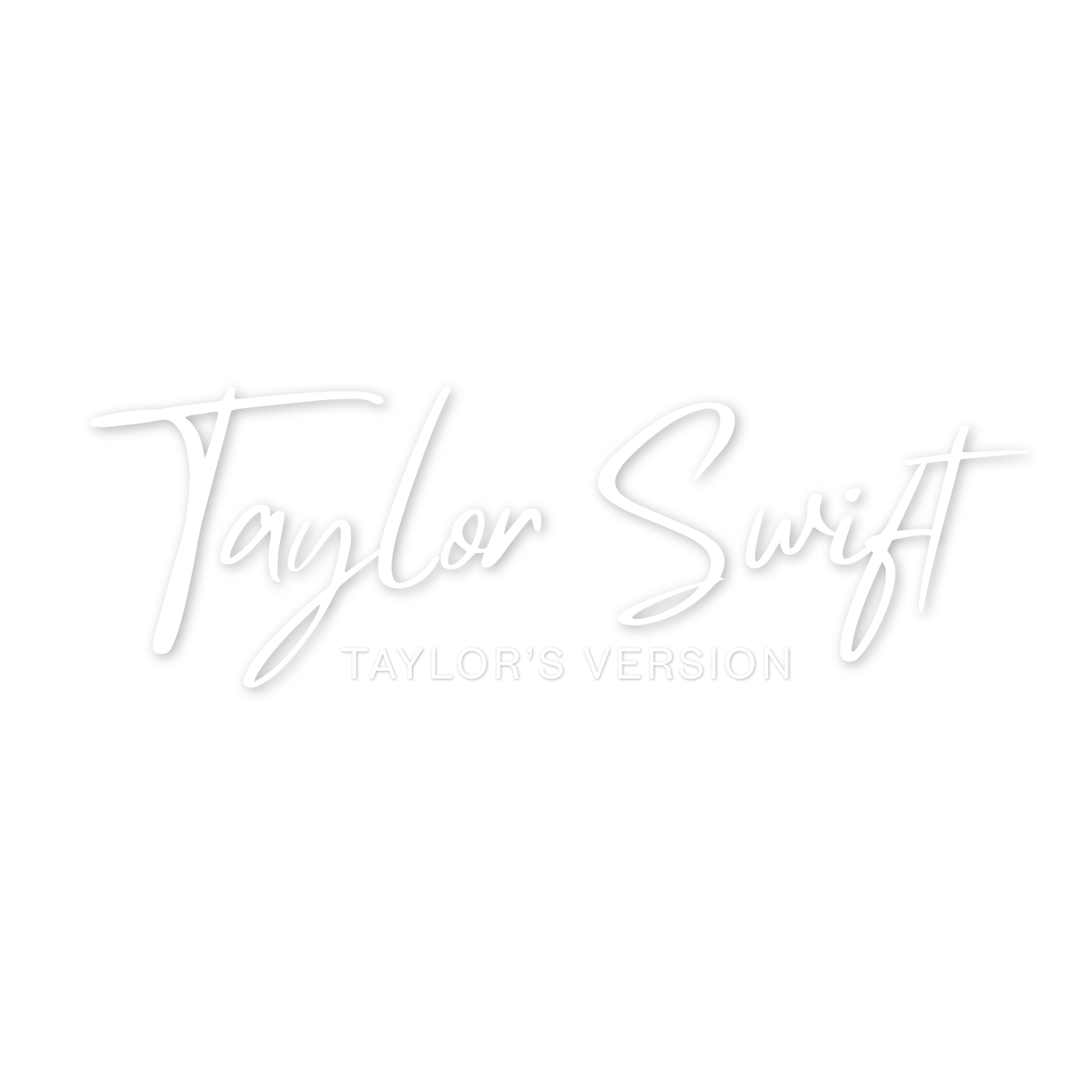
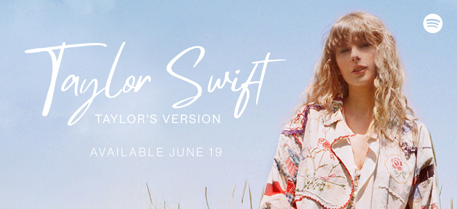
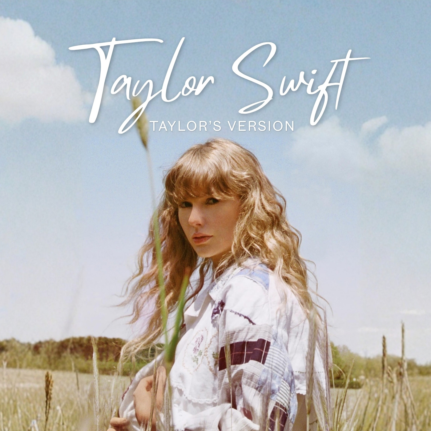
TYPEFACES
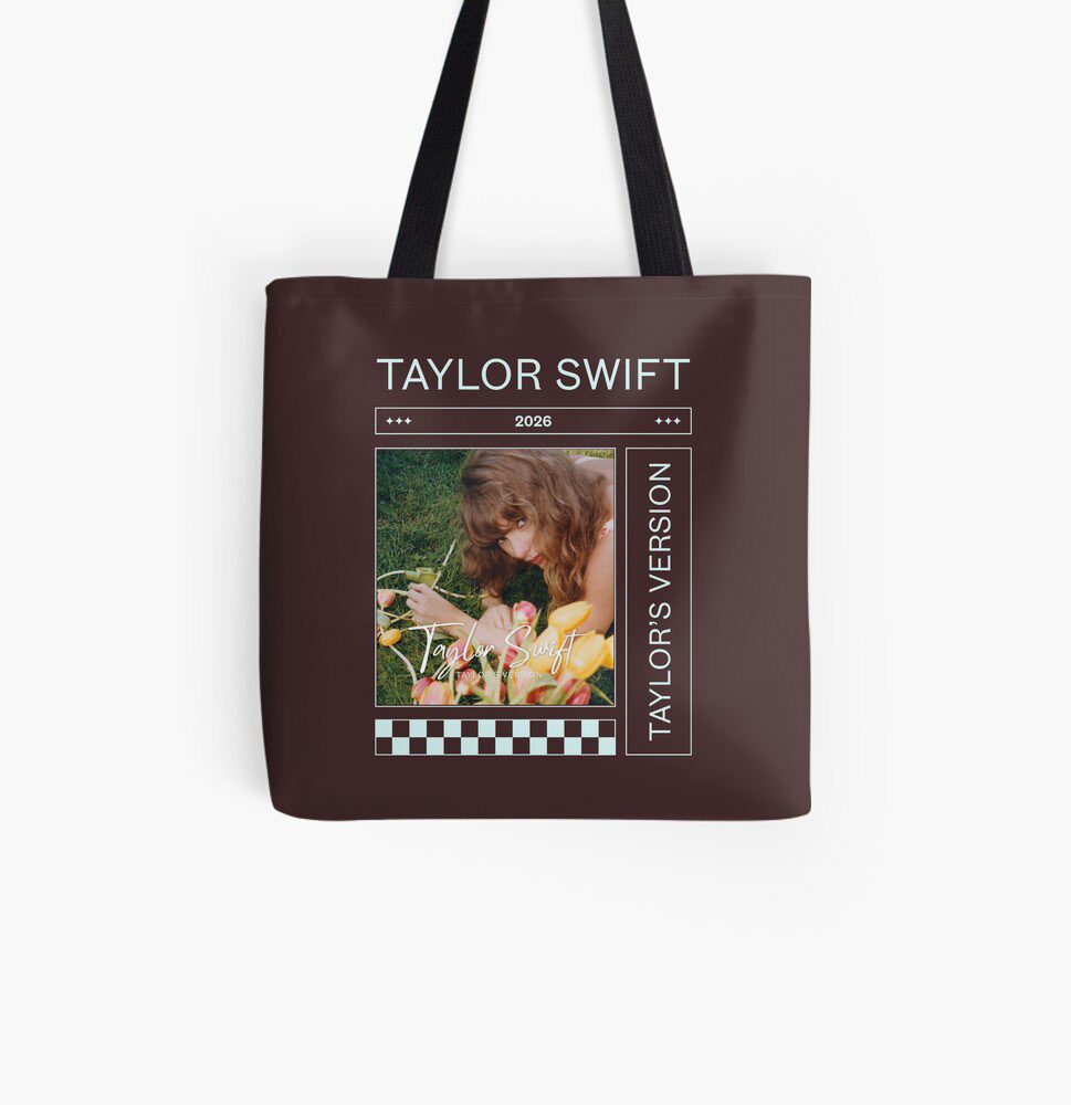
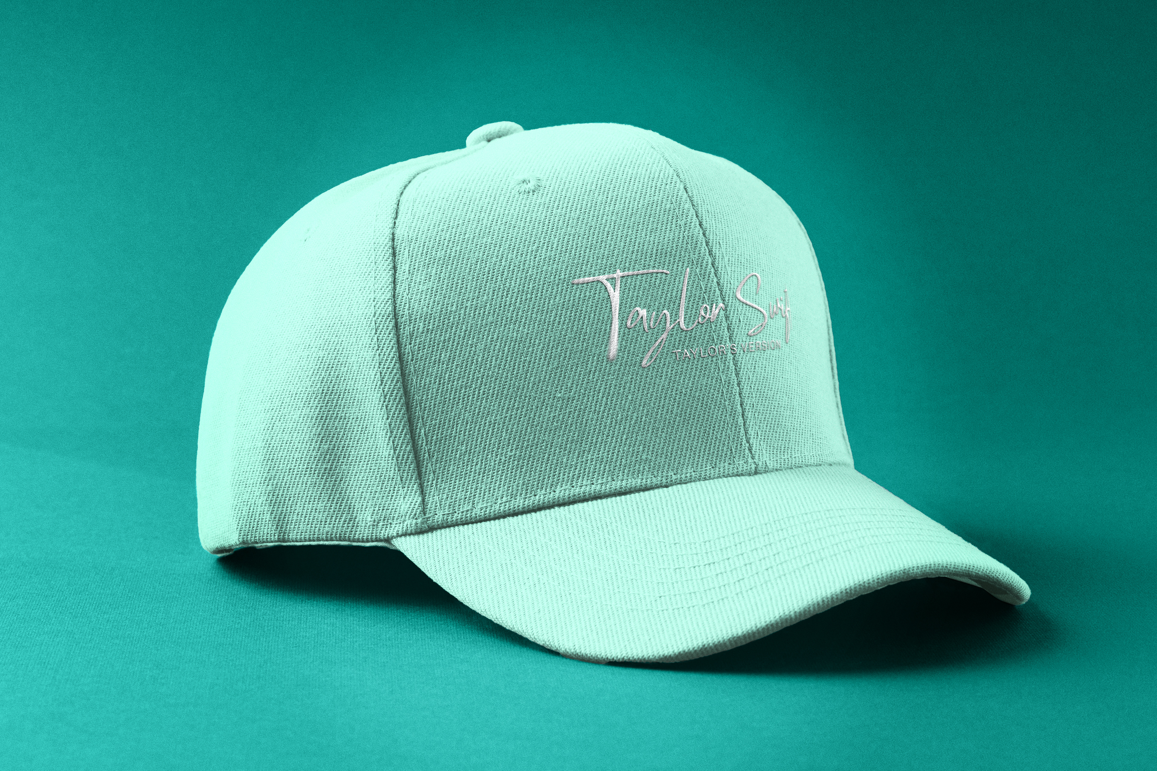
Each re-recording incorporates a refreshed typeface, updating the original logos and strengthening their identity for newer generations. For the Debut re-recording, Mistrully was chosen due to how closely it resembles the original handwritten cursive design from the Debut album. I paired it with Touvlo, a sleek sans-serif typeface, for the “Taylor’s Version” tagline.
DROP SHADOW
The drop shadow was incorporated for contrast and serves as a nod to the original logo’s drop shadow, which was less blurred and more defined.
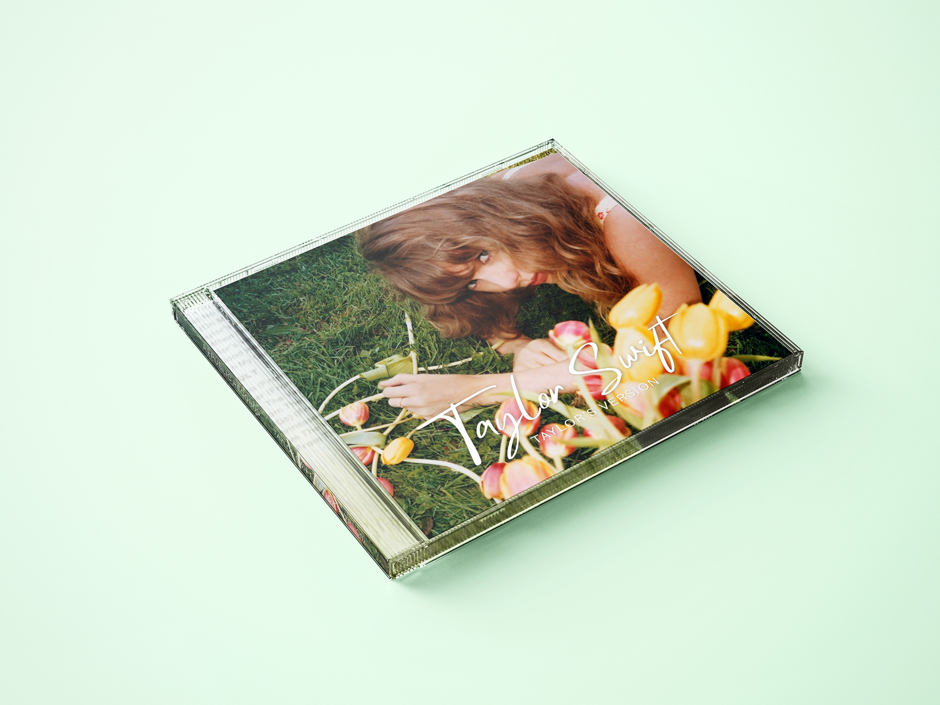
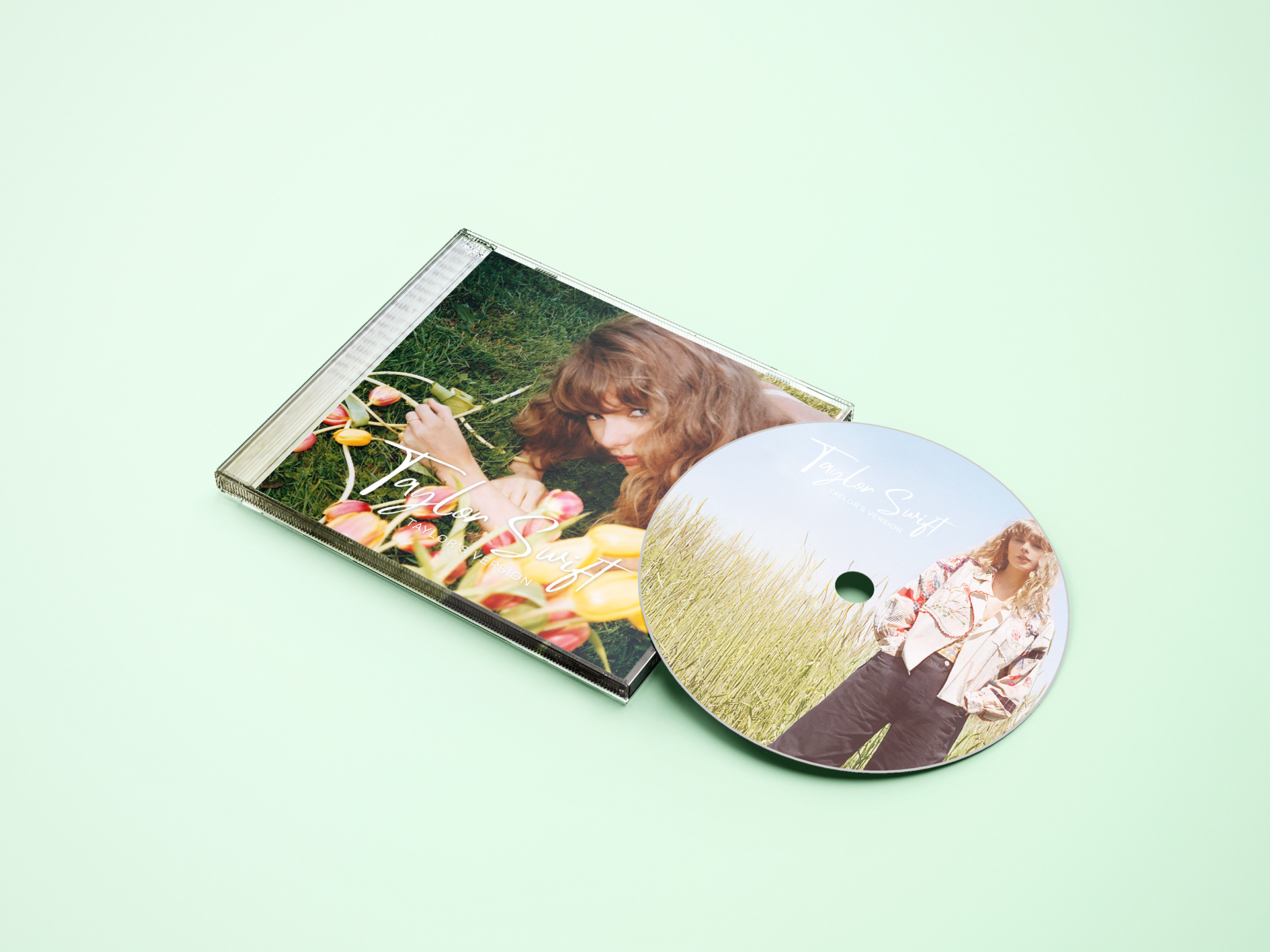
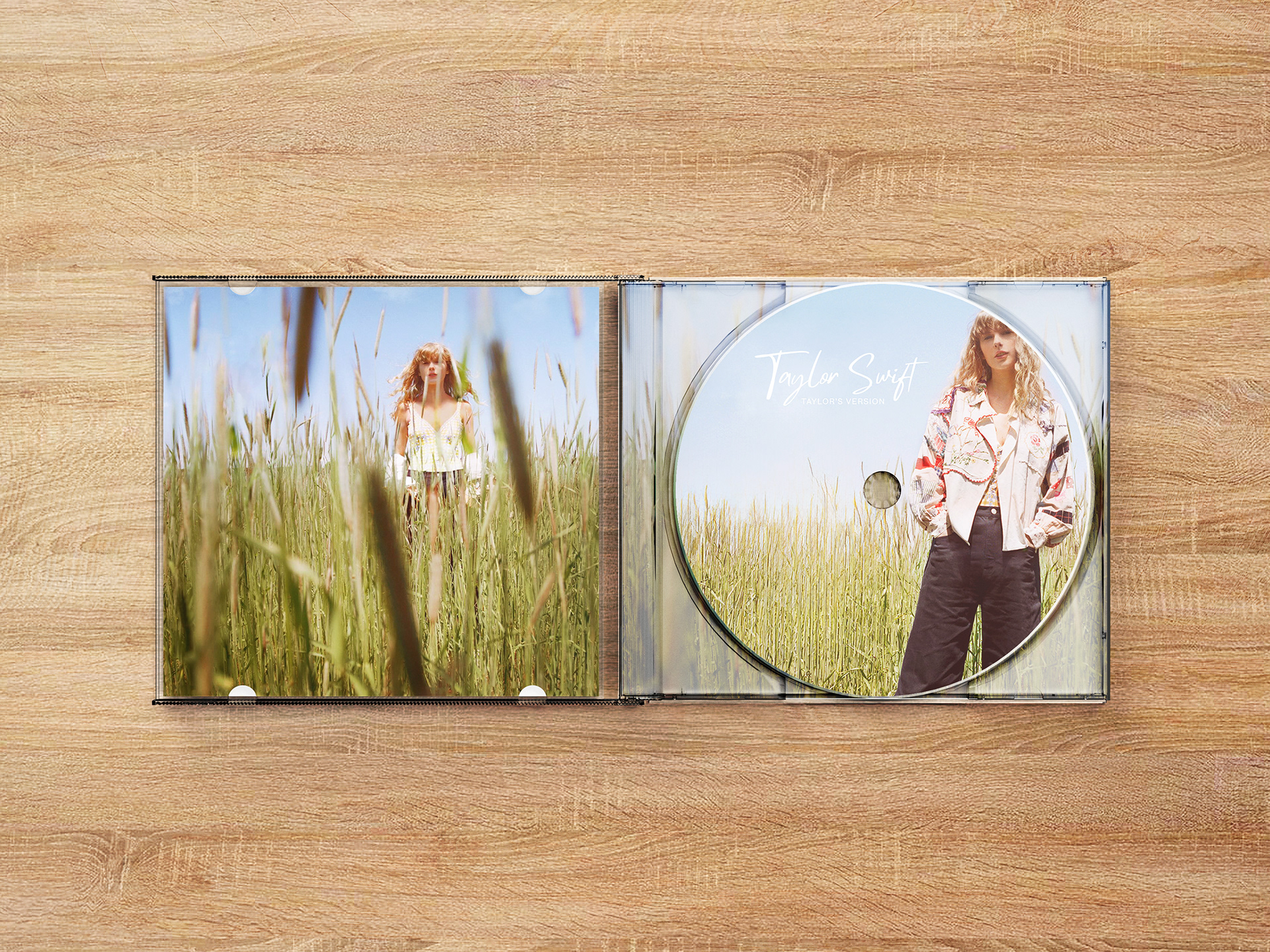
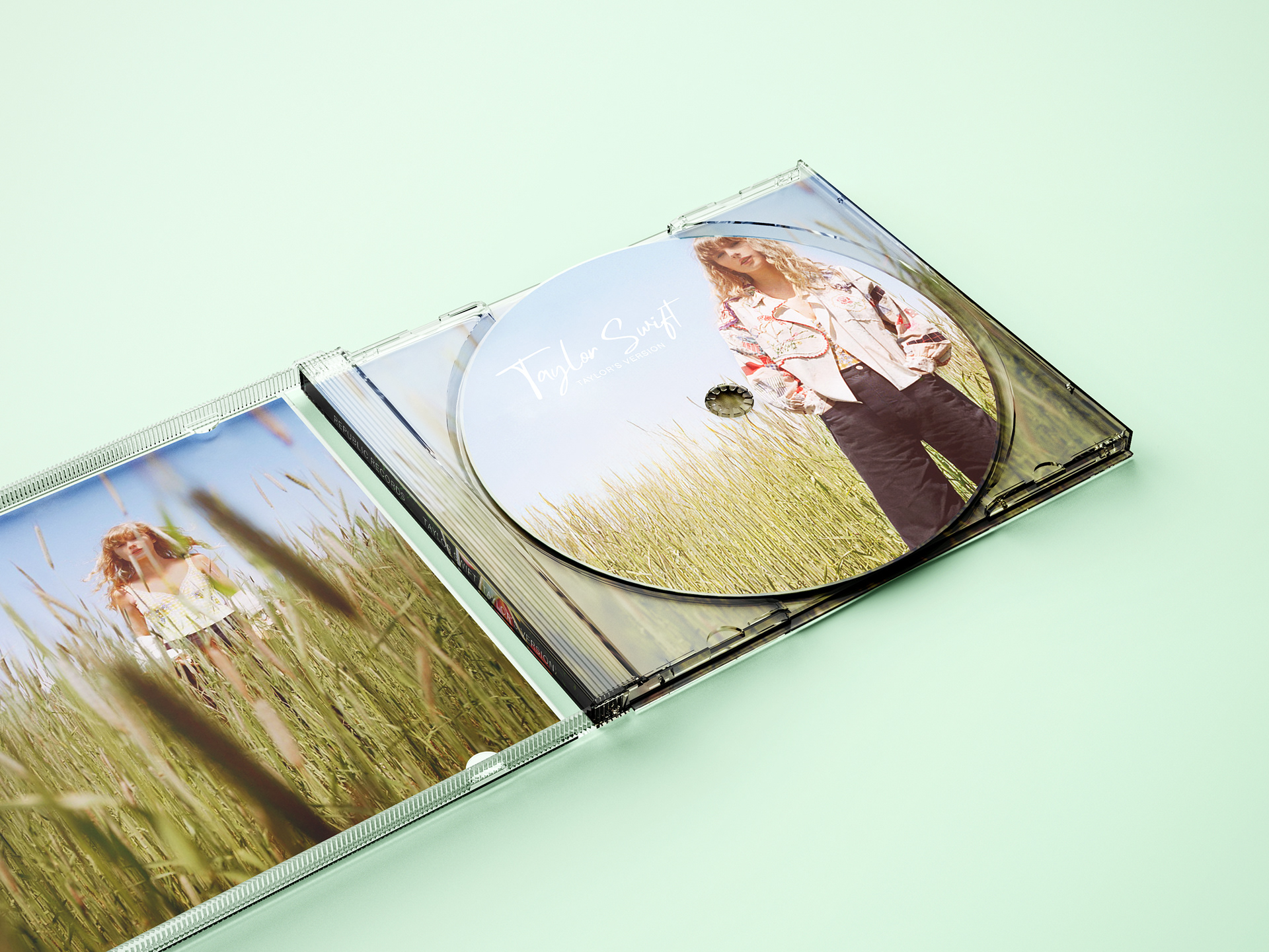
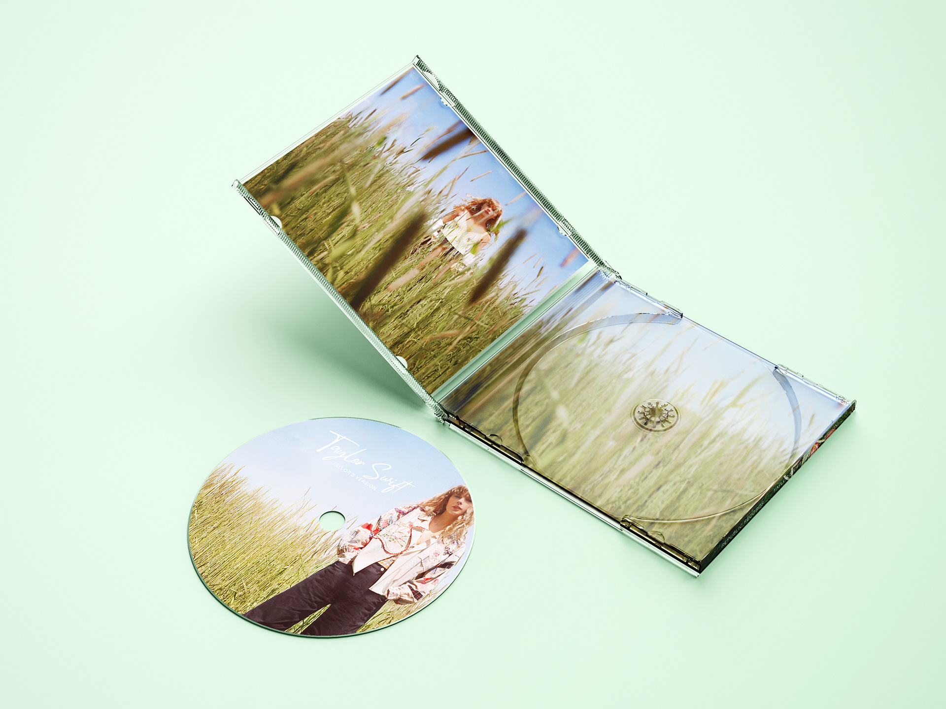
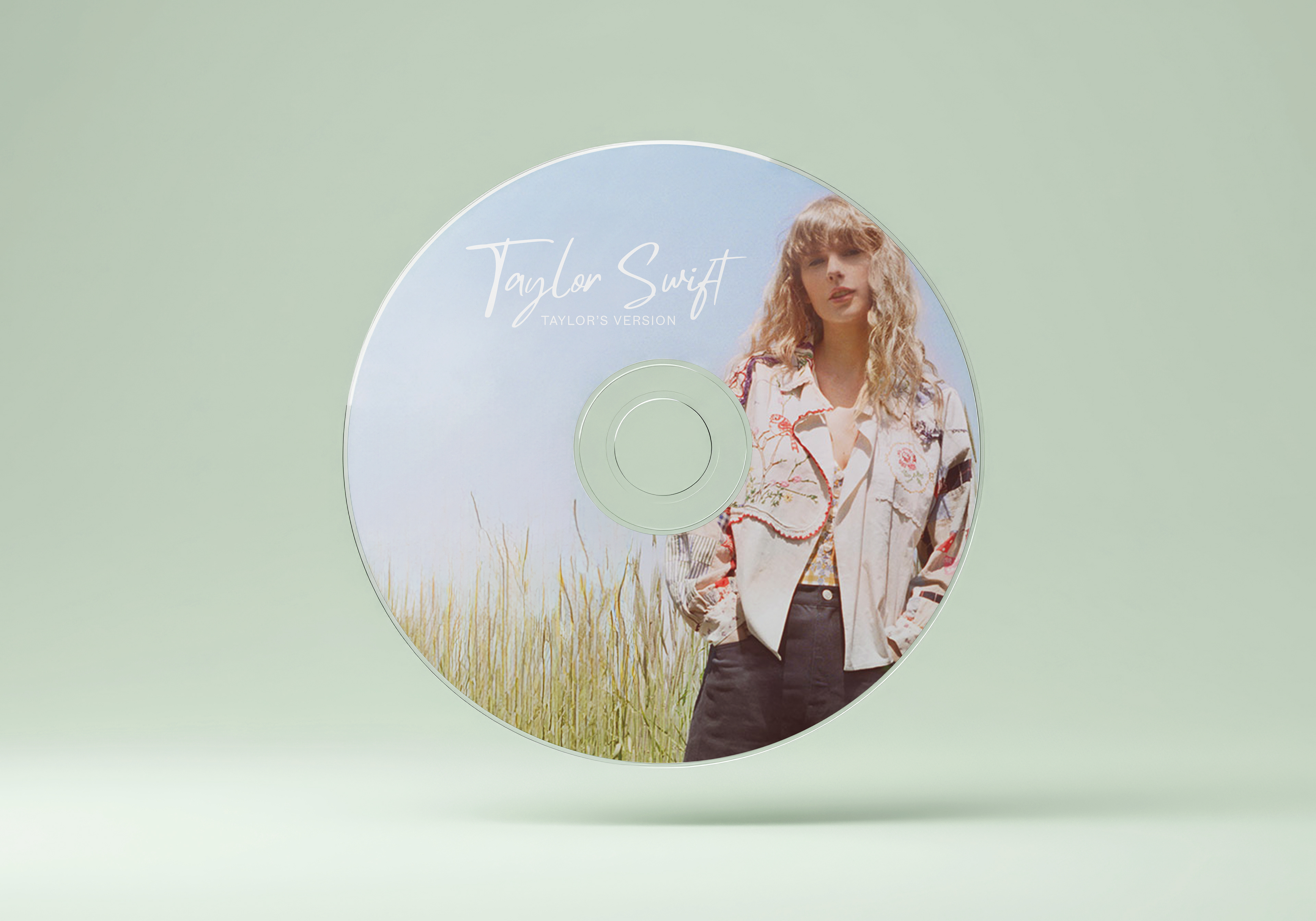
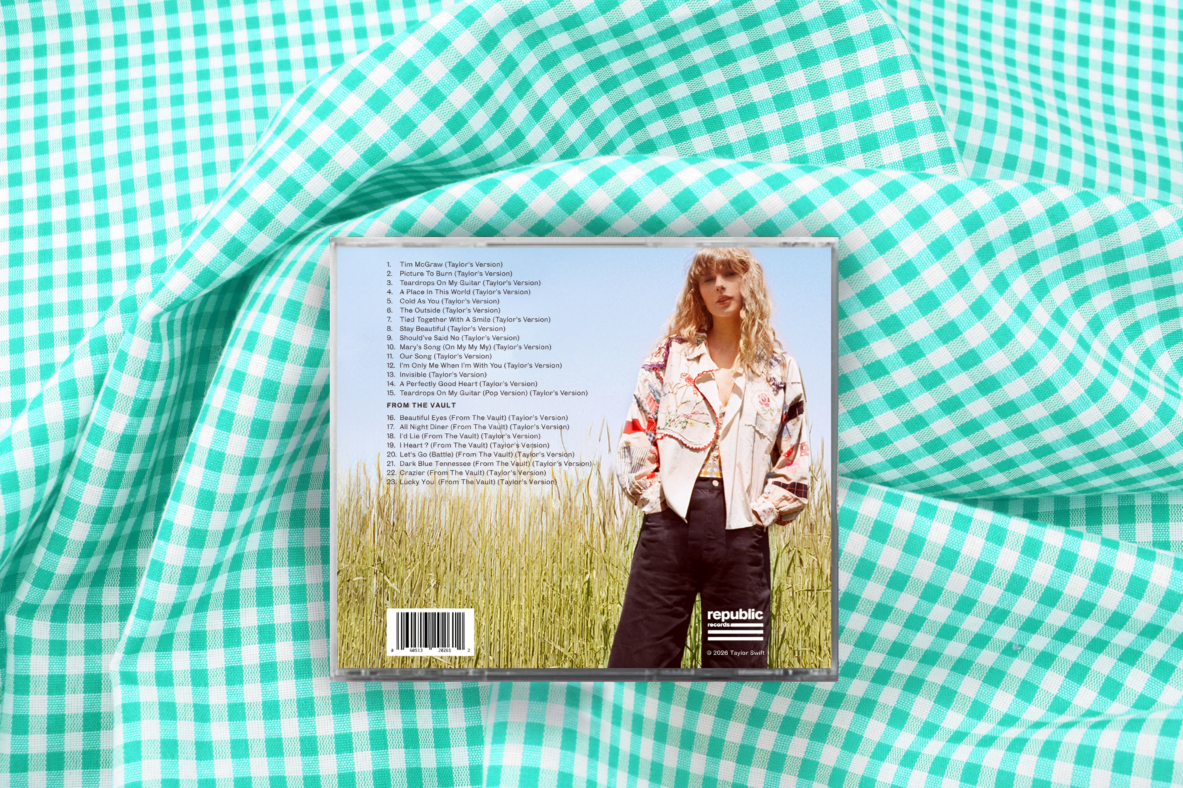
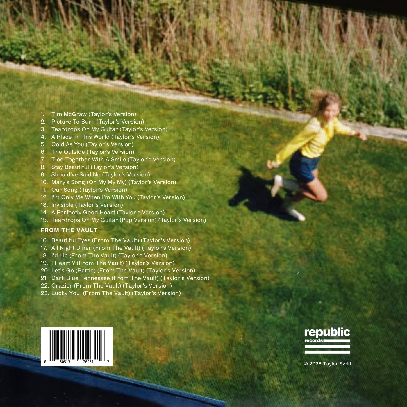
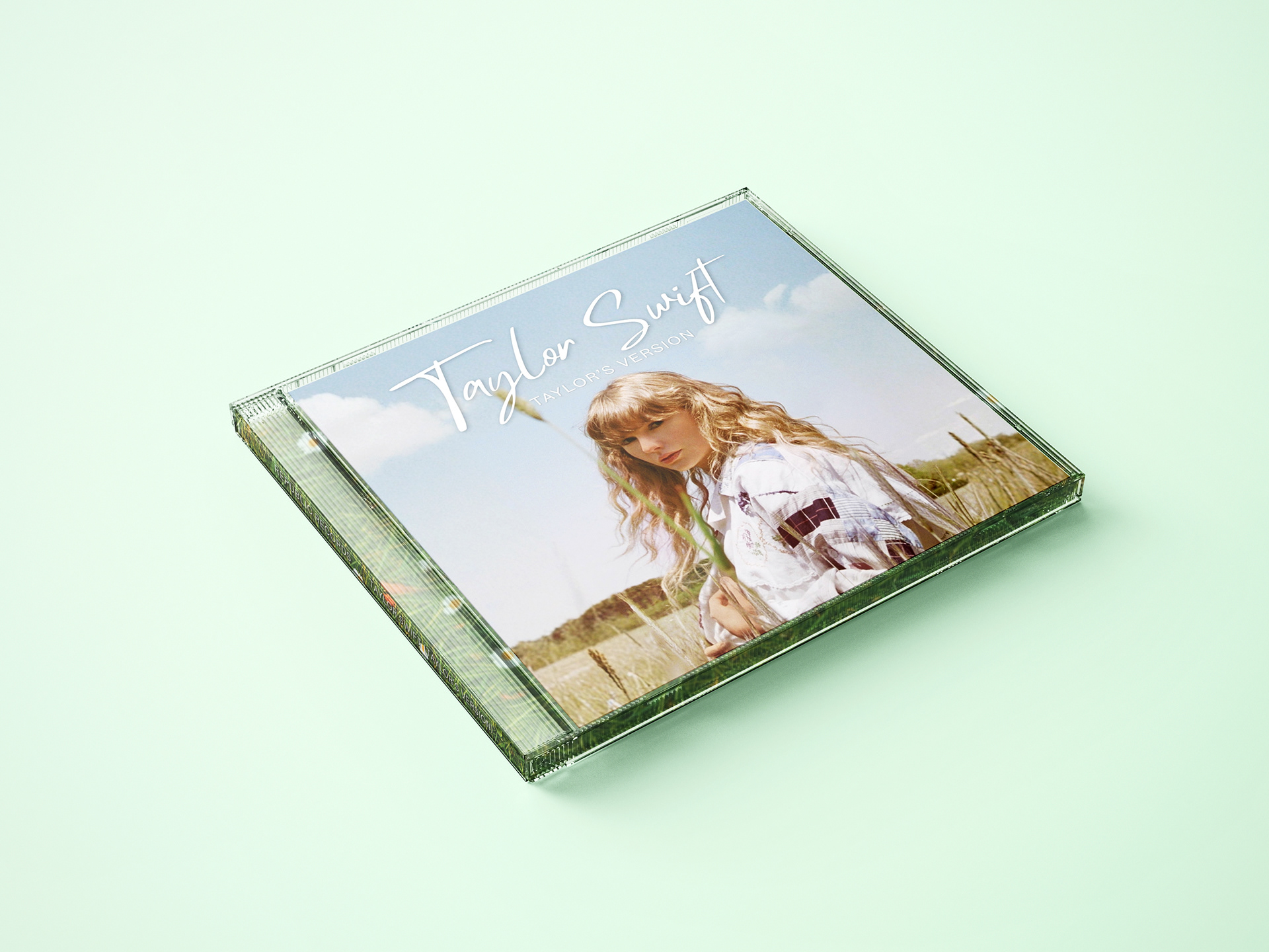
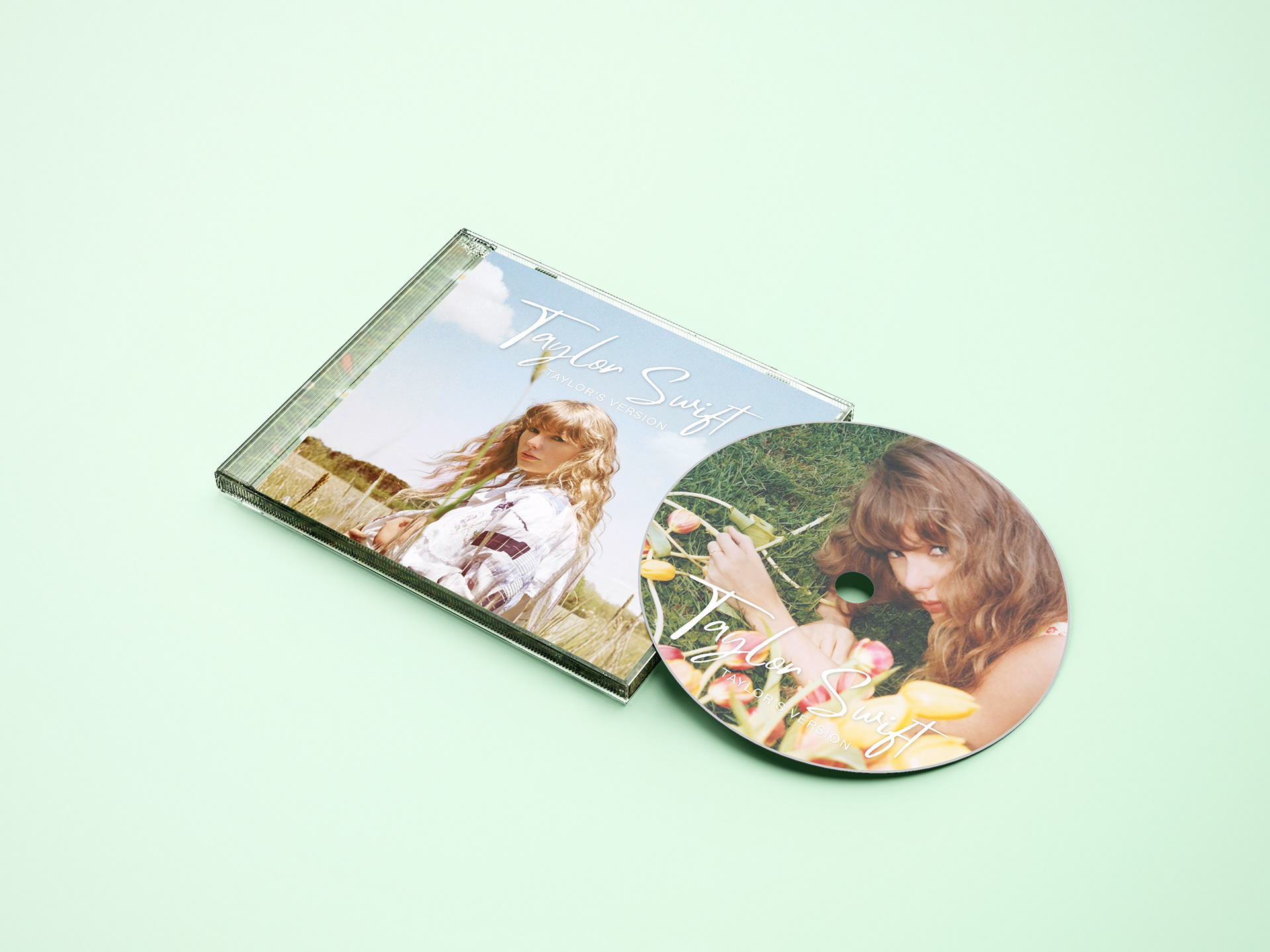
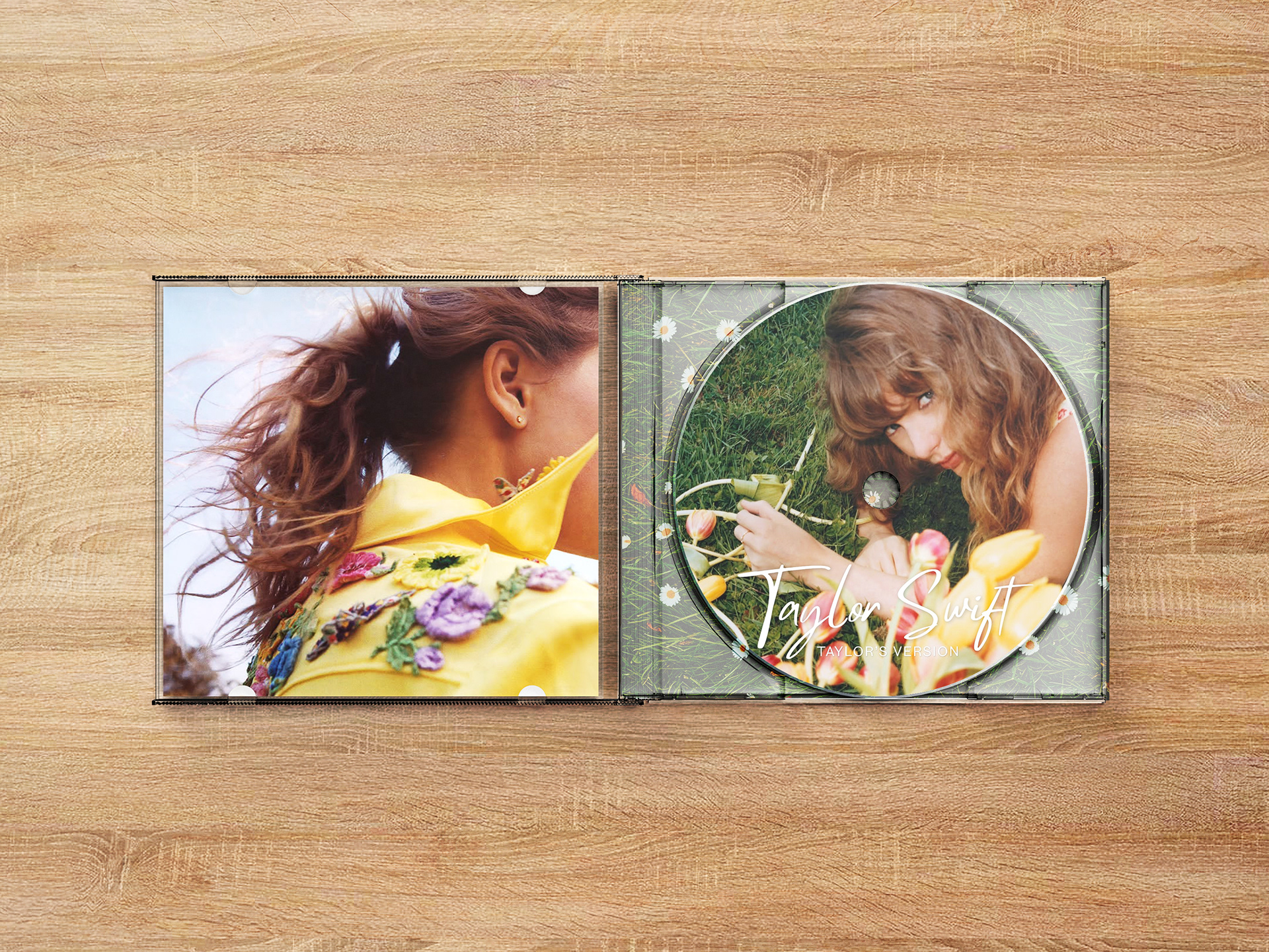
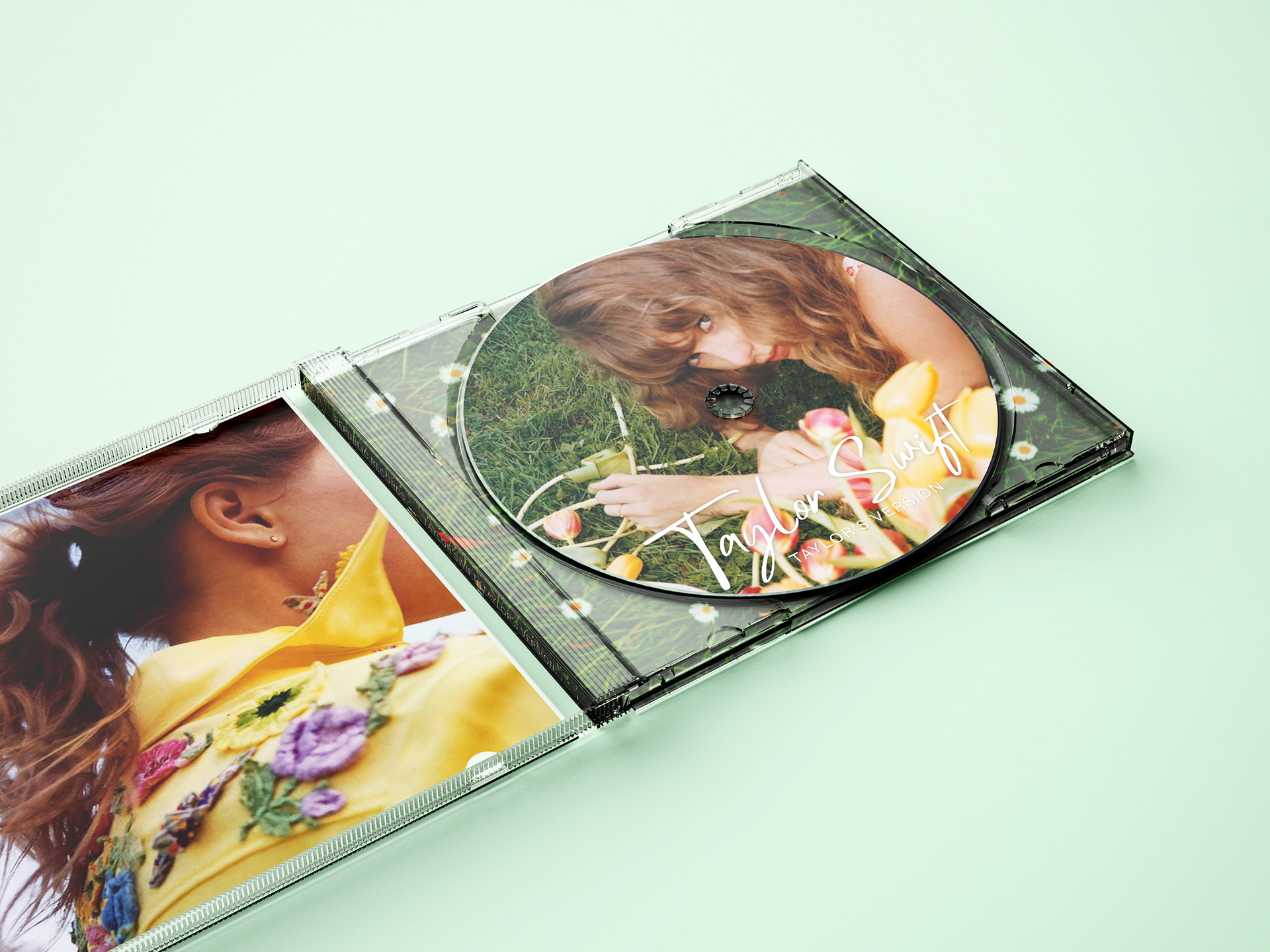
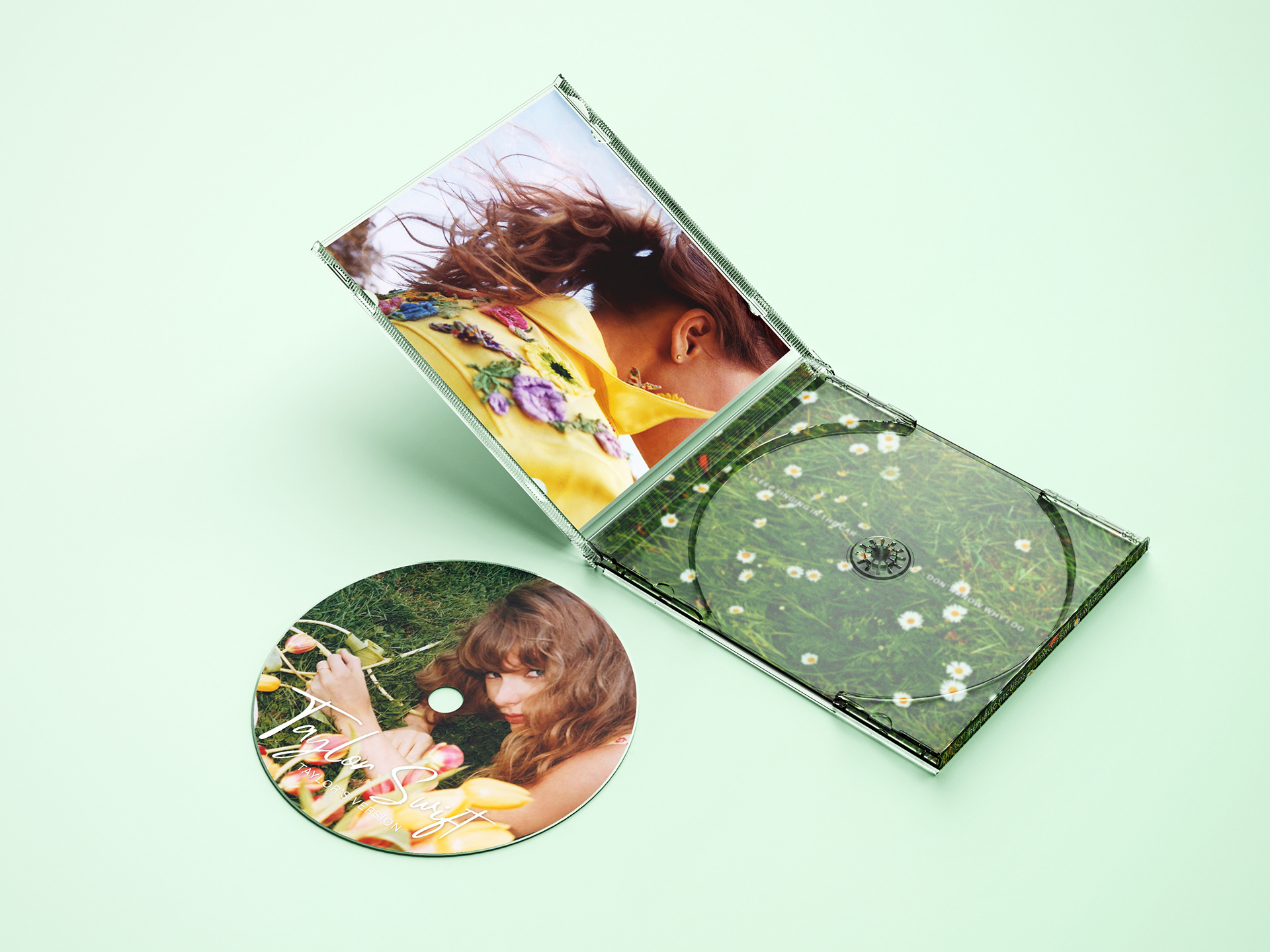
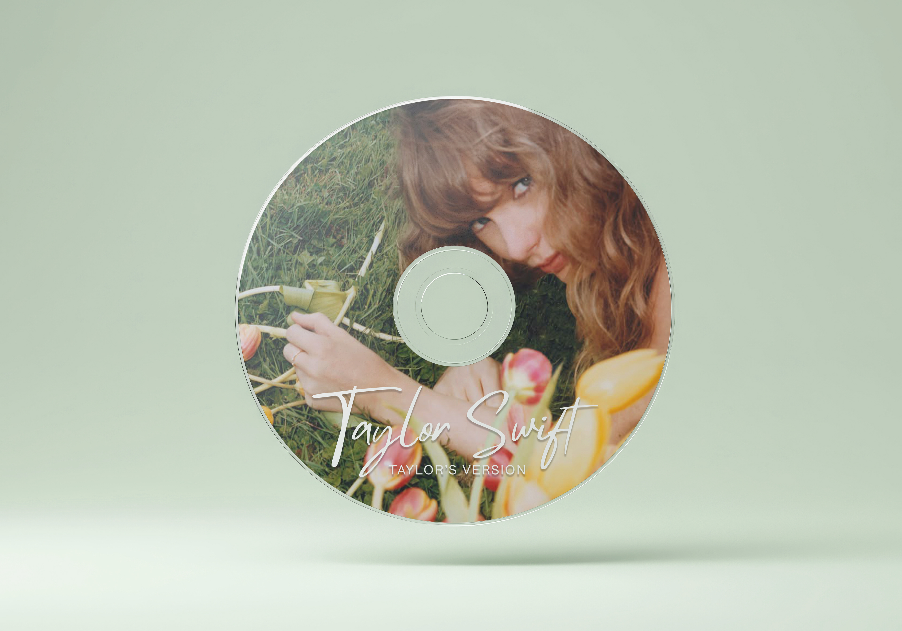
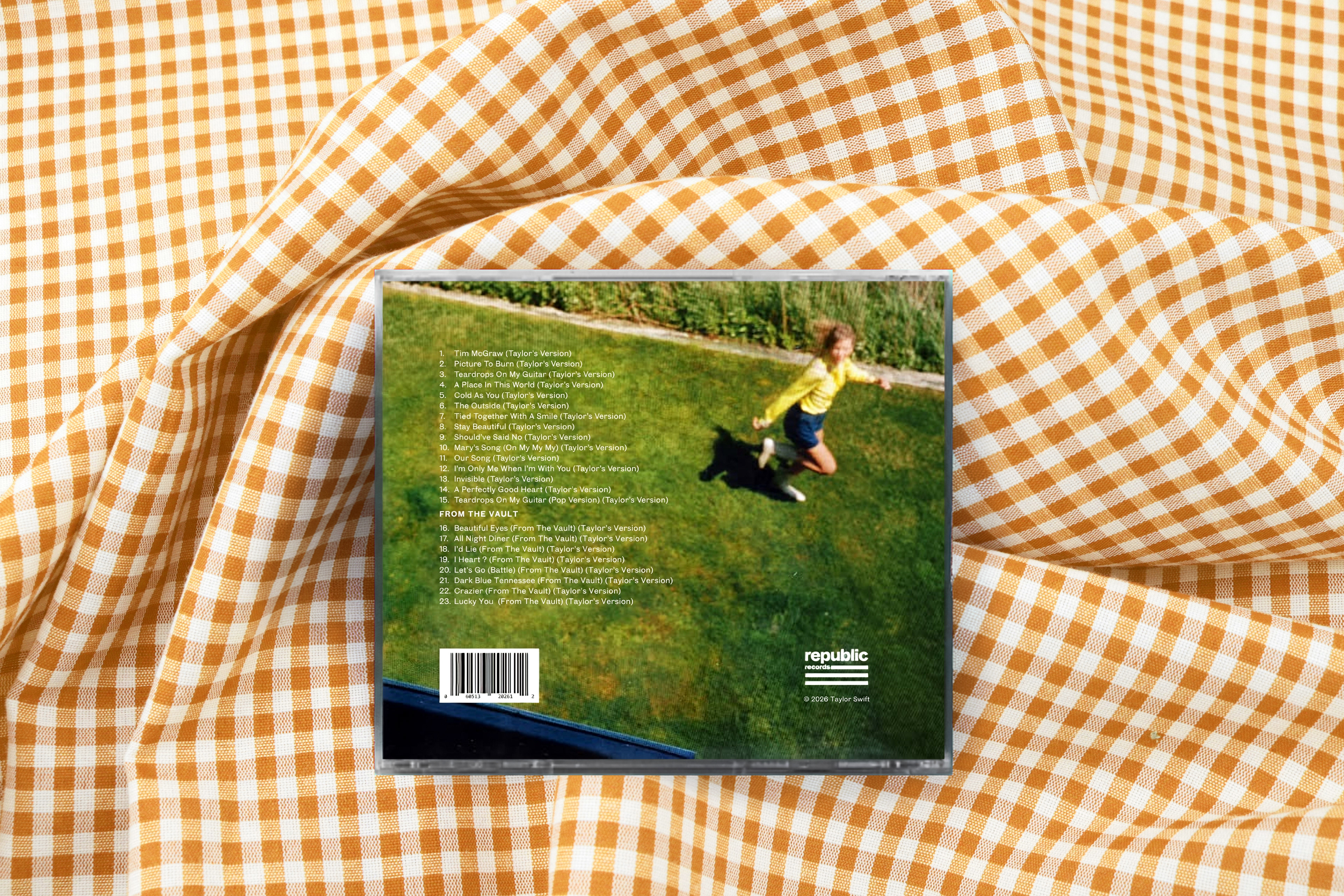
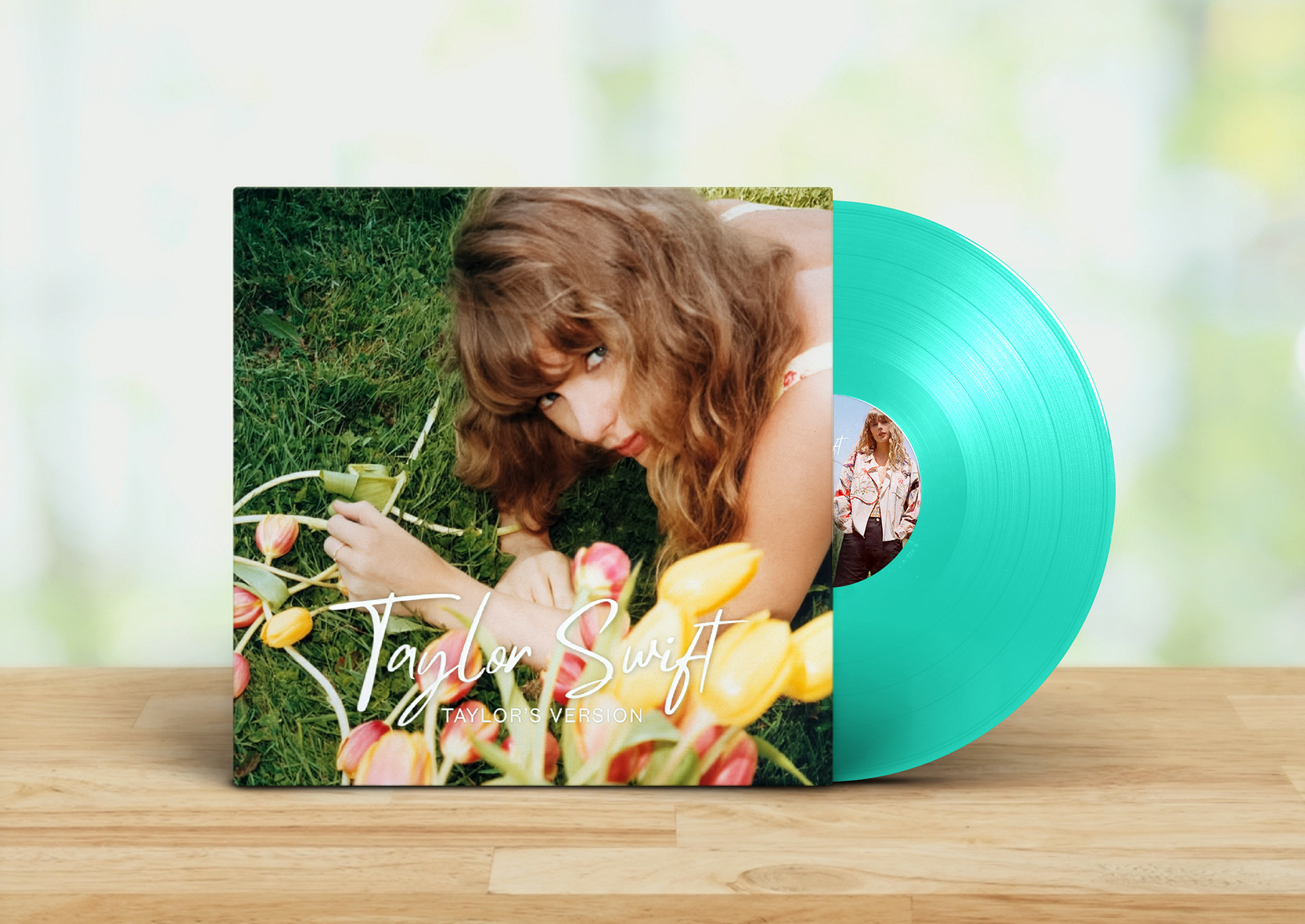
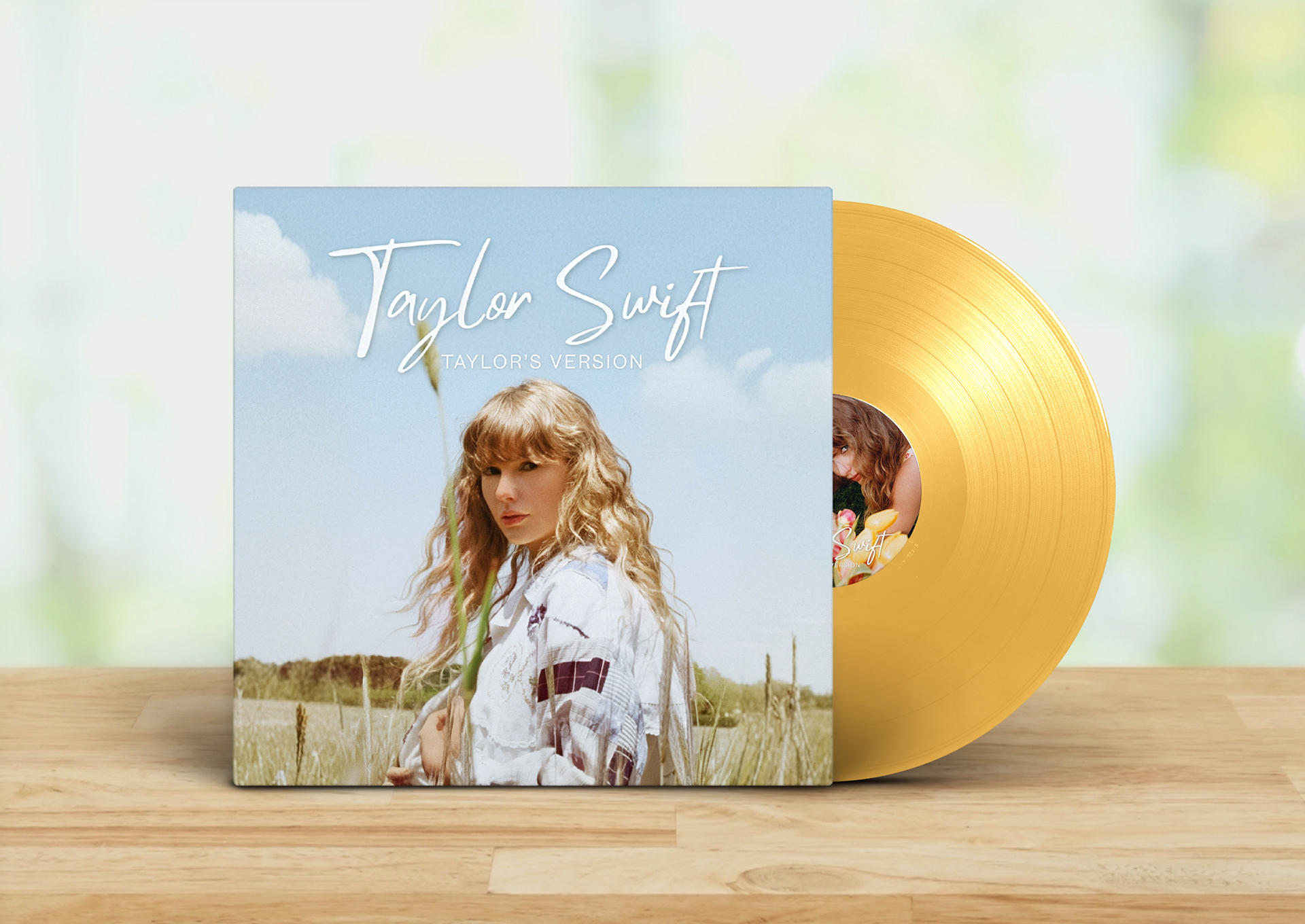
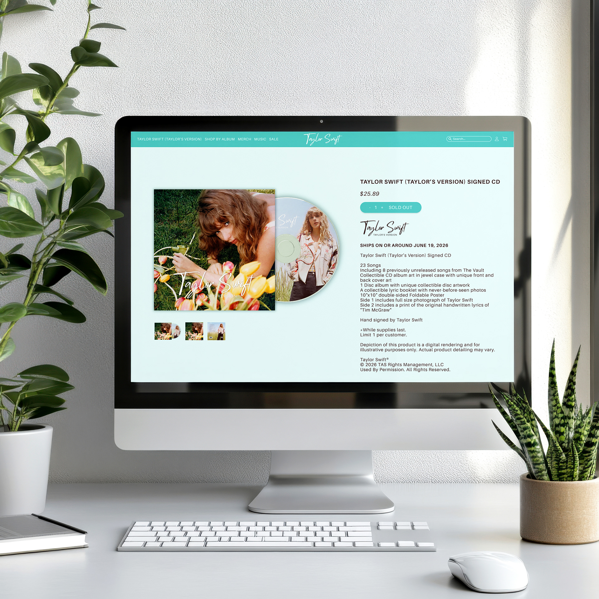
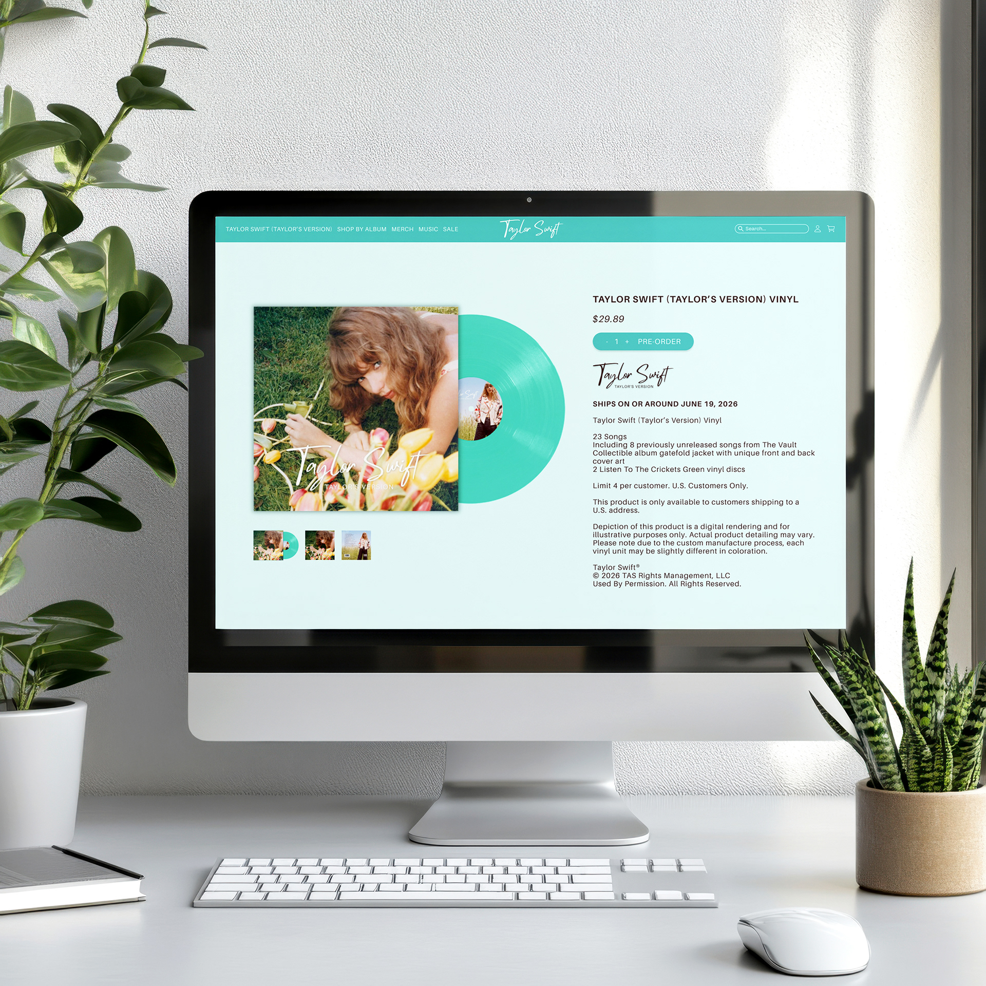
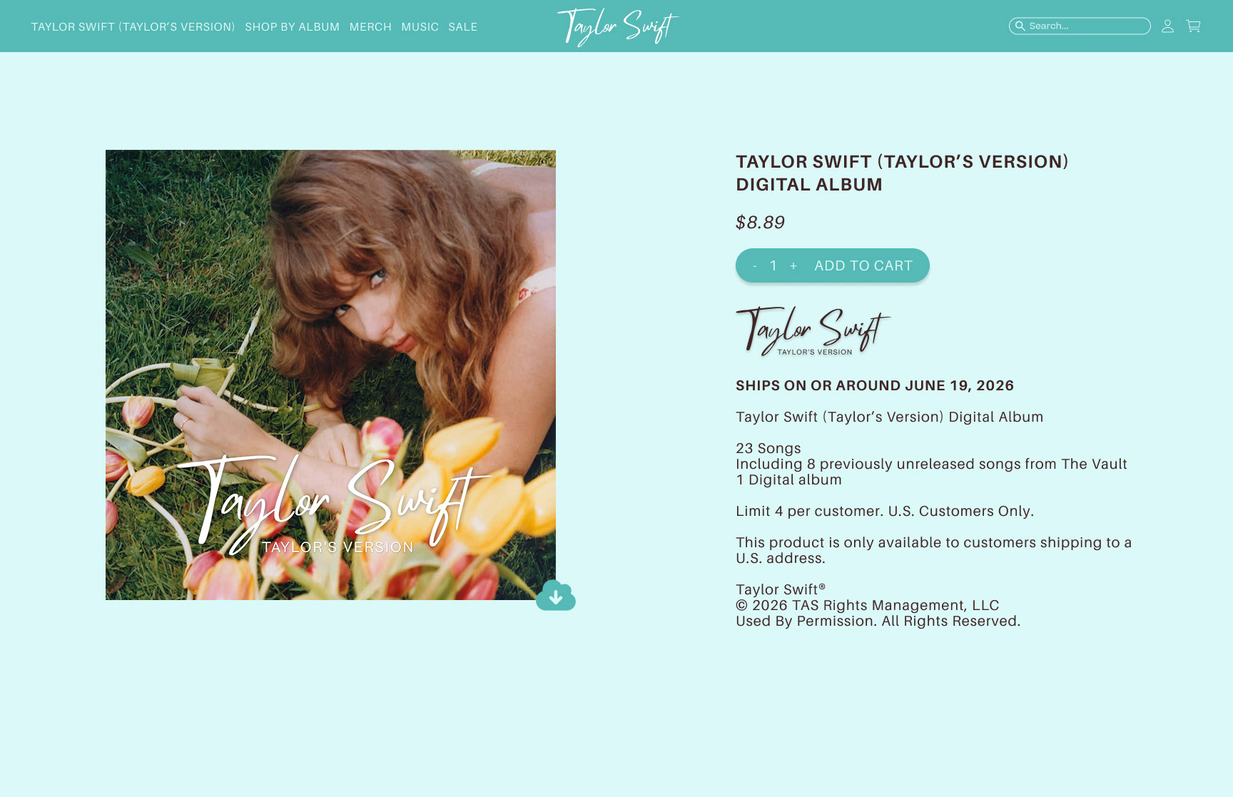
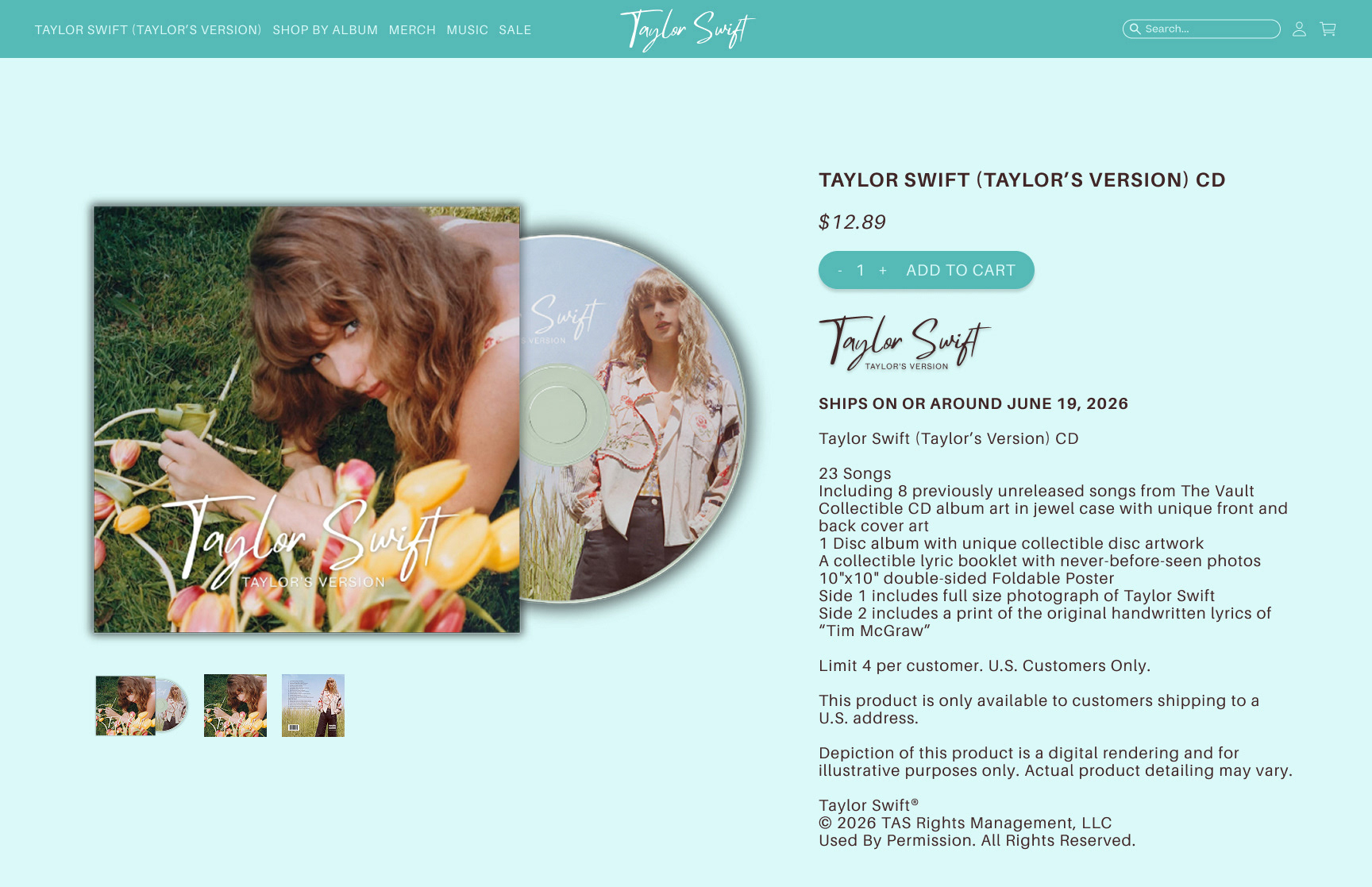
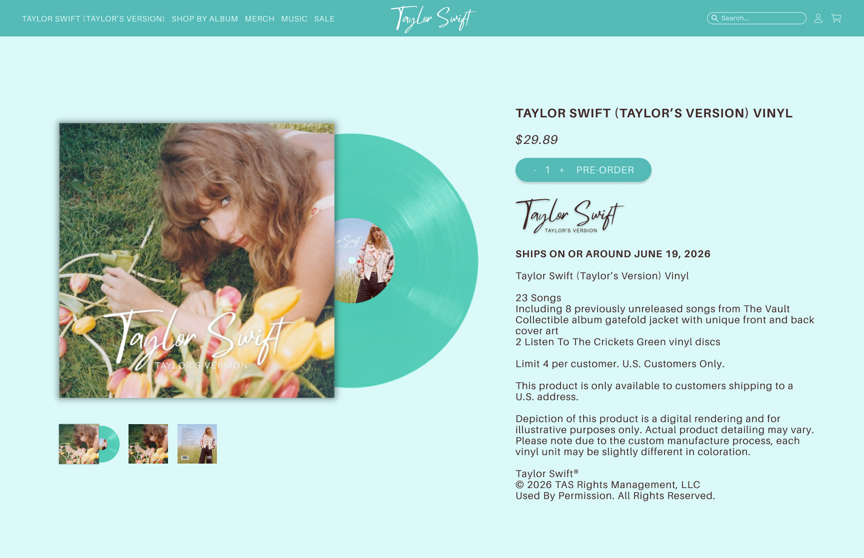
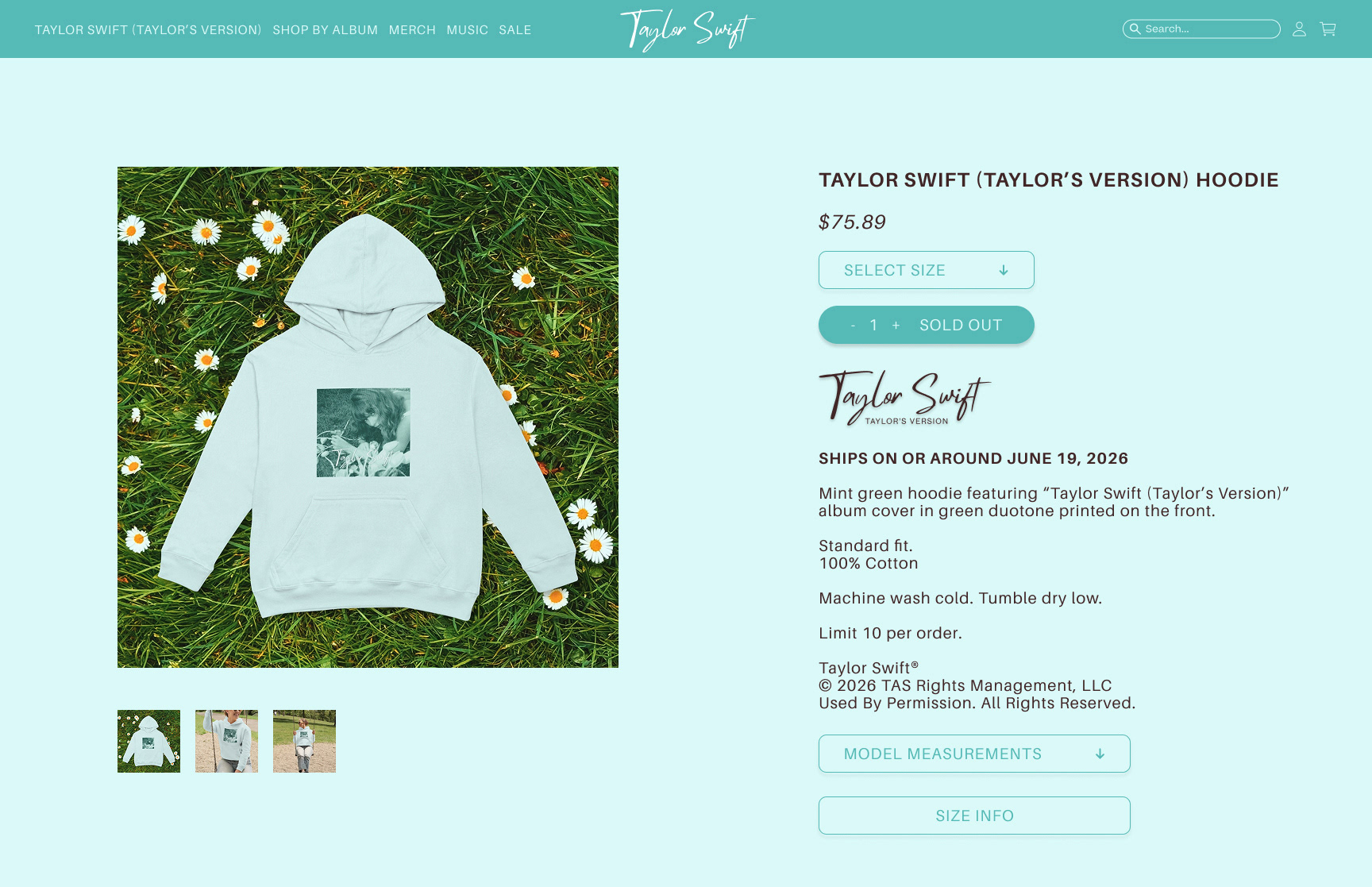
CD & VINYL

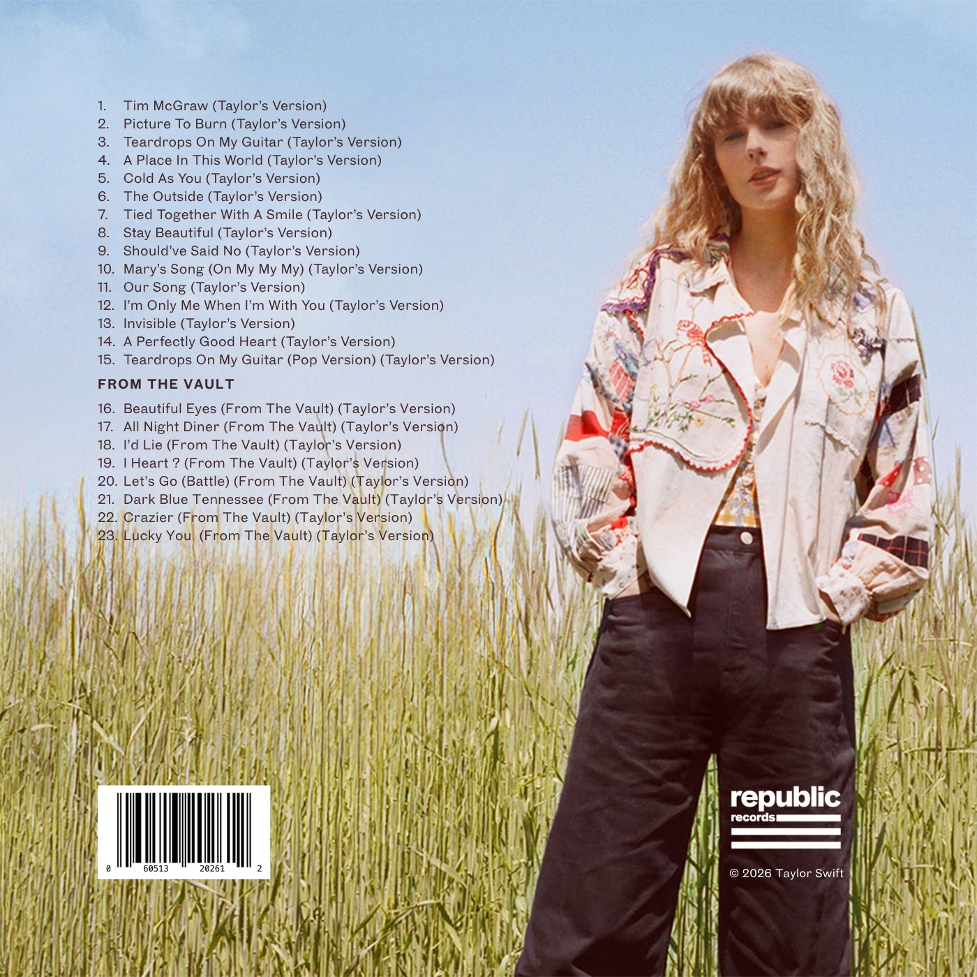
At the time of designing the cover and most of the campaign, these were the only two available images. Using Adobe Photoshop, I removed the promotional text and graphics of the Toy Story 5 CDs from the image used for the back cover.
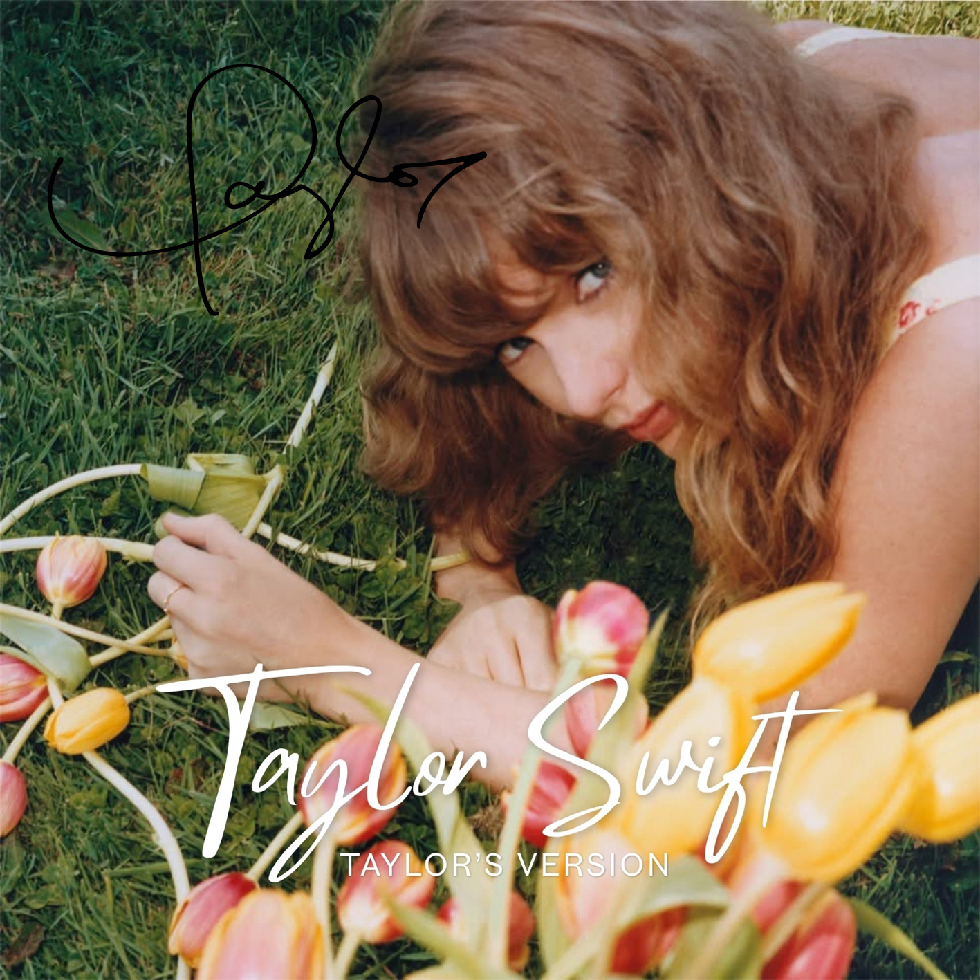
Signed Copy
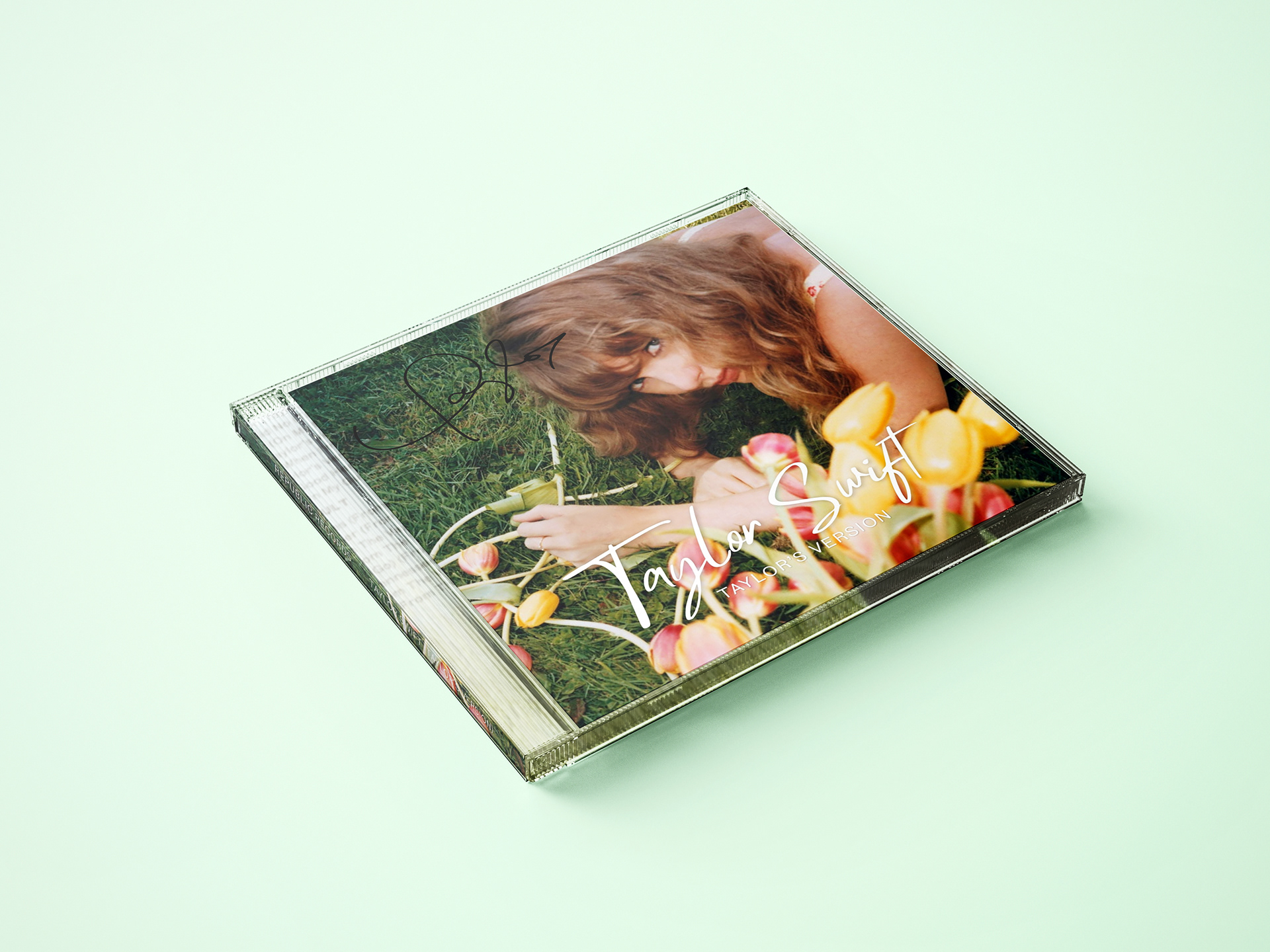
Signed Copy

Signed Copy
SIGNED COPY
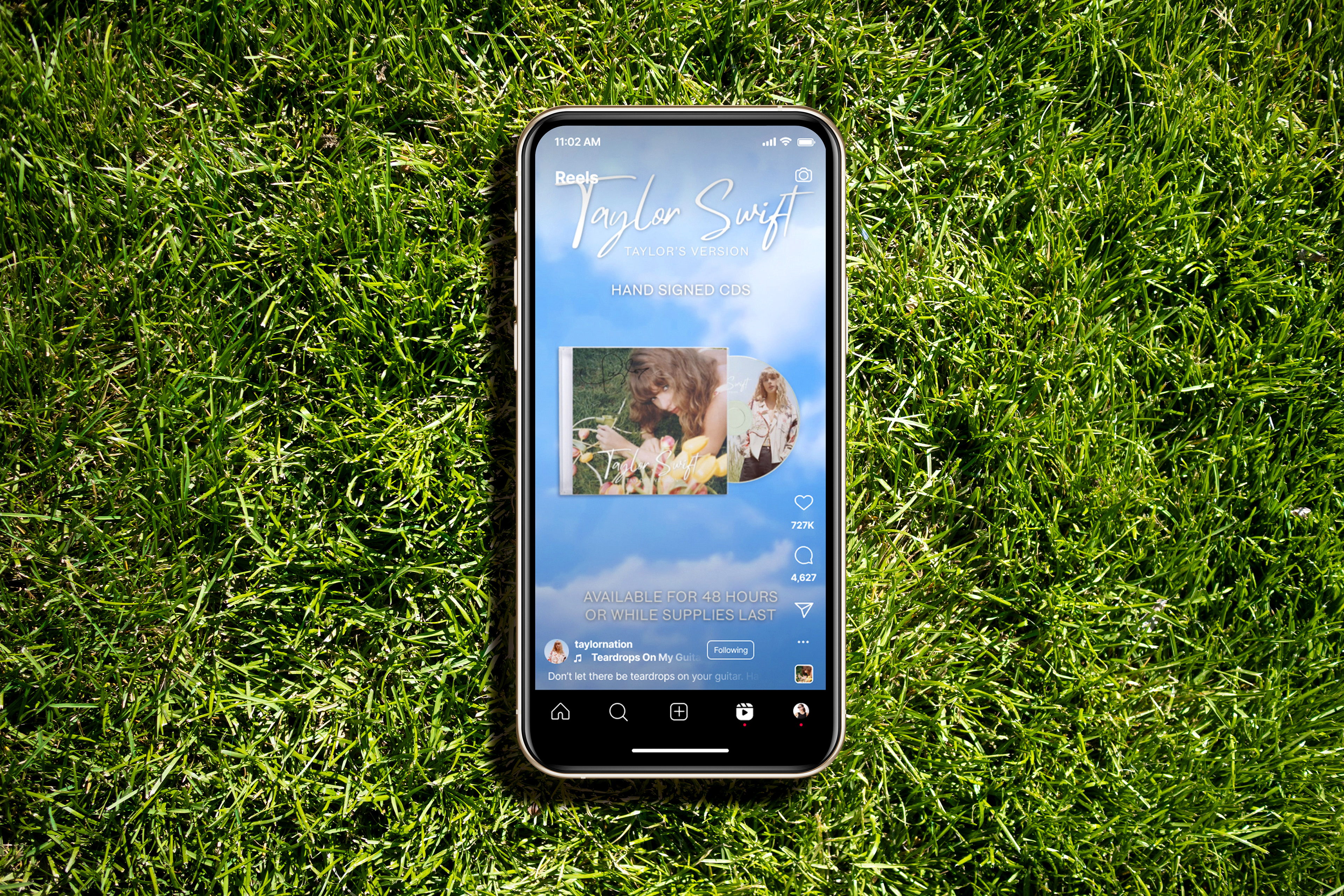
Often, Swift offers signed editions of her albums and re-recordings. Therefore, I decided to create a signed copy of Taylor Swift (Taylor’s Version).
Perfect Fantasy Edition
Perfect Fantasy Edition
PERFECT FANTASY EDITION
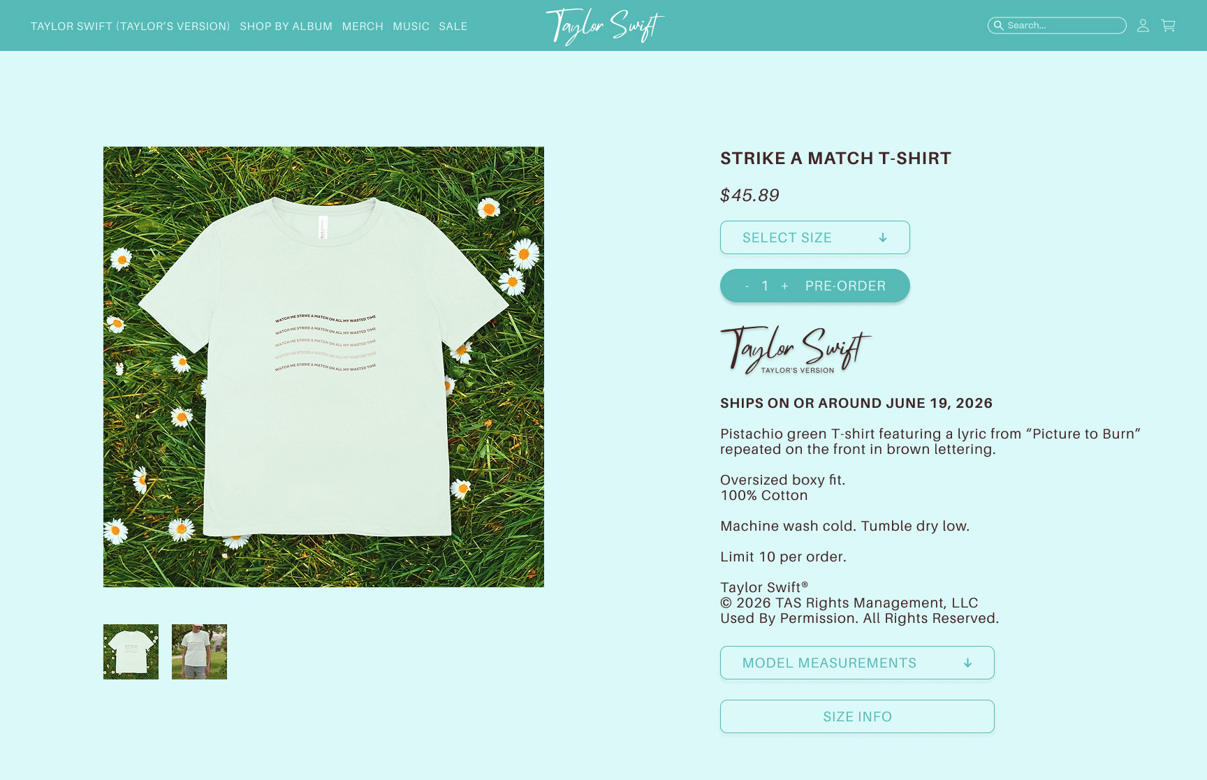
Swift frequently releases special collector’s editions of her albums and re-recordings, typically named after lyrics featured in the album. This particular version is titled the Perfect Fantasy Edition, inspired by a lyric from “Picture to Burn.”
Perfect Fantasy Edition
Perfect Fantasy Edition
Perfect Fantasy Edition
Perfect Fantasy Edition
Perfect Fantasy Edition
Perfect Fantasy Edition
Perfect Fantasy Edition
Listen to the Crickets Green Vinyl
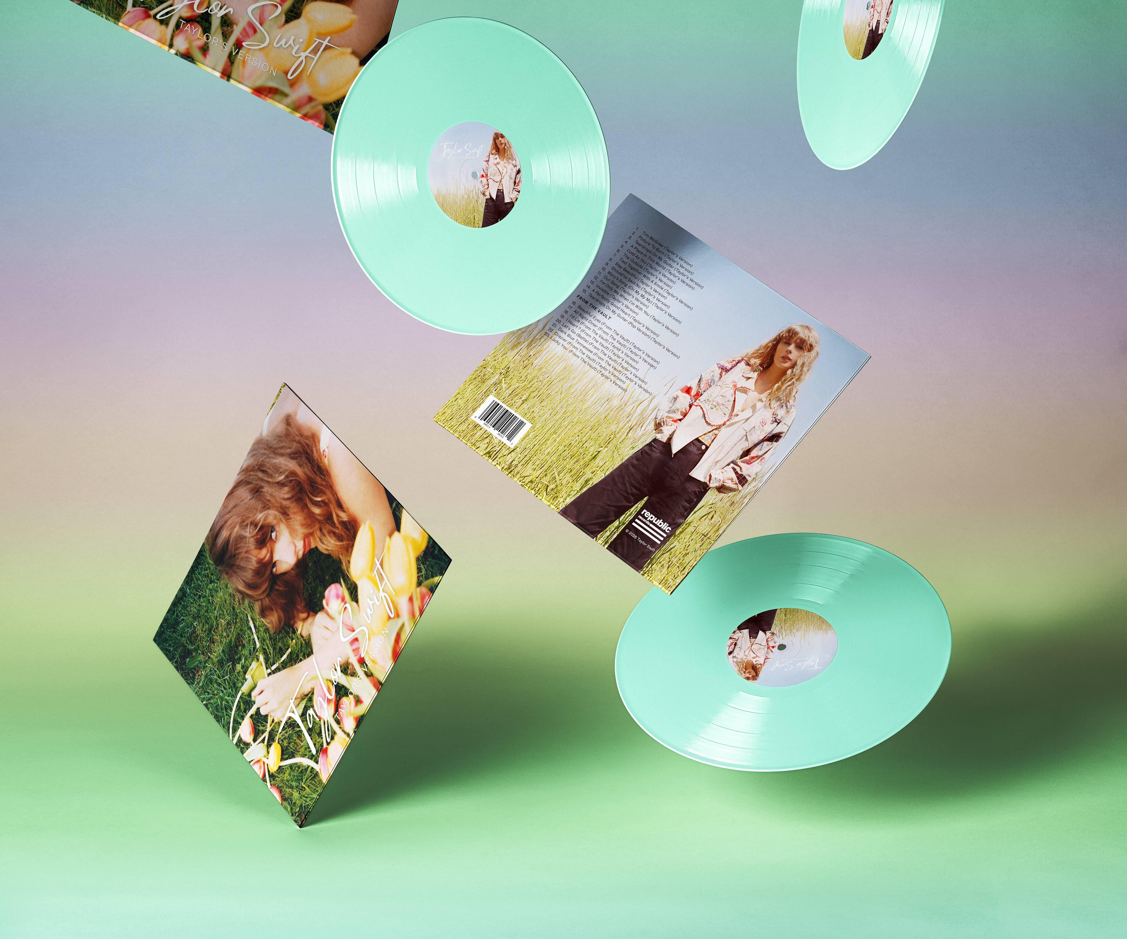
Listen to the Crickets Green Vinyl
The main color of the vinyl record is referred to as “Listen to the Crickets Green,” a lyric from the song “I’m Only Me When I’m With You.” This naming pattern is reminiscent of Swift’s records, which often derive their titles from colors mentioned in her songs (e.g., blood moon and mahogany) or from lyrics that evoke a specific color (e.g., “crystal skies”).
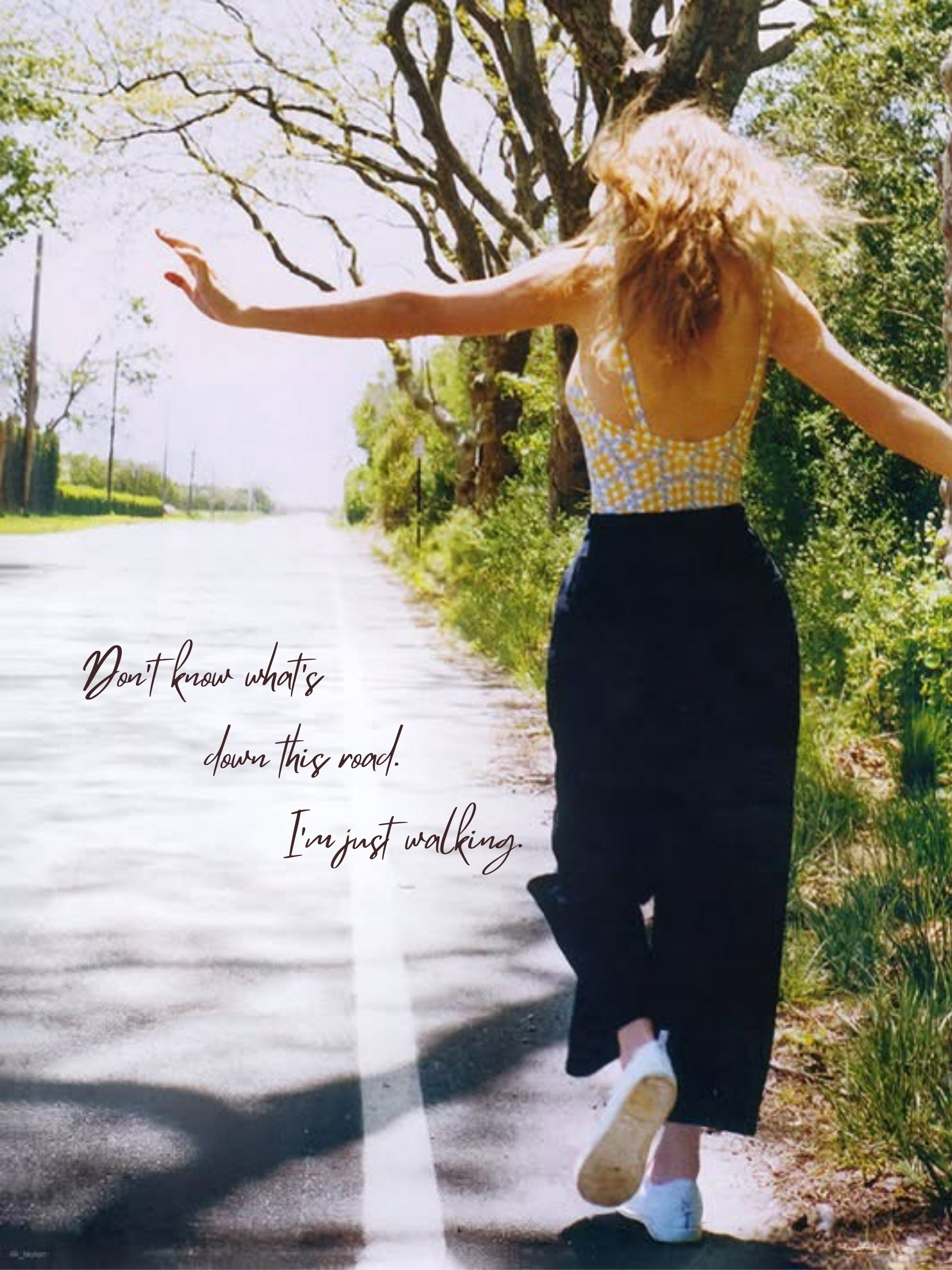
Poster Insert for Vinyl

Poster Insert for Vinyl
POSTER INSERT
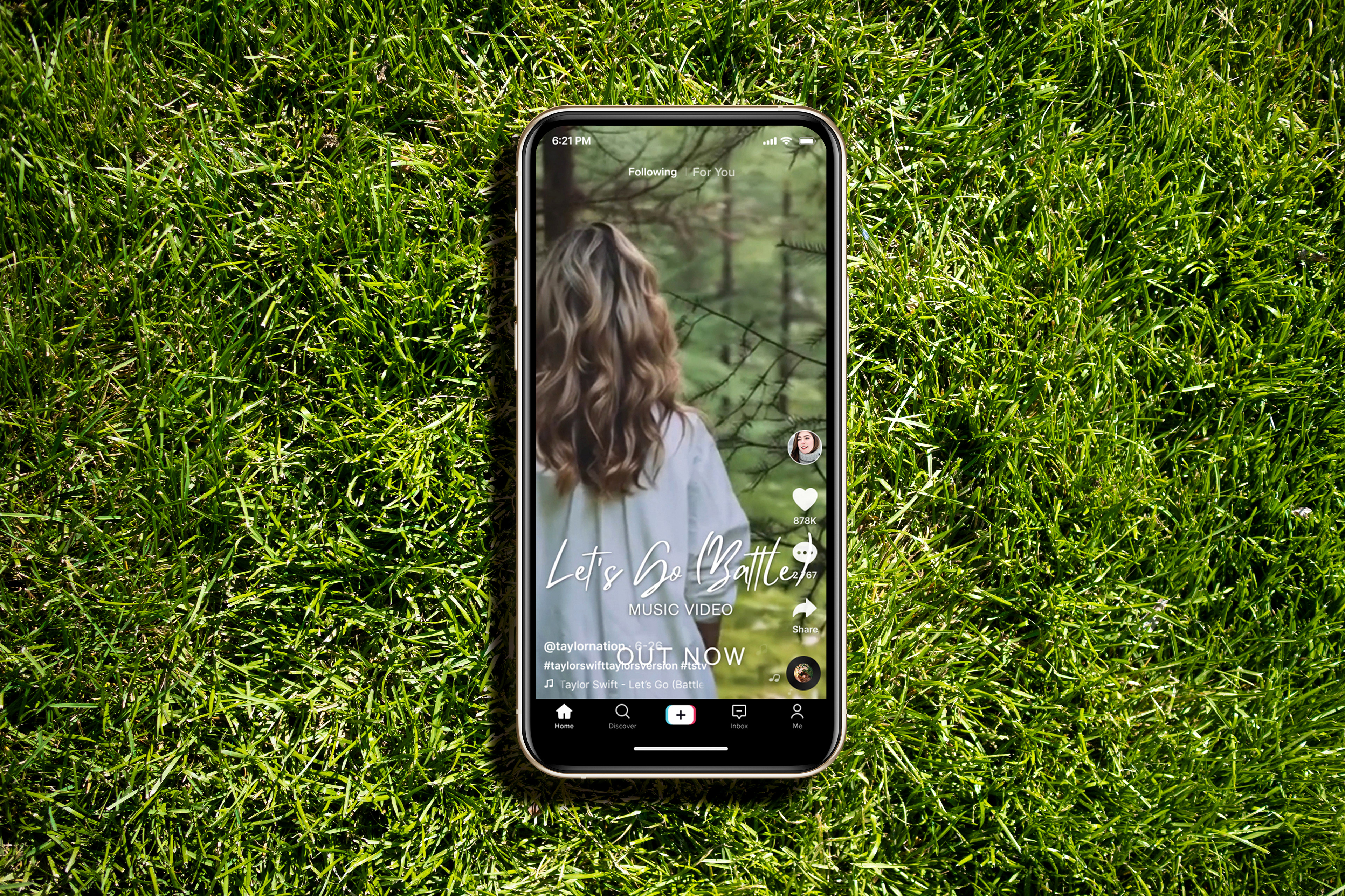
I used one of the images from the “I Knew It, I Knew You” photoshoot to create a poster that would be inside the “Listen to the Crickets Green” vinyl. The poster features a lyric from “A Place in This World” that perfectly reflects the imagery.
Perfect Fantasy Edition
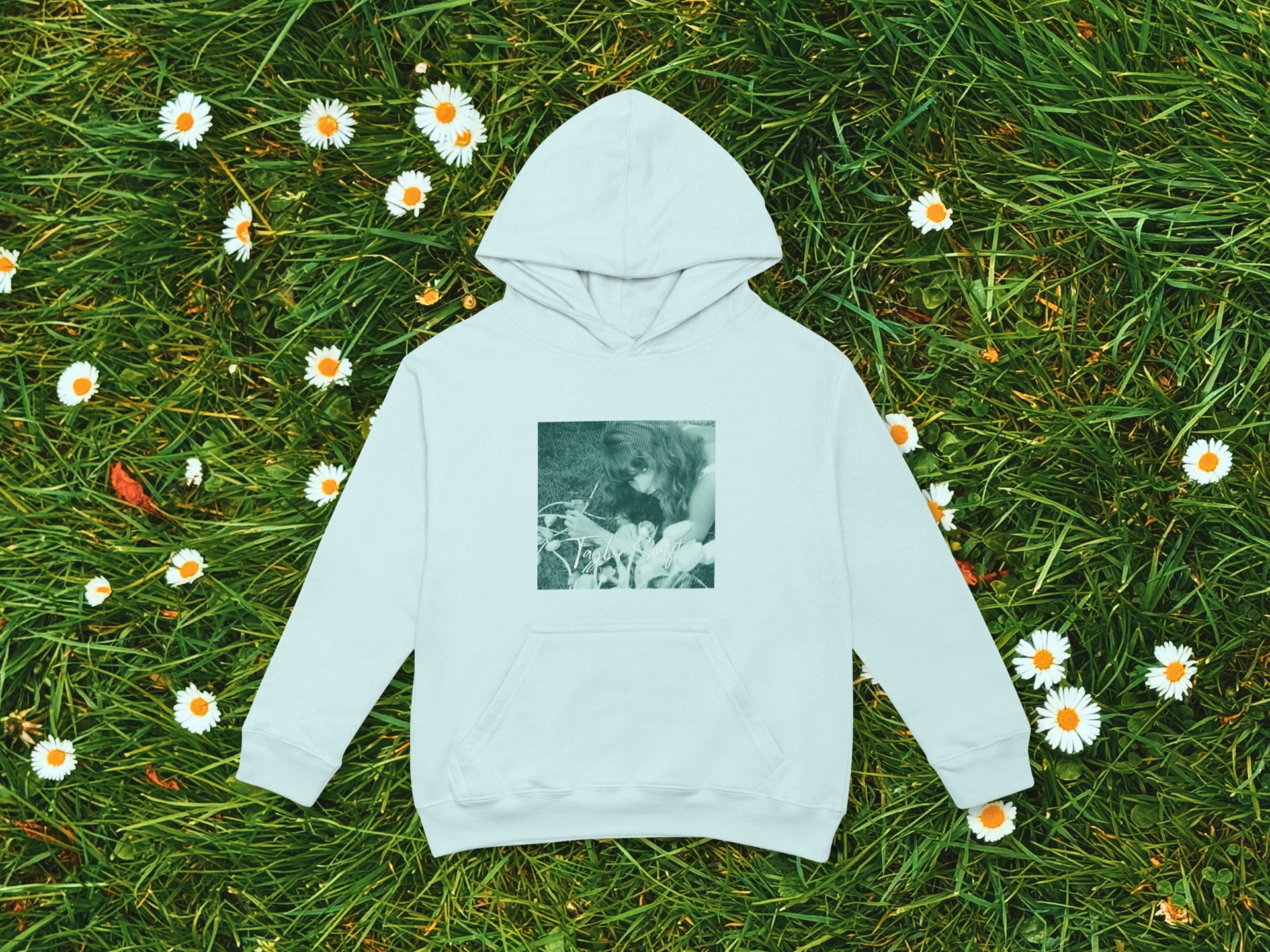
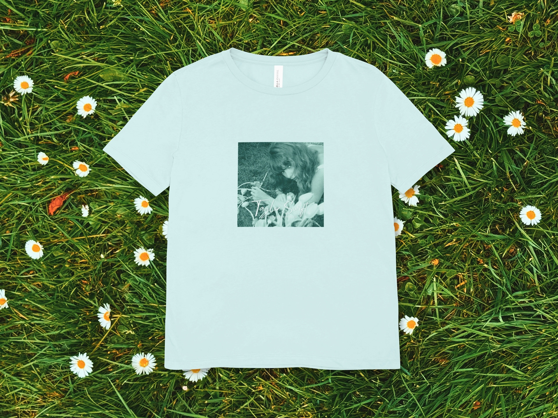
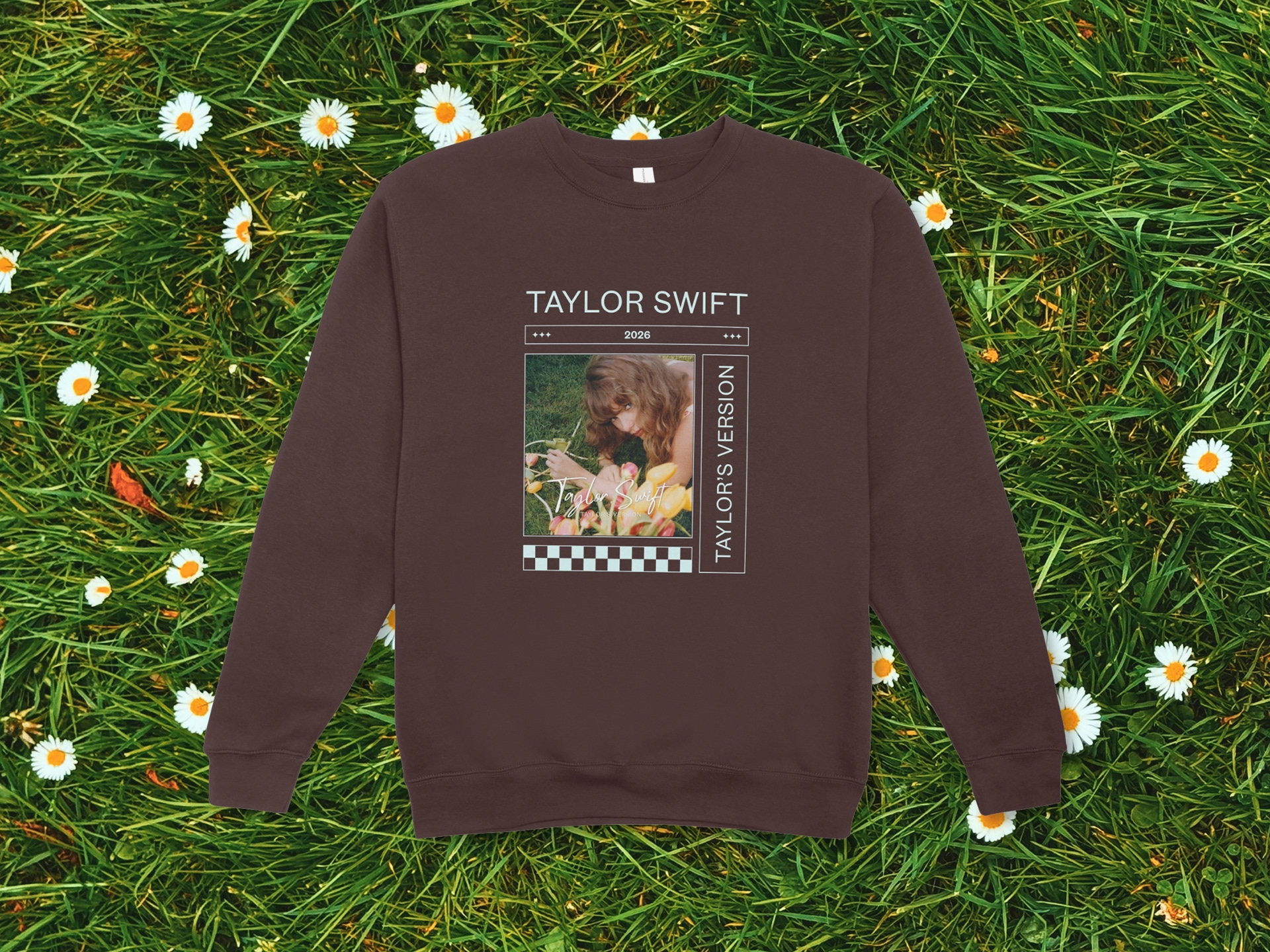
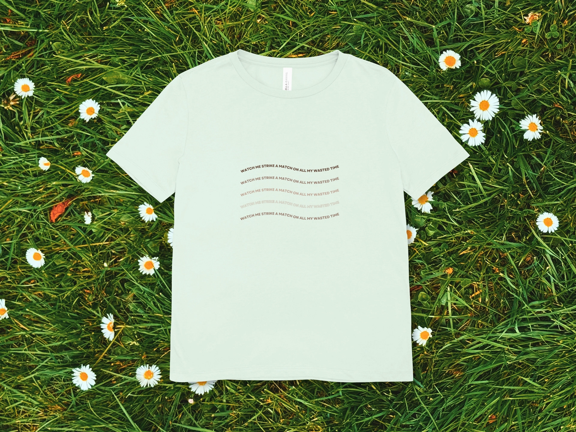
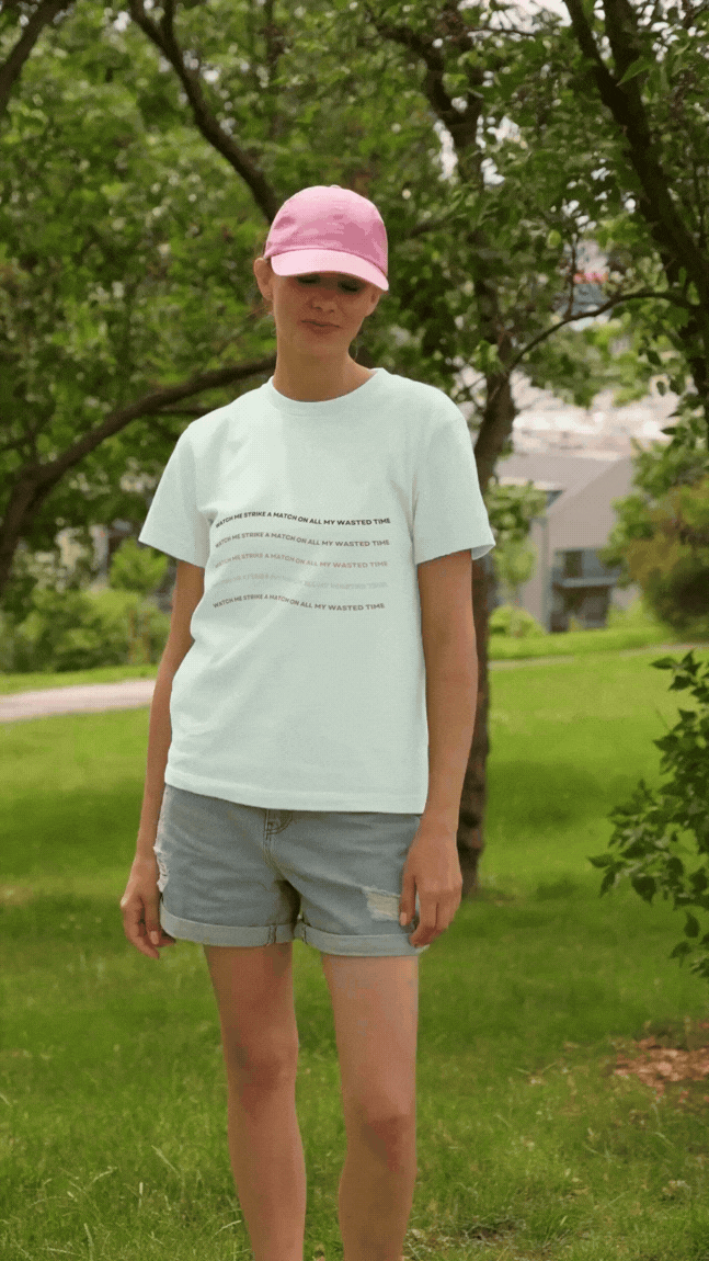
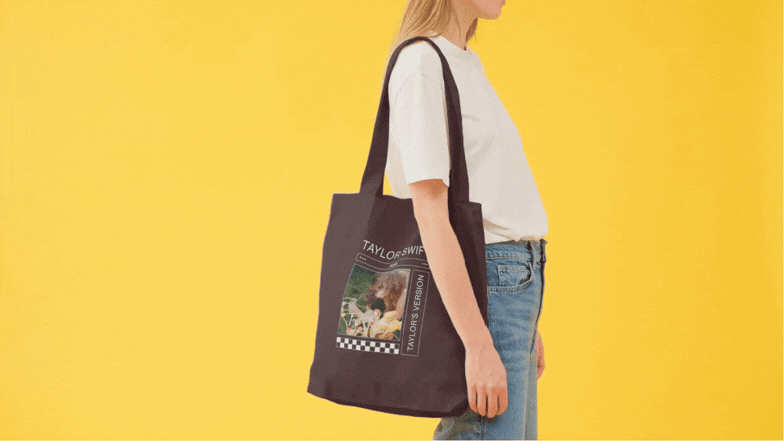
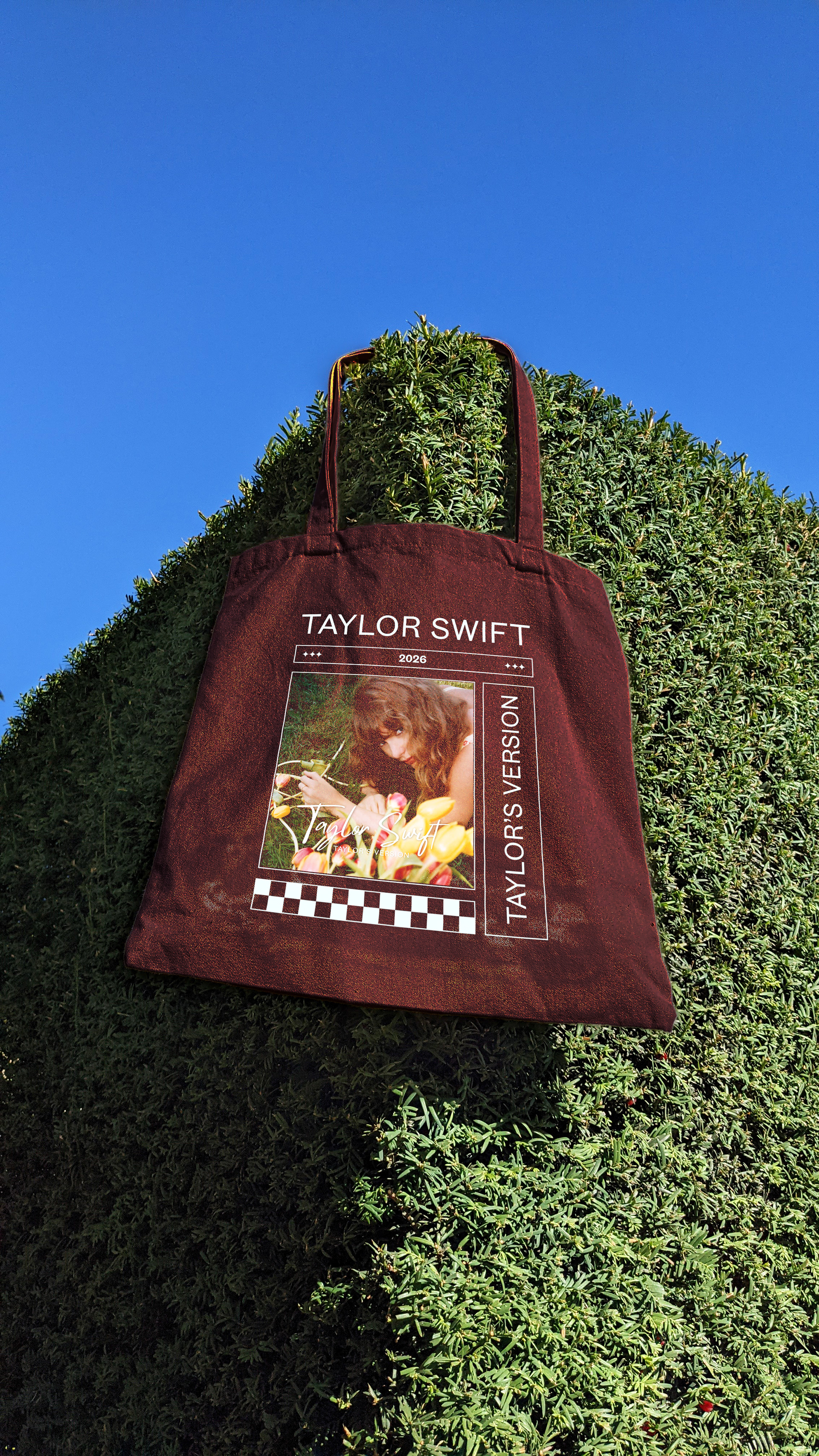
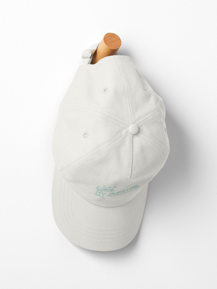
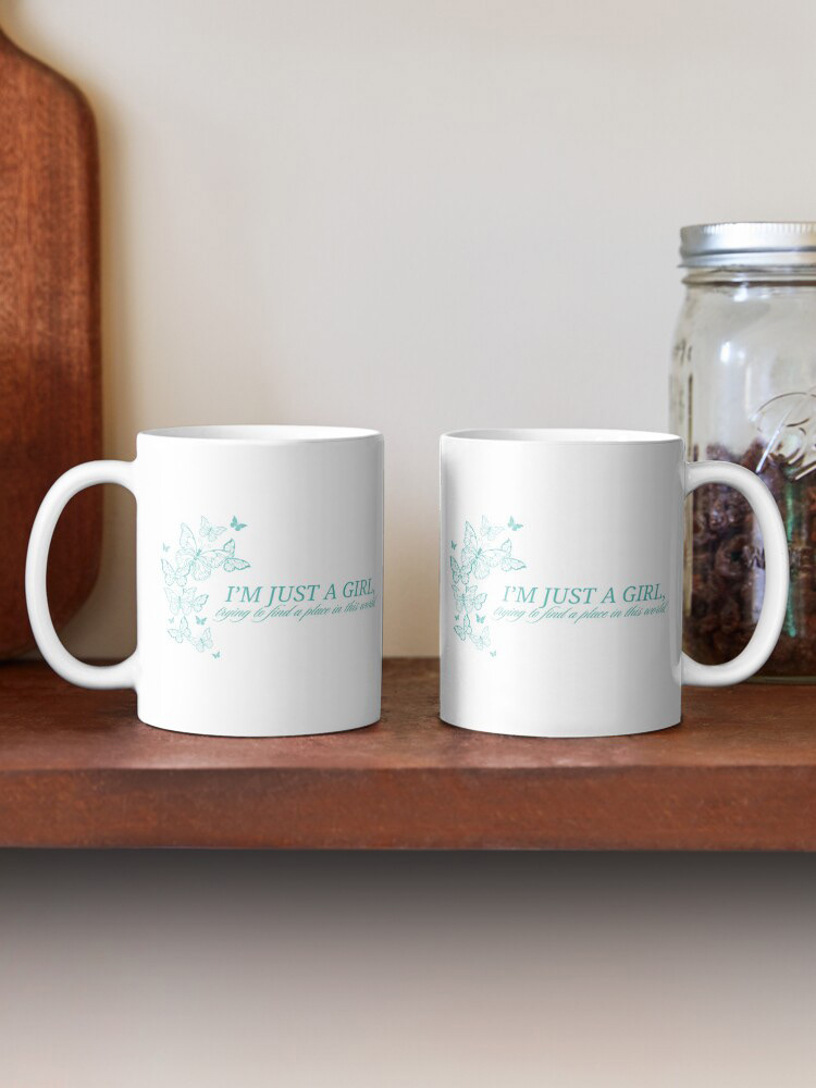
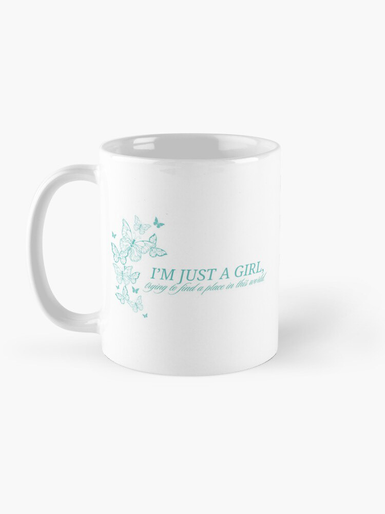
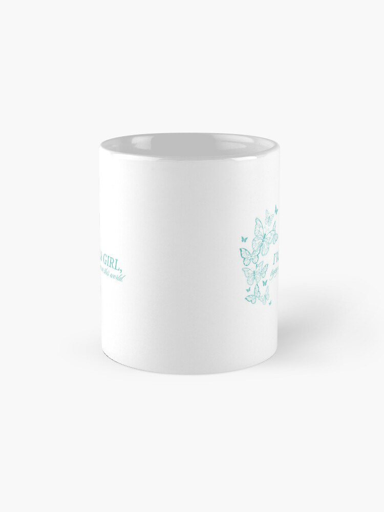
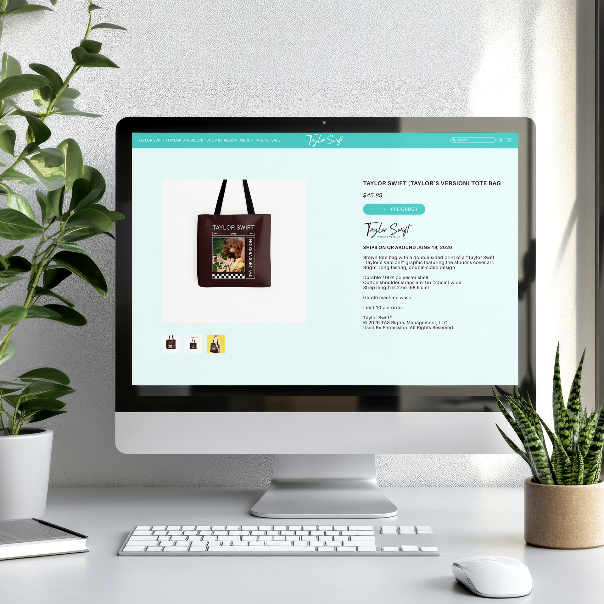
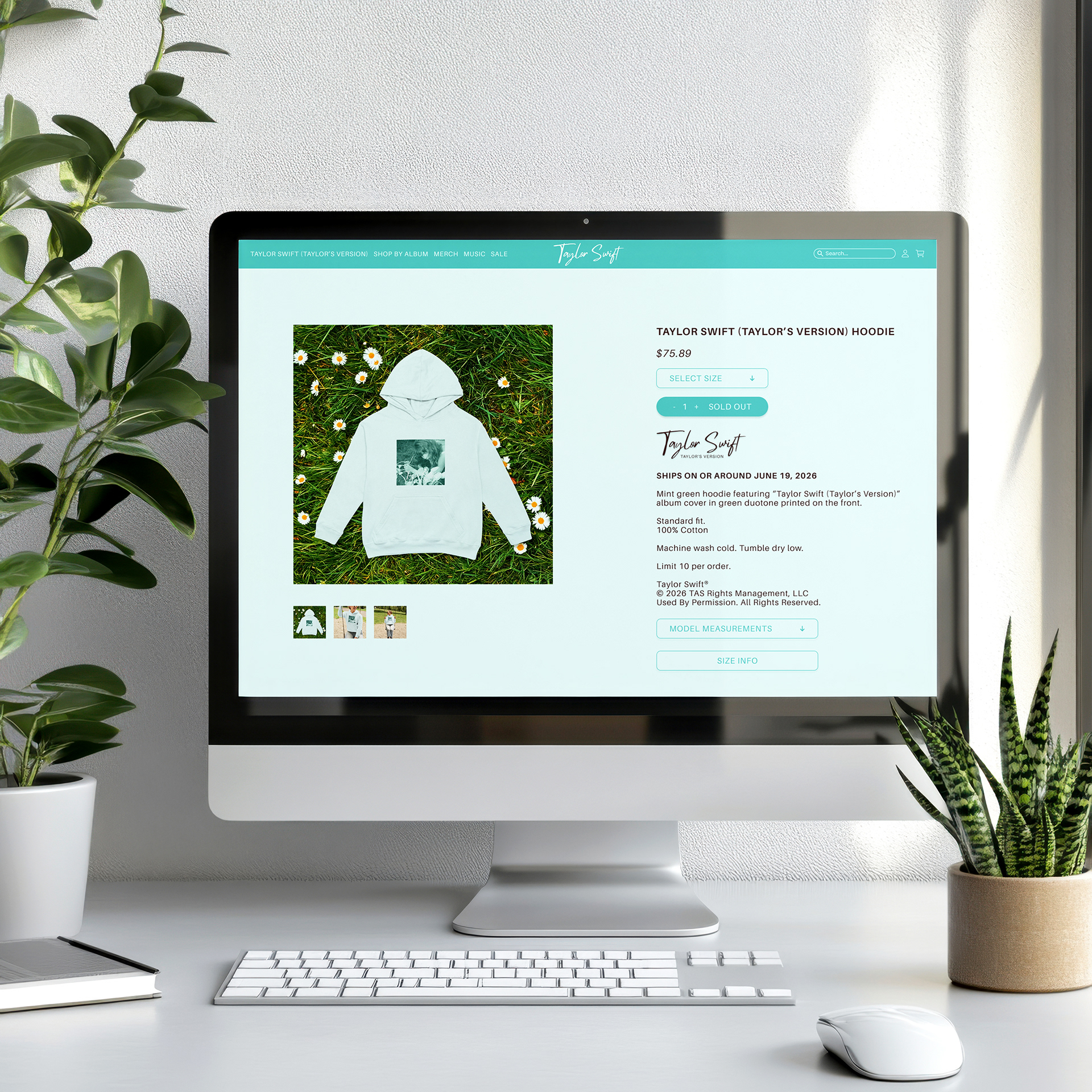
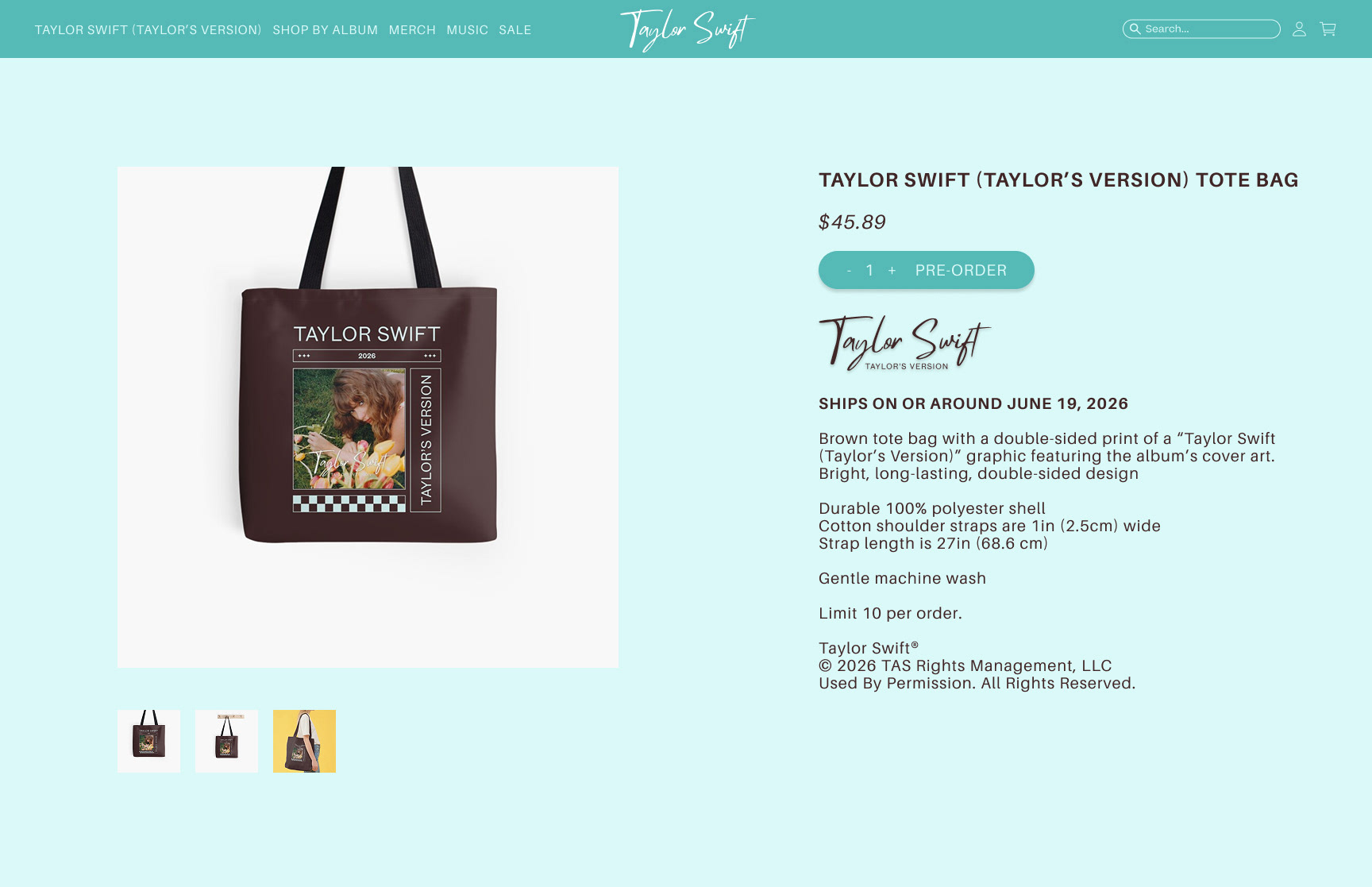
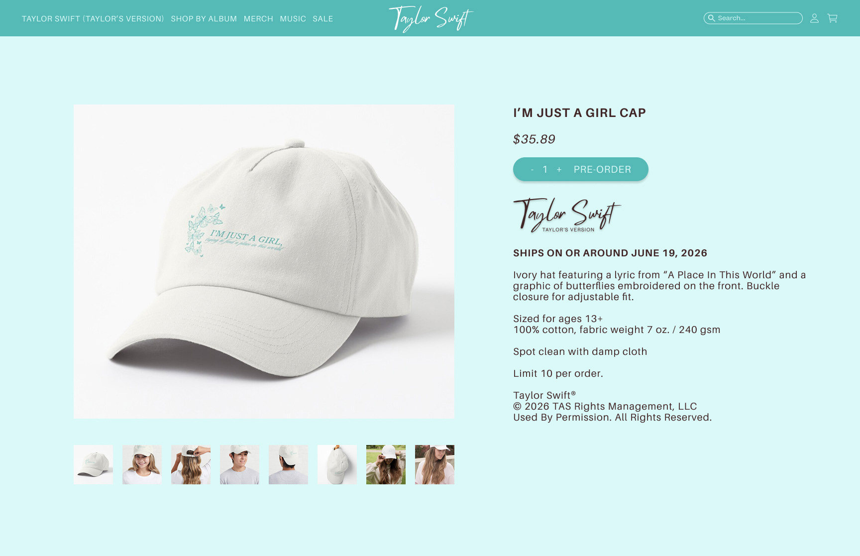
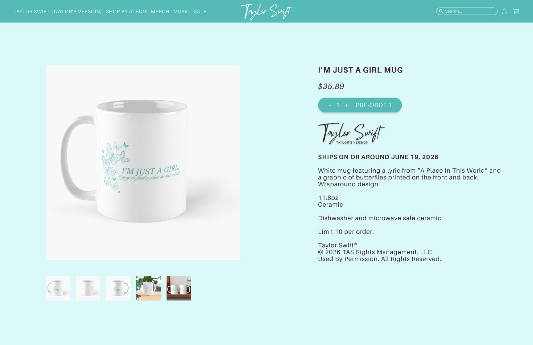
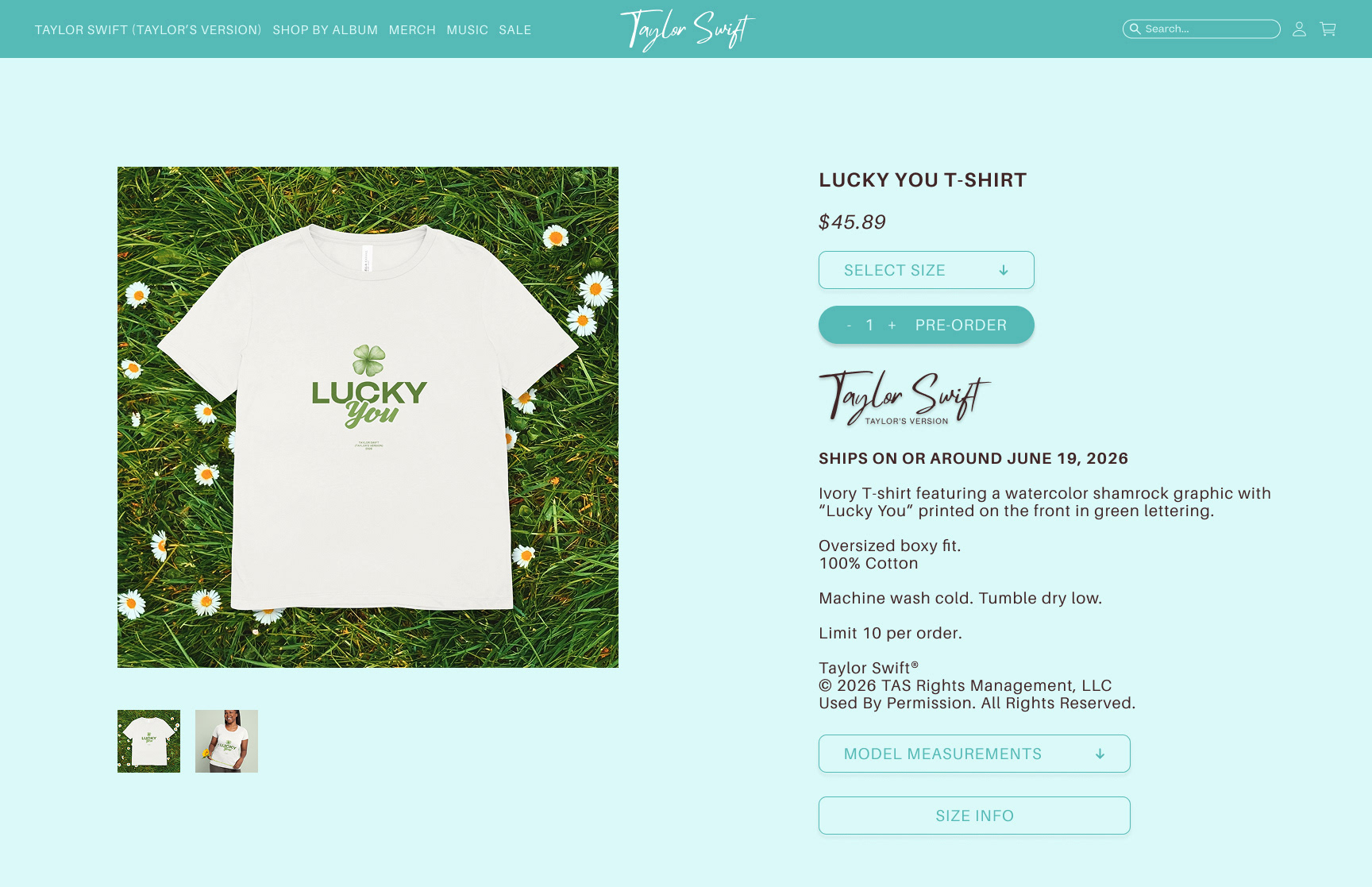
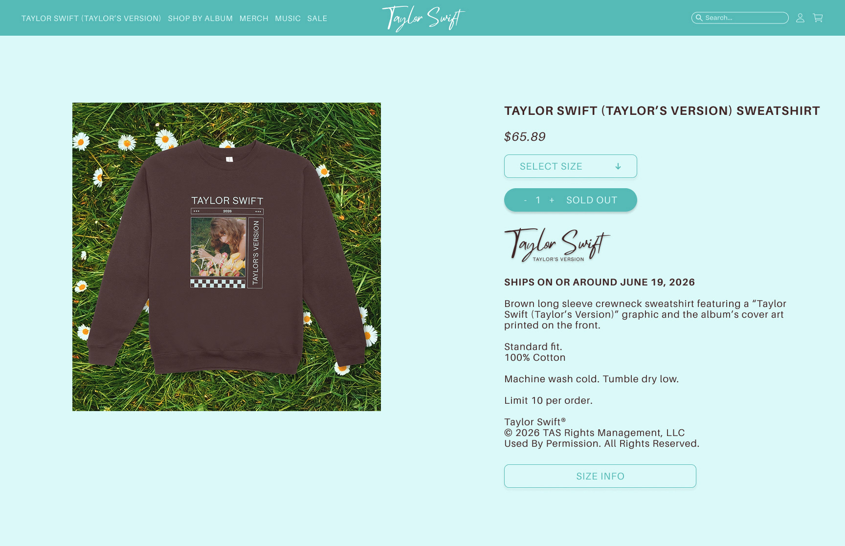
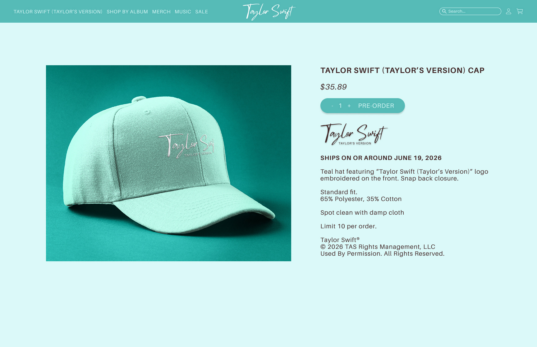
Merchandise


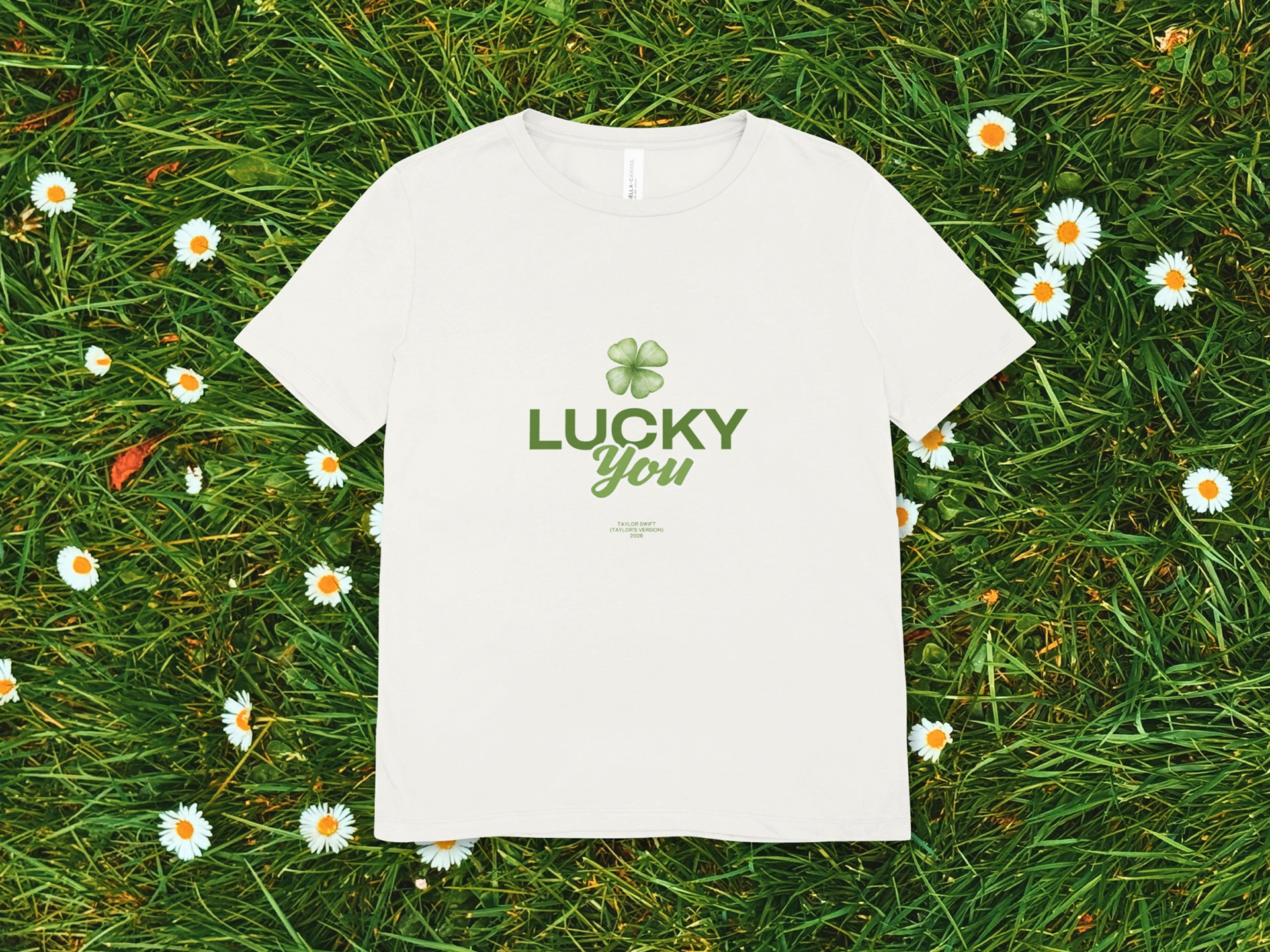


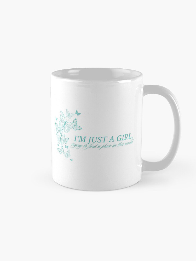

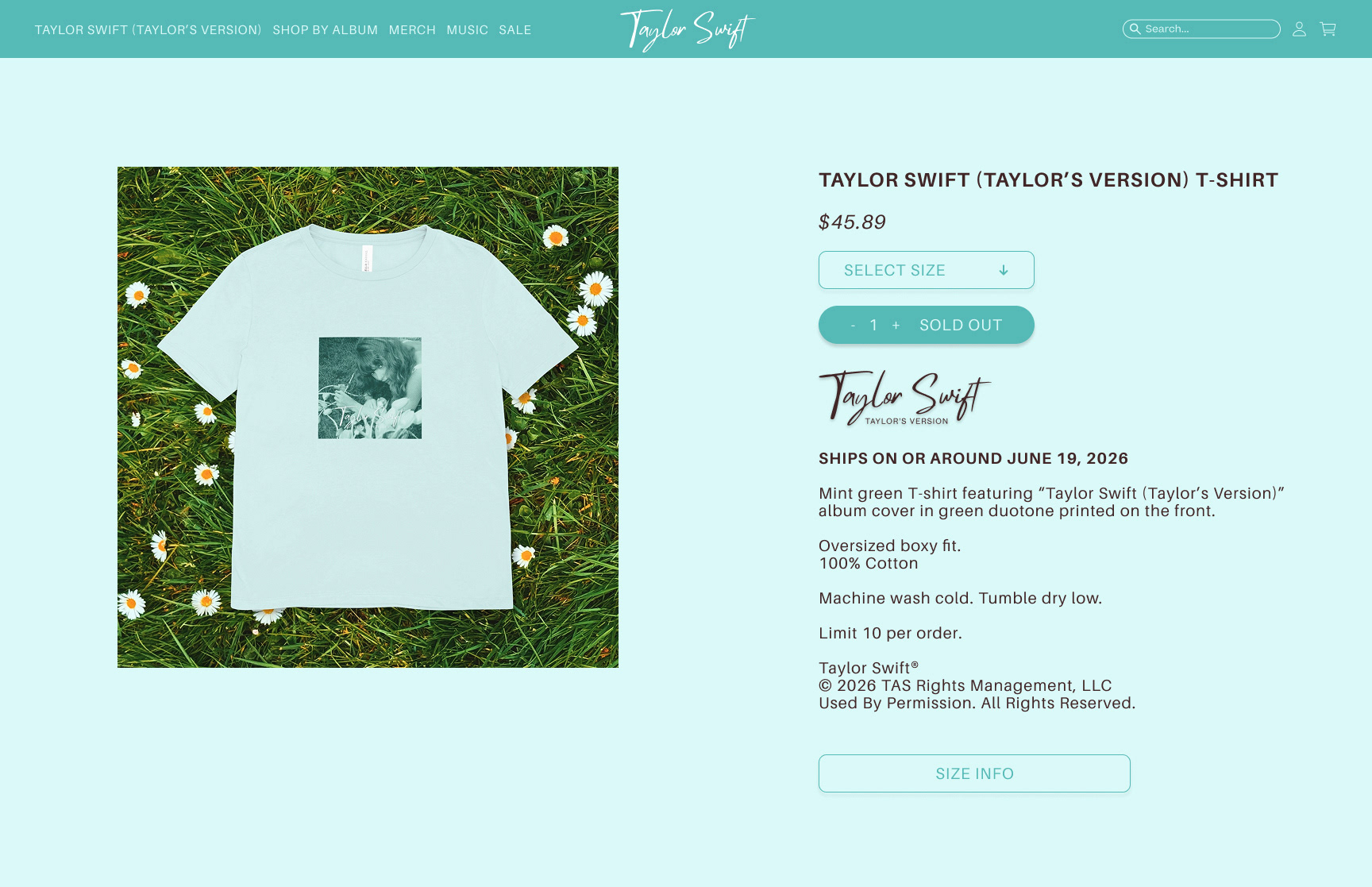
CARDIGAN
Most of Swift’s albums feature a coordinating cardigan, which gained popularity during the Folklore era. This particular cardigan was made using Adobe Firefly. I prompted the tool to create a mint green cable-knit cardigan adorned with shimmering blue butterfly patches on the sleeves. I imported one of the concepts into Adobe Photoshop to add the embroidered TS detailing on the chest, using the same typeface as the new logo.

Created with Canva’s Ask Canva Feature

Created with Canva’s Image to Video Feature
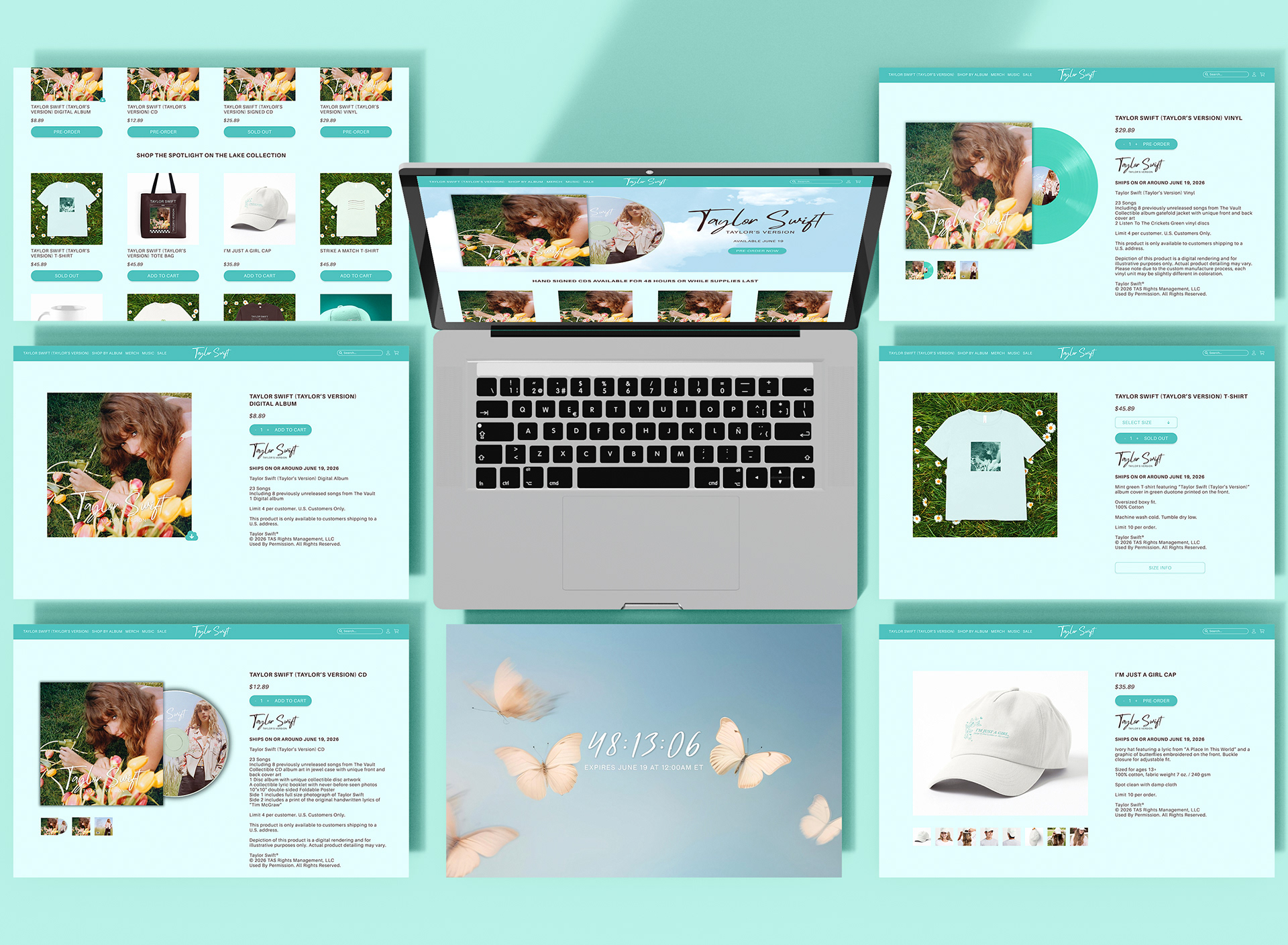
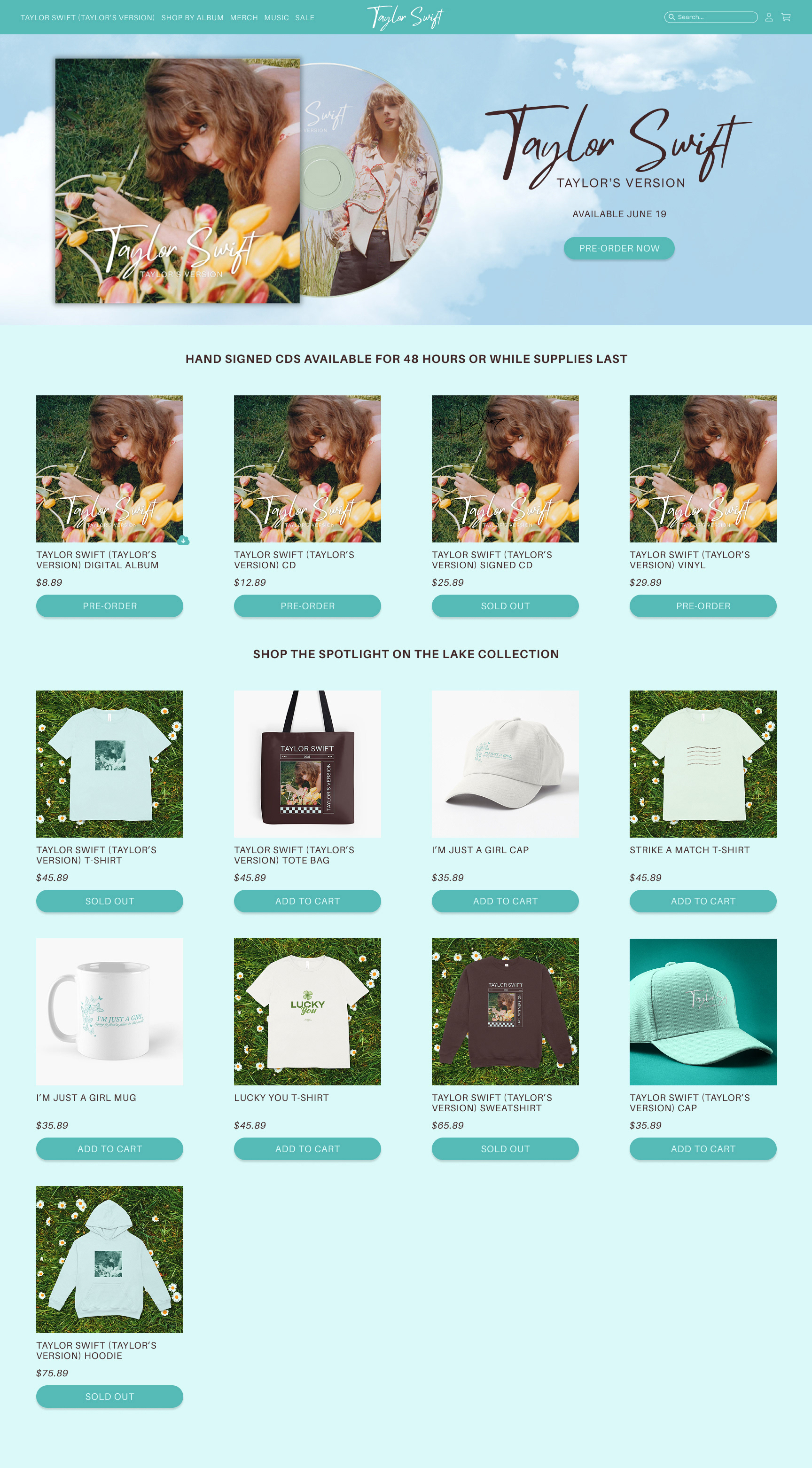
Website


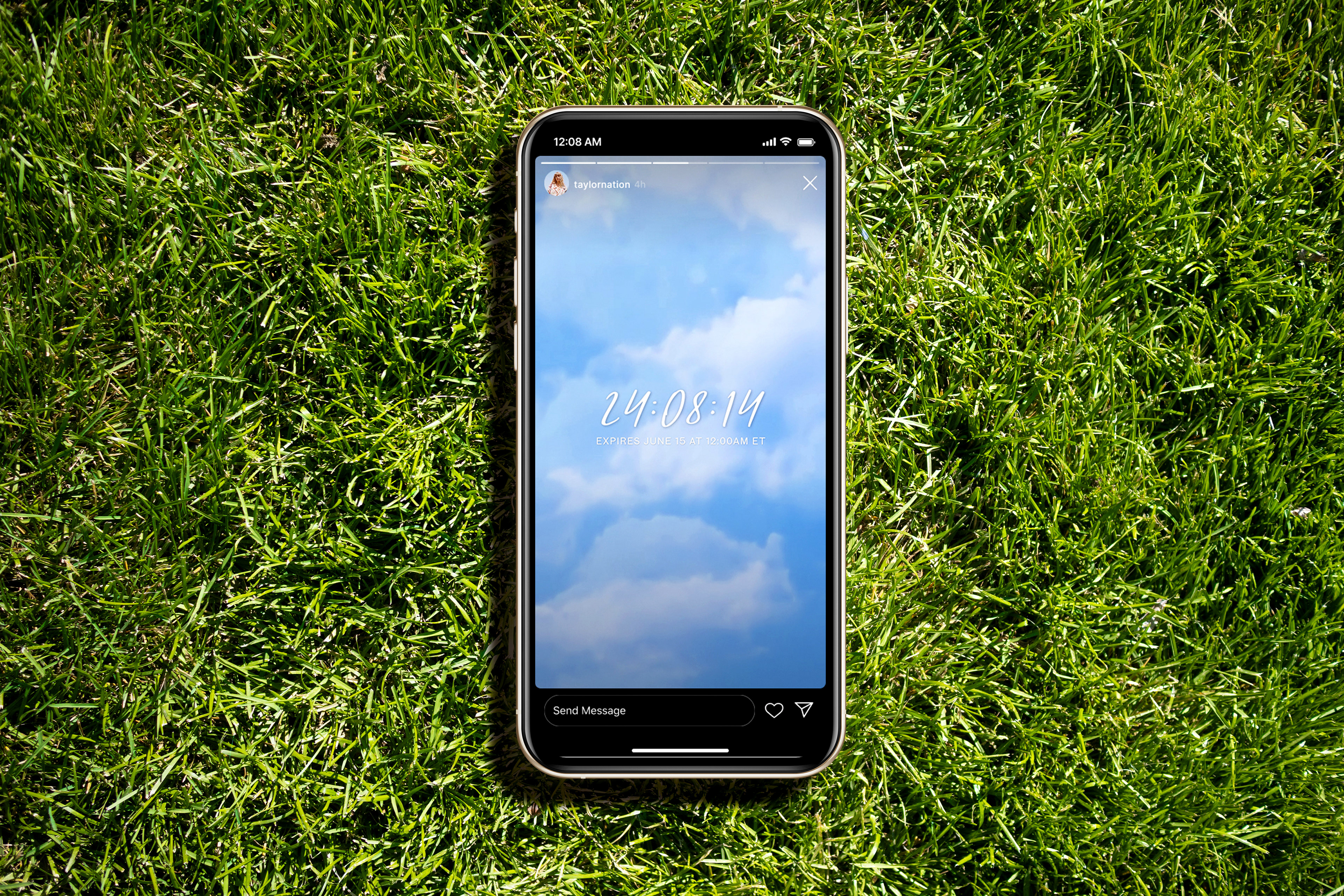
COUNTDOWN
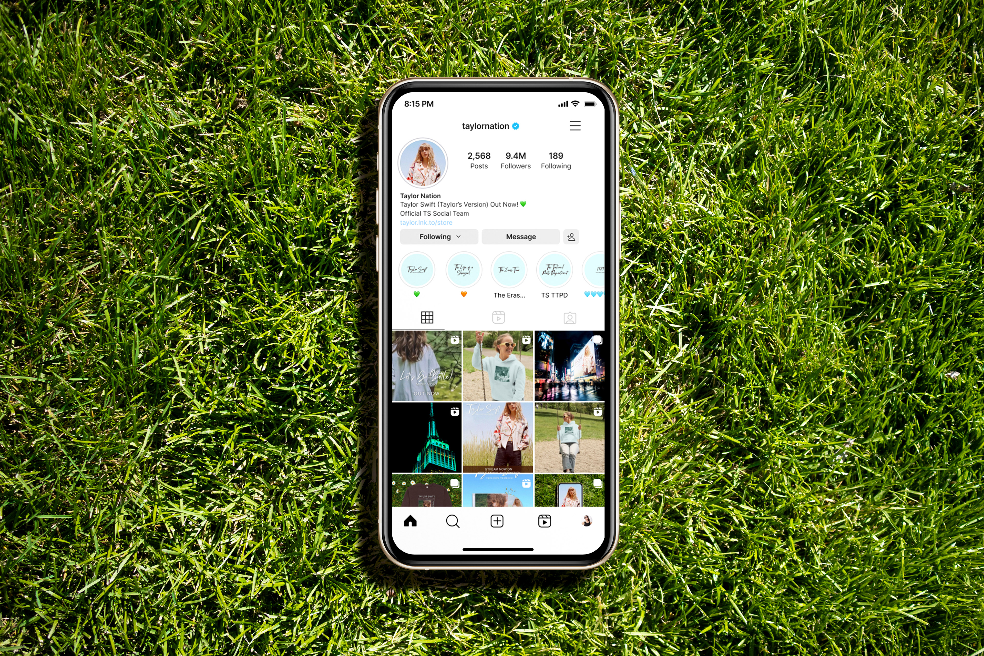
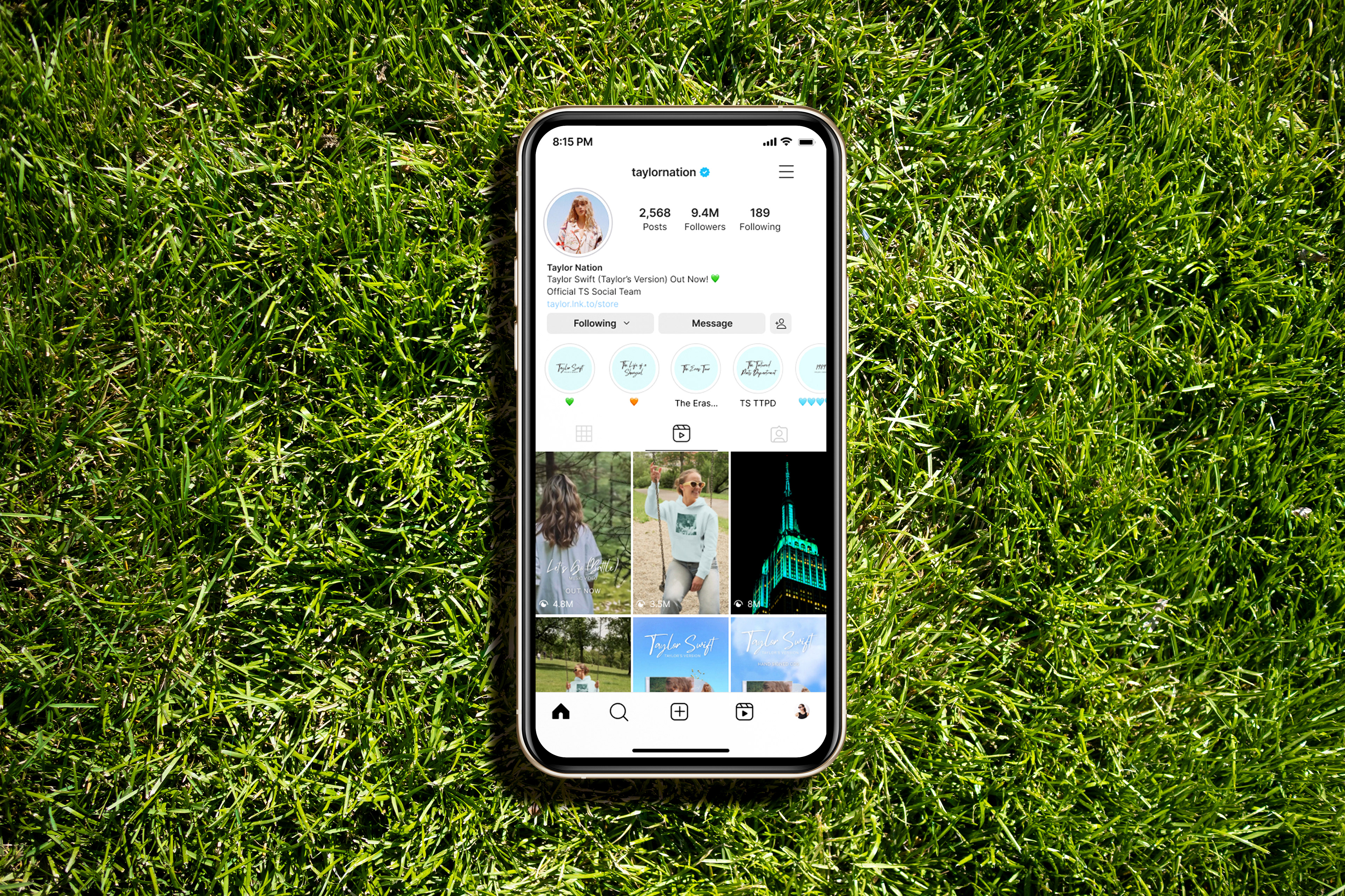
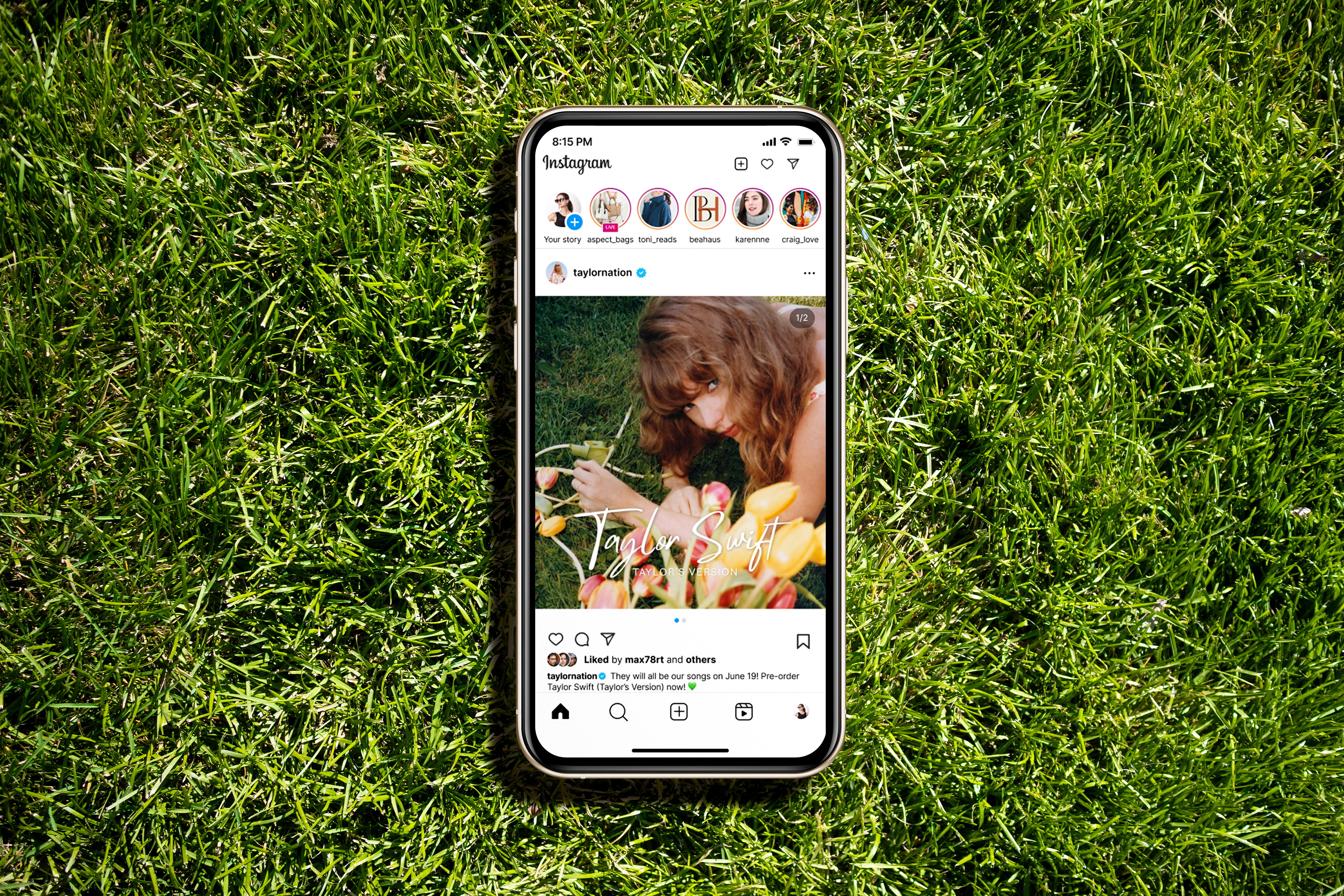
To generate buzz around new music, whether it’s singles, remixes, albums, re-recordings, or fresh merchandise, a countdown is frequently showcased on Taylor Swift’s website. This sparks speculation and excitement among fans, who craft theories on social media that often go viral. Additionally, these countdowns sometimes appear in Taylor Nation’s (Swift's official social team) Instagram stories.
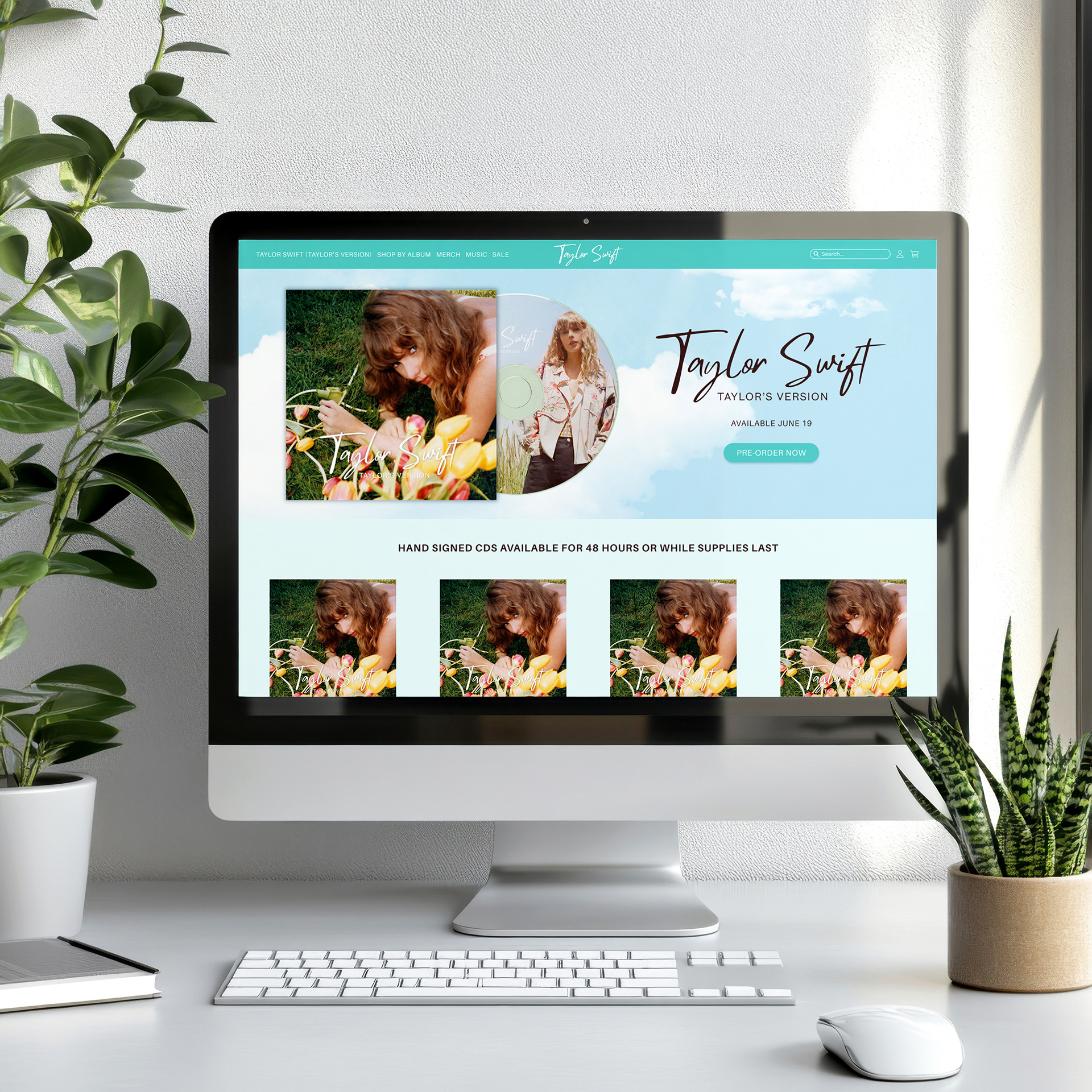
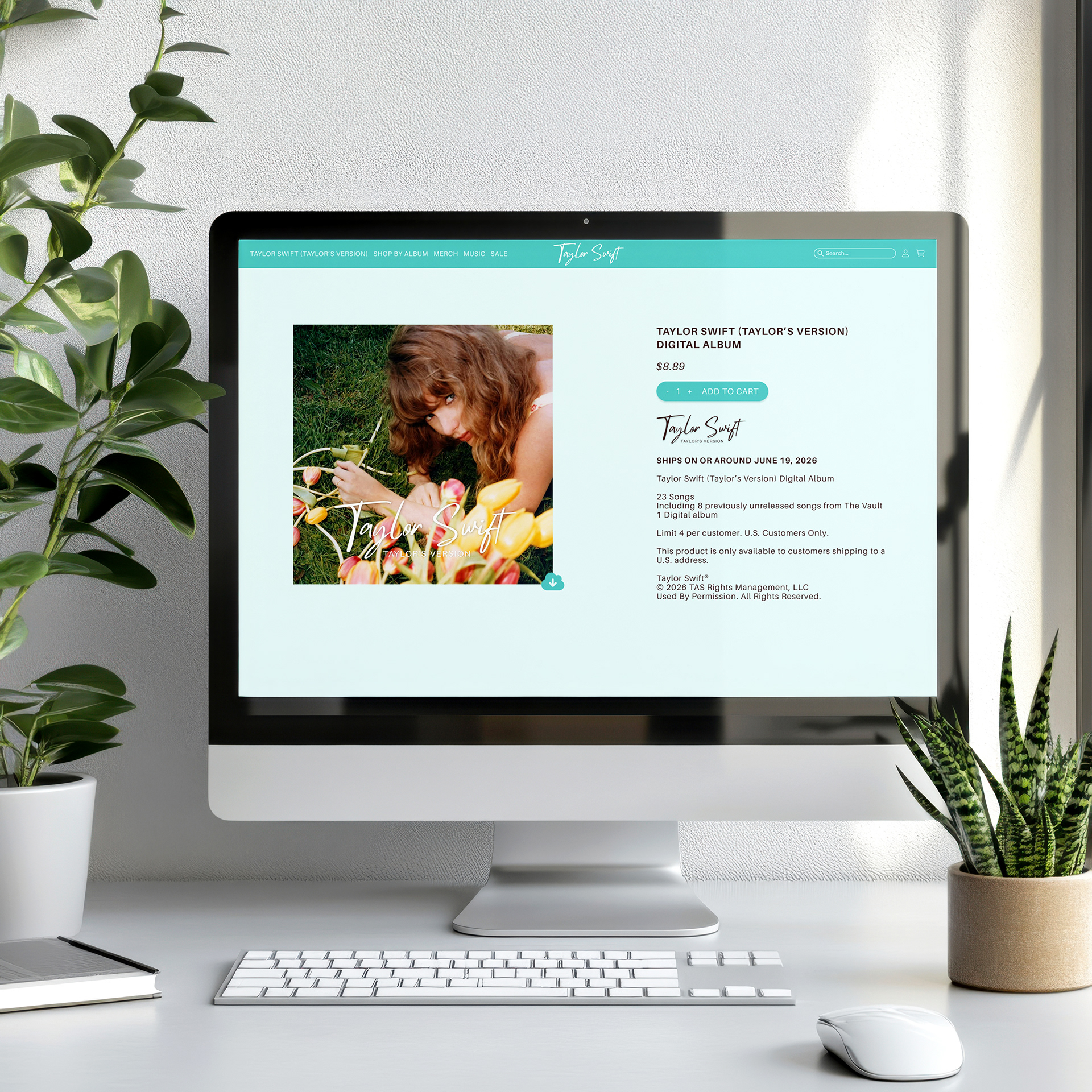
I redesigned Swift’s website to align with the fresh Debut era since her website design frequently evolves to reflect the aesthetic of each new era.
COLOR PALETTE
The color palette is rooted in soft mint green, a color that Swift has long associated with the original Debut era. The pale blue signifies the clear sky, while the aqua reflects the waters of lakes. The white symbolizes fluffy clouds, and the soft brown captures the essence of earth and countryside aesthetics. These colors evoke images of open fields, country roads, and pastoral landscapes. Together, the palette creates a fresh, airy, and approachable aesthetic that feels both youthful and nostalgic.

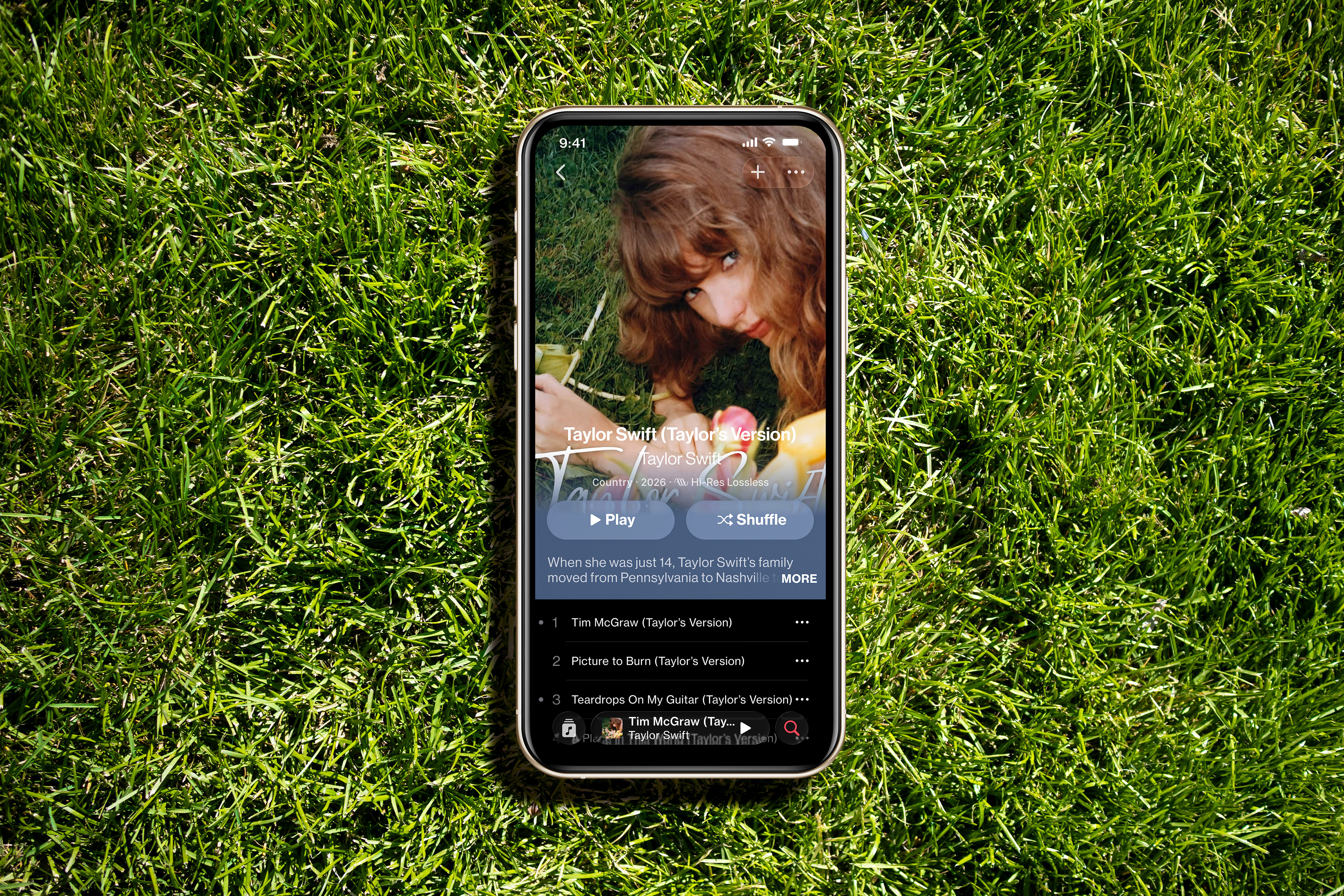
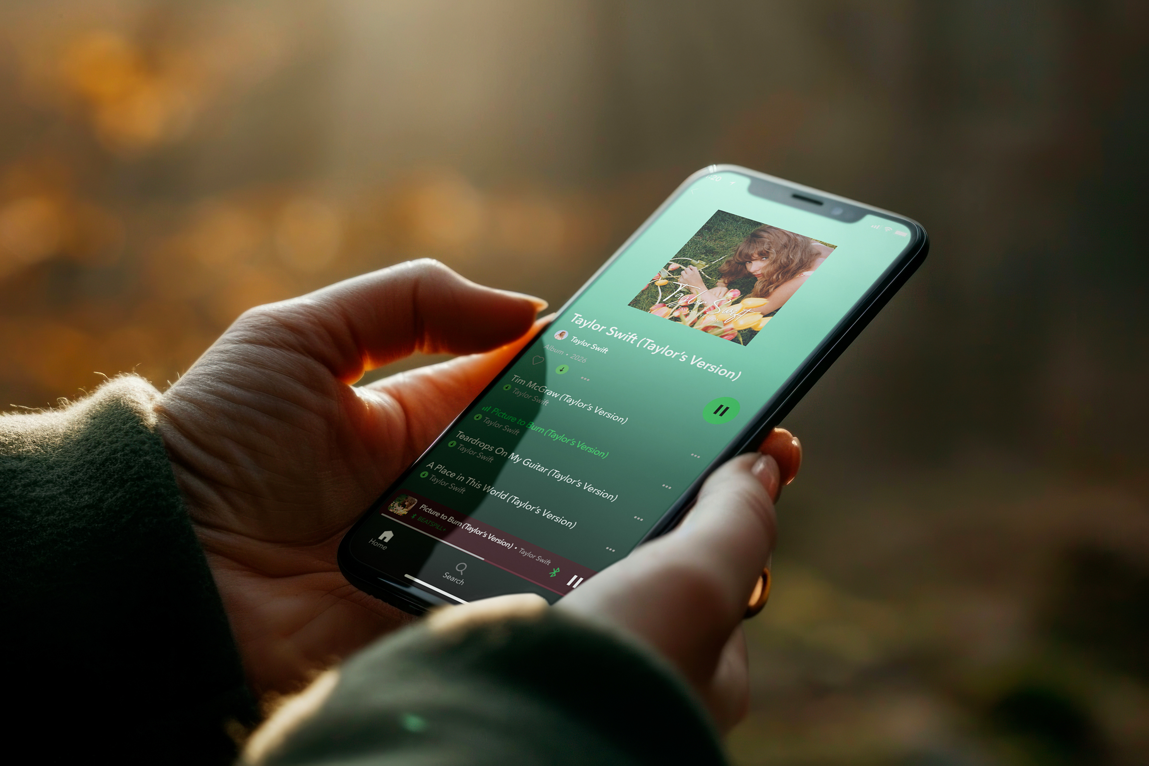
Streaming Platforms

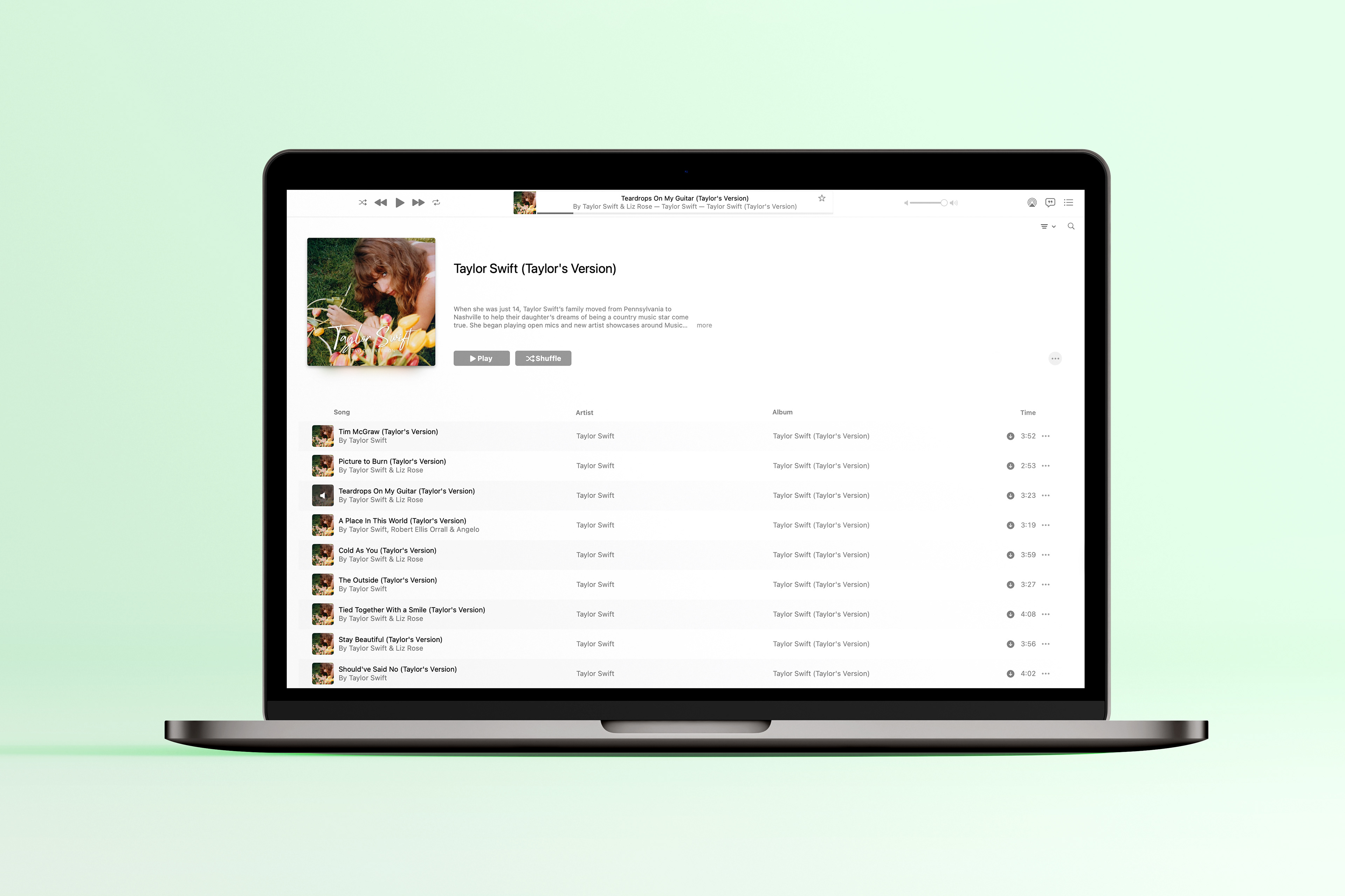
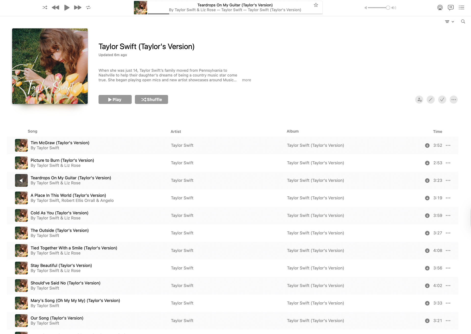
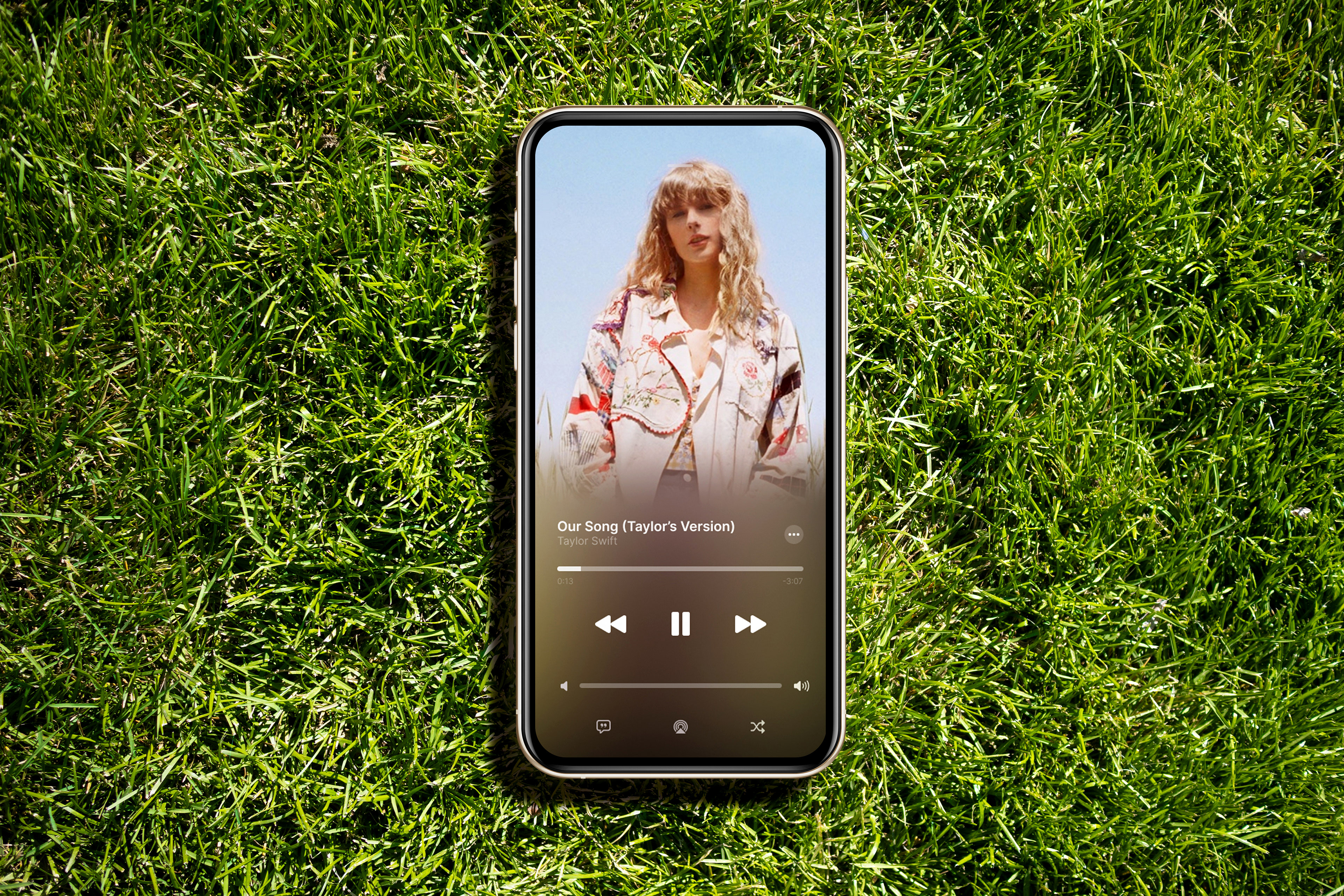
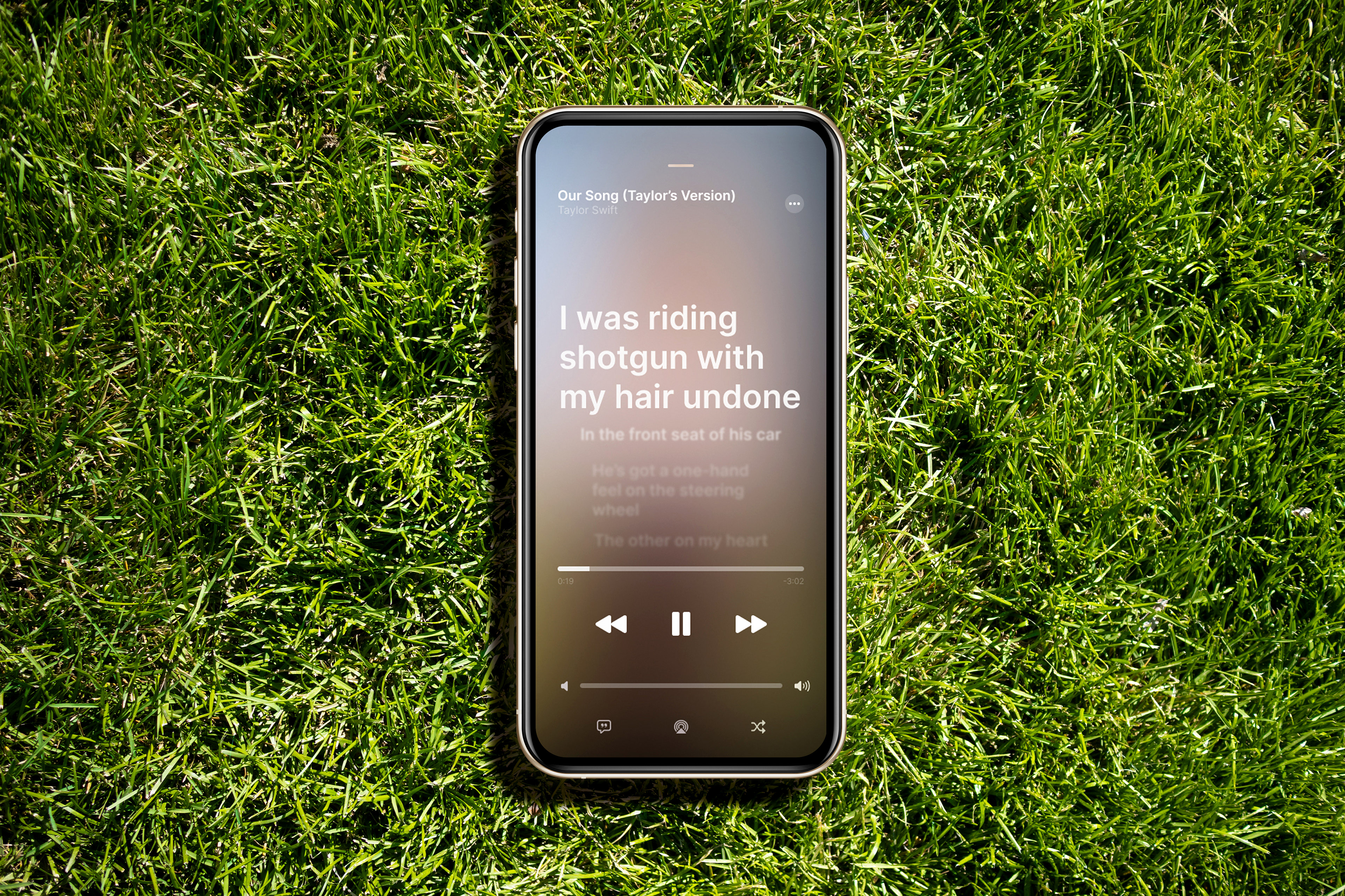
APPLE MUSIC DESKTOP VIEW
For the desktop view of Apple Music, I purchased the original Debut album and compiled all the tracks into a playlist titled “Taylor Swift (Taylor’s Version).” I then modified the album art to feature my own design, renamed the album from Taylor Swift (Bonus Track Version) to Taylor Swift (Taylor’s Version), and added “(Taylor’s Version)” to each track title. Finally, I captured a screenshot of my desktop to utilize for mockups.
Social Media
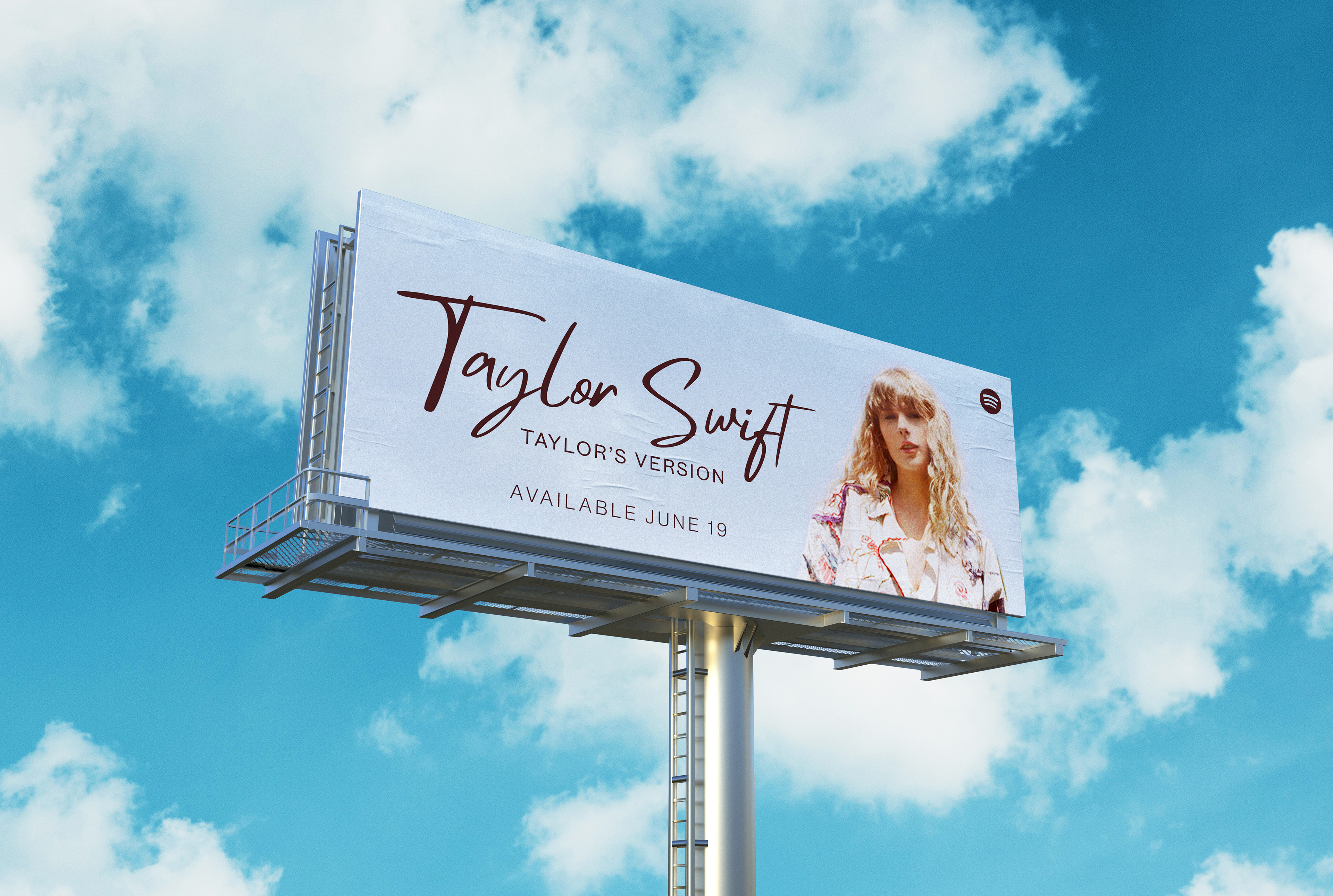
OUTDoor Advertising
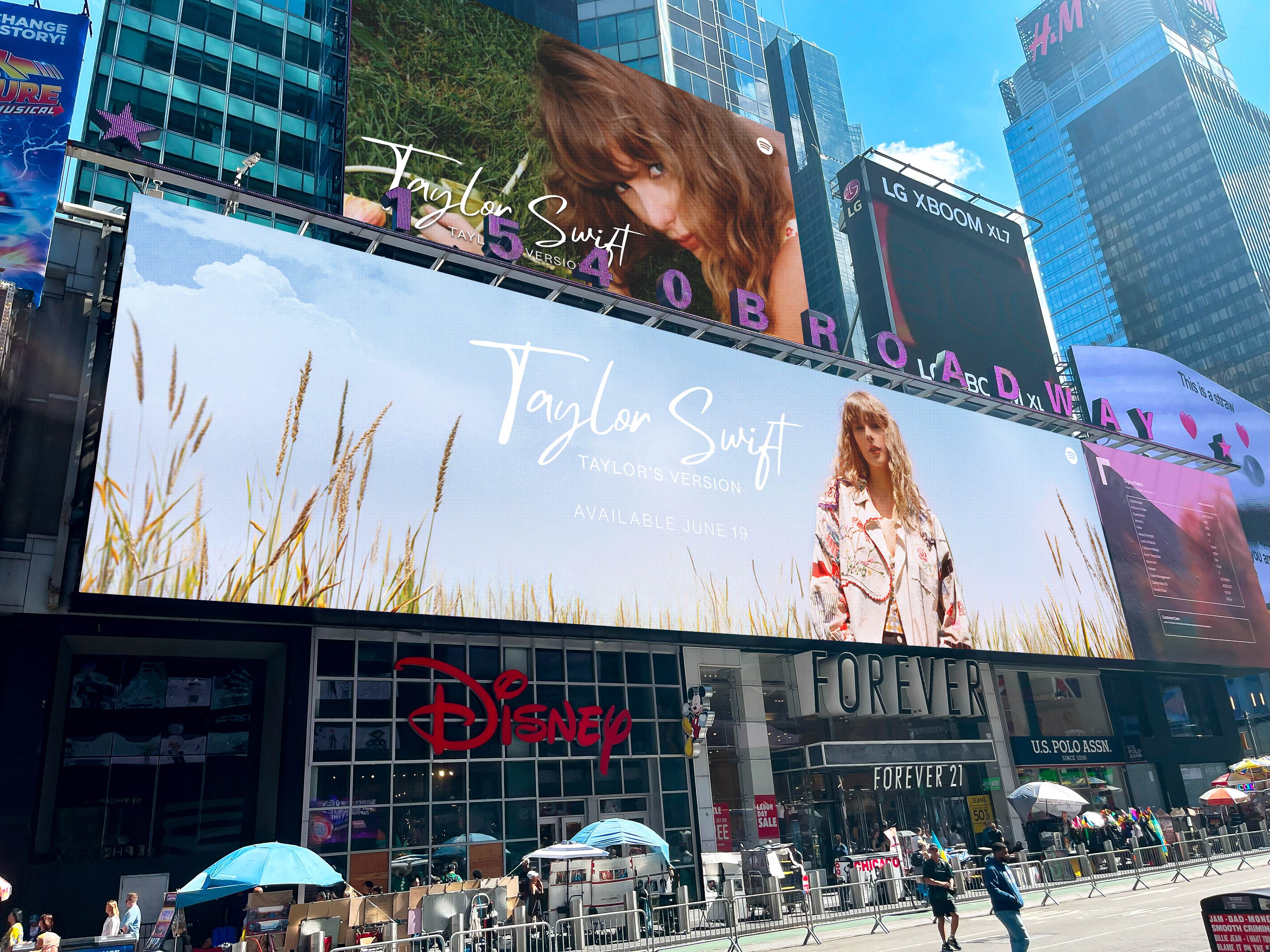
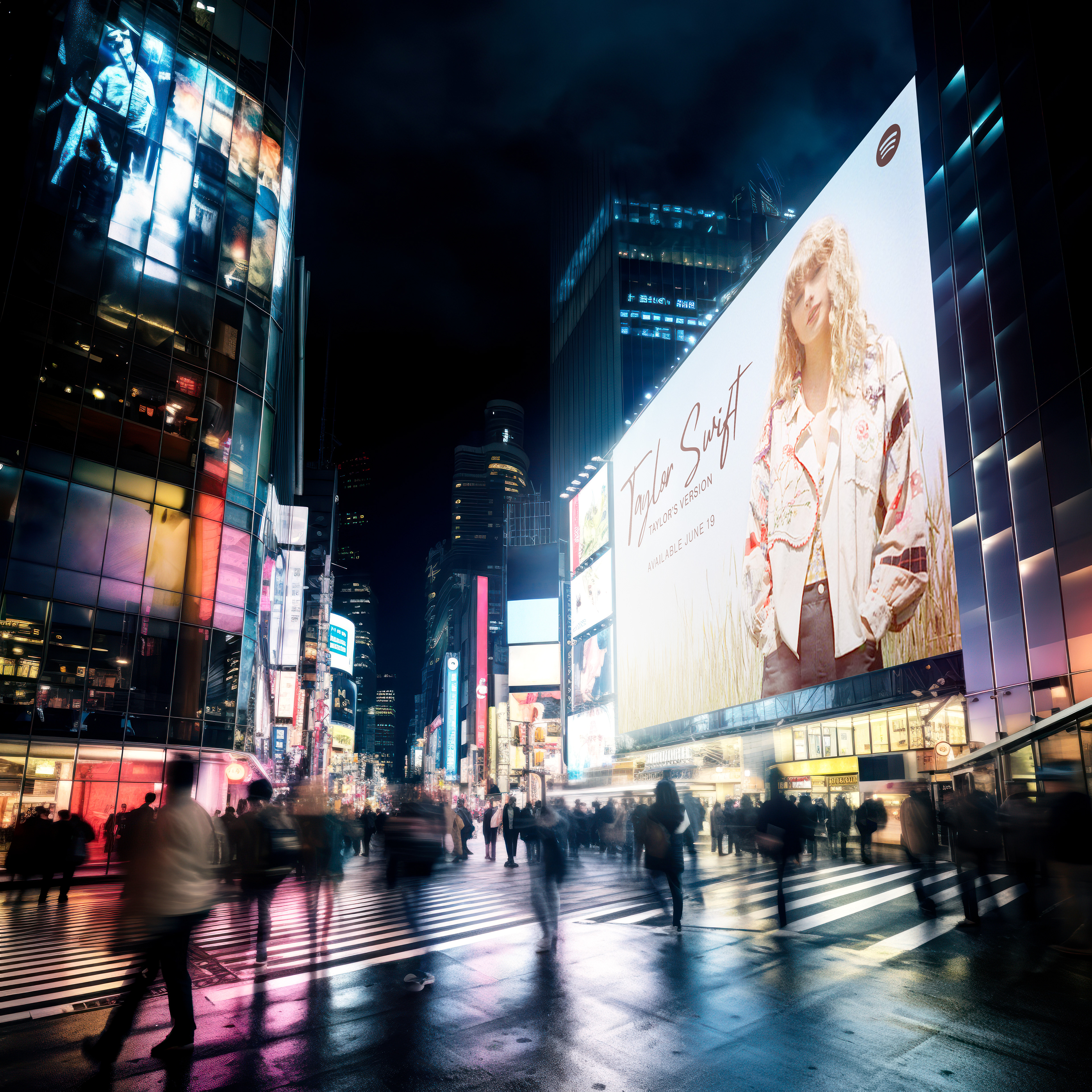
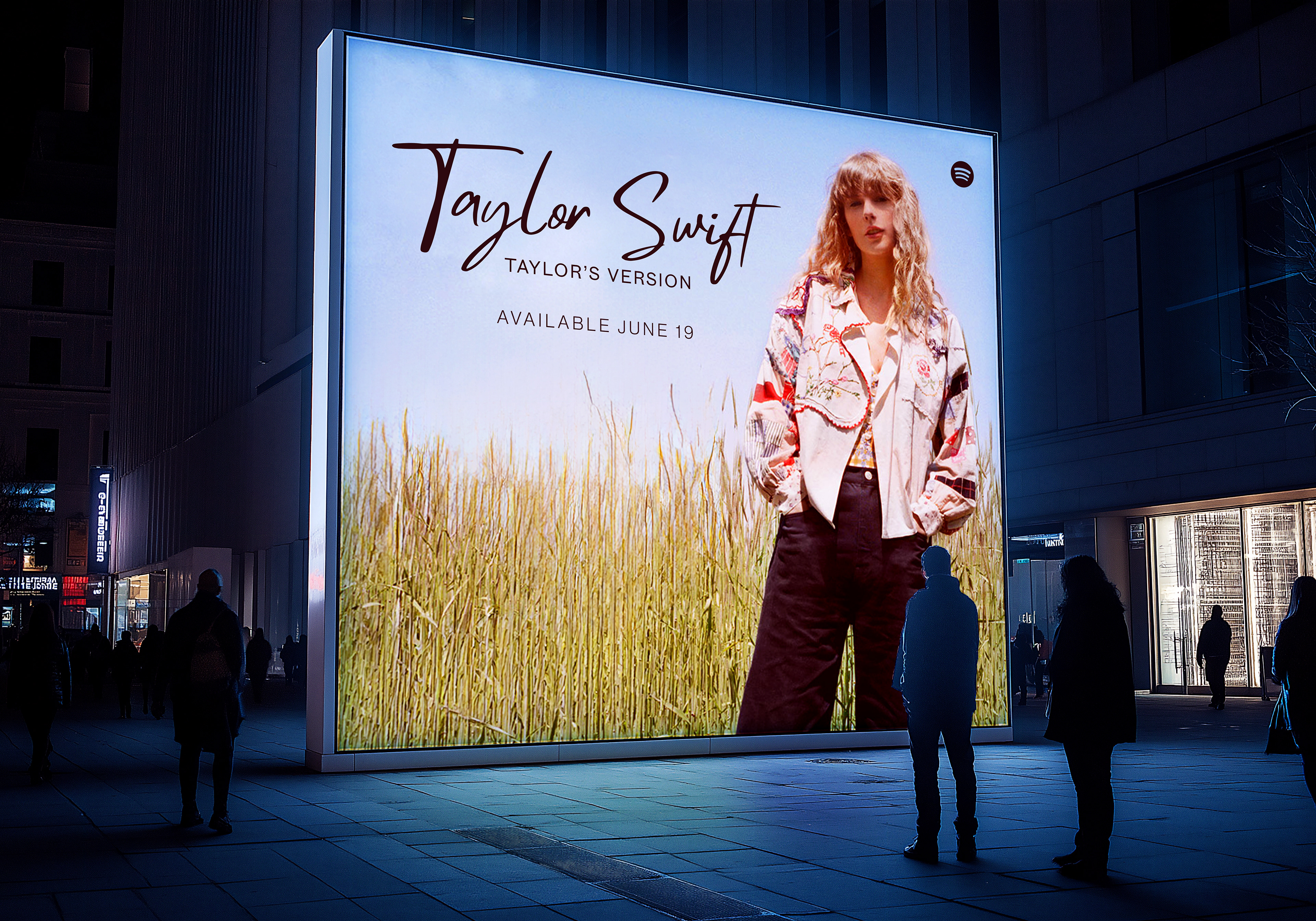
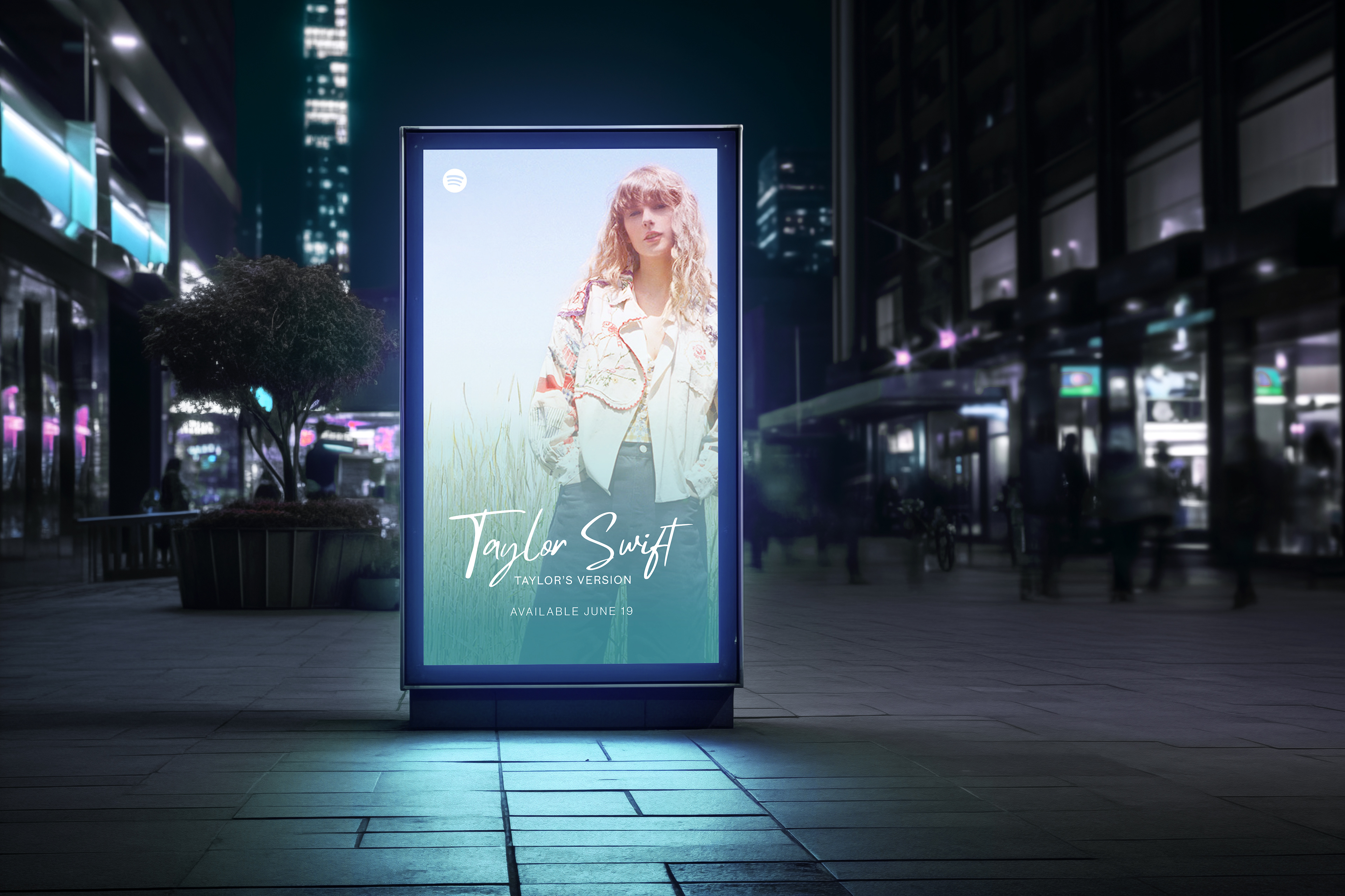
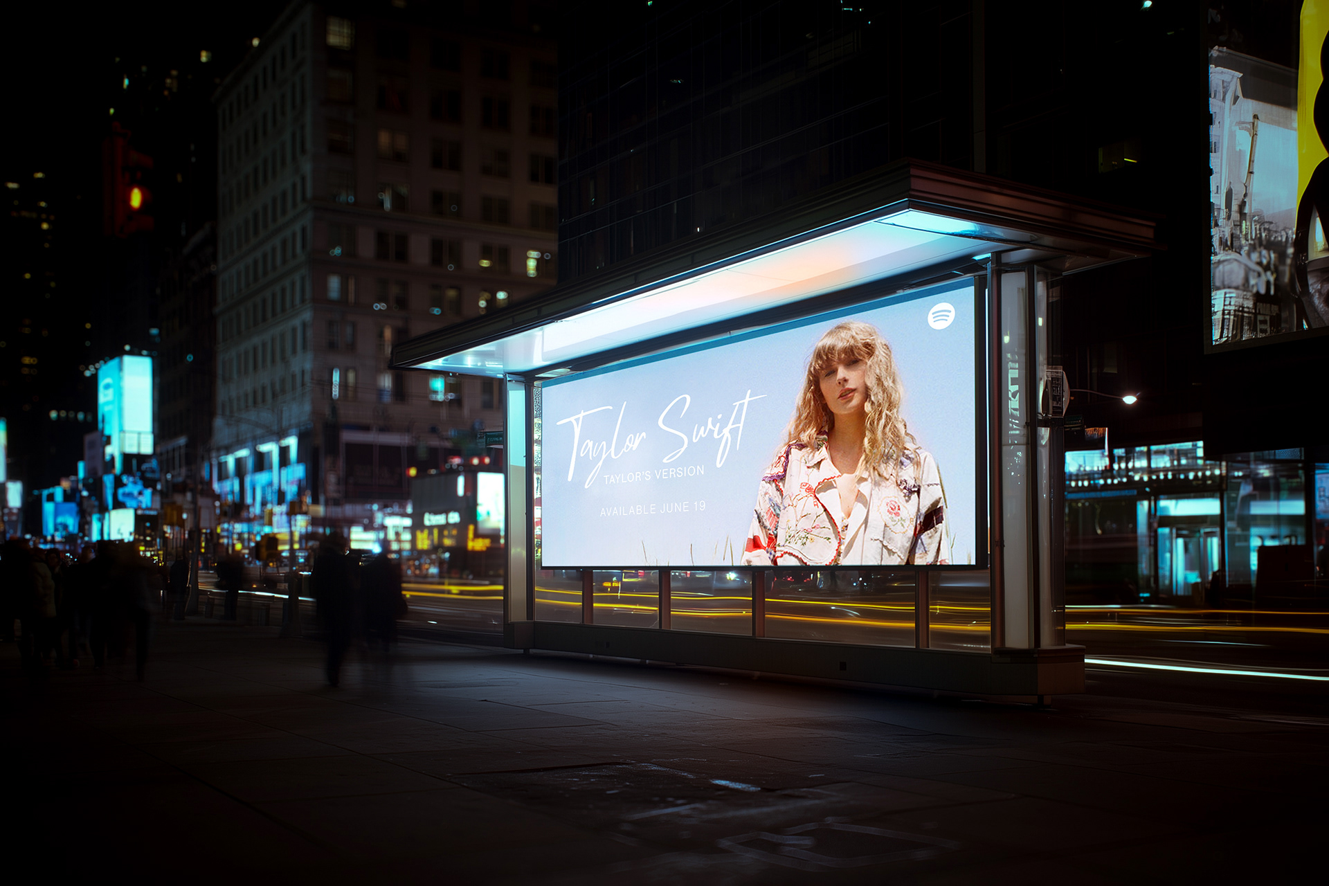
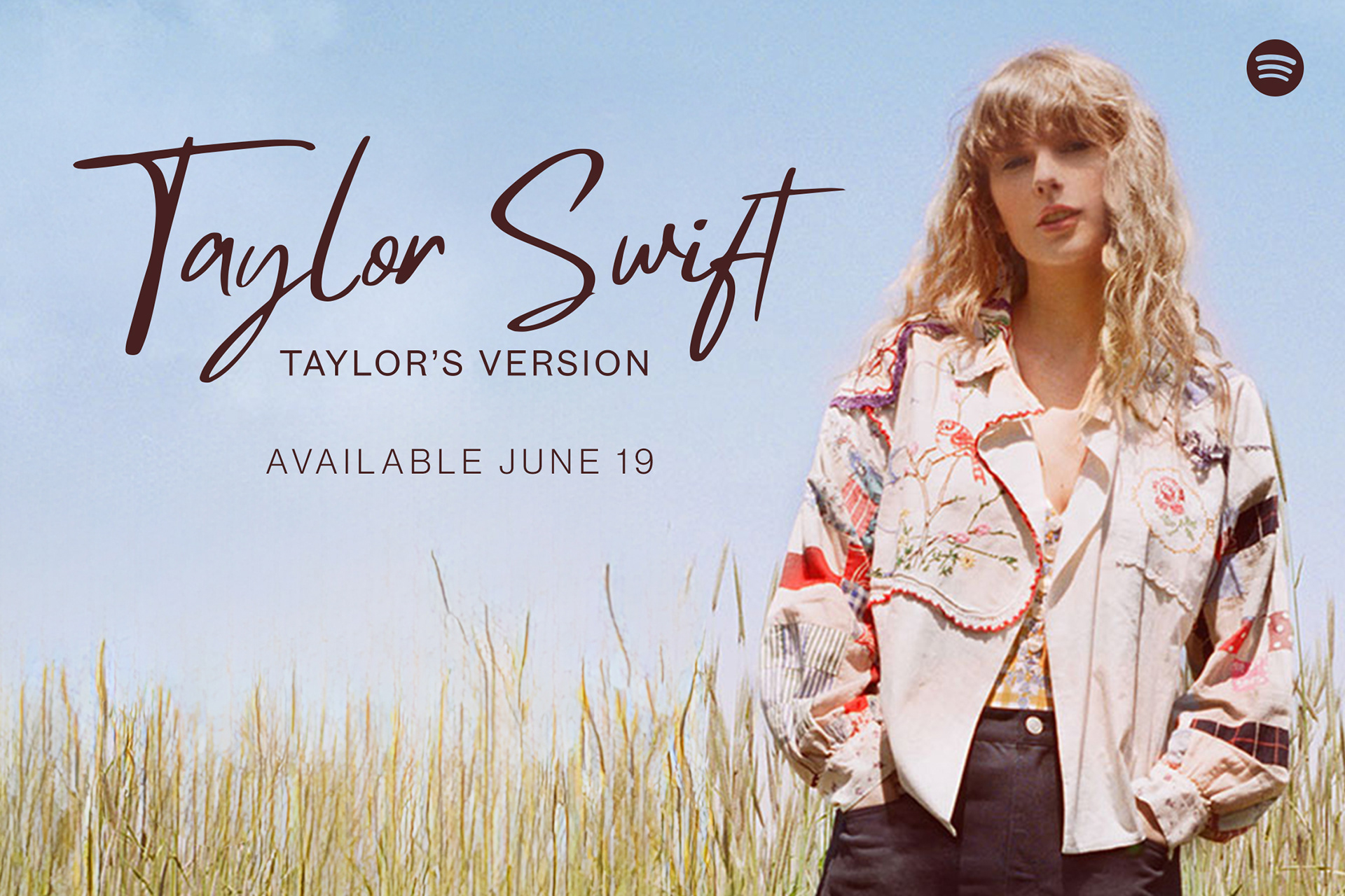
RELEASE DATE
I chose June 19, 2026 as the release date for the album because 2026 marks the 20th anniversary of Taylor Swift’s career, with June 19, 2006 being the anniversary of her debut single, “Tim McGraw.” This date also coincides with the theatrical release of Toy Story 5.

This project is not affiliated with Taylor Swift, Taylor Nation, Republic Records, Spotify, or Apple Music.