
BRAND NAME
MERAKI
[may-rah-kee] - Greek
(v.) To do something with soul, creativity, or love; to put something of yourself into your work.
The name “Meraki” was chosen because it means to do something with soul, creativity, and love, just as the chocolate is meticulously crafted to produce a high-quality, delicious product.
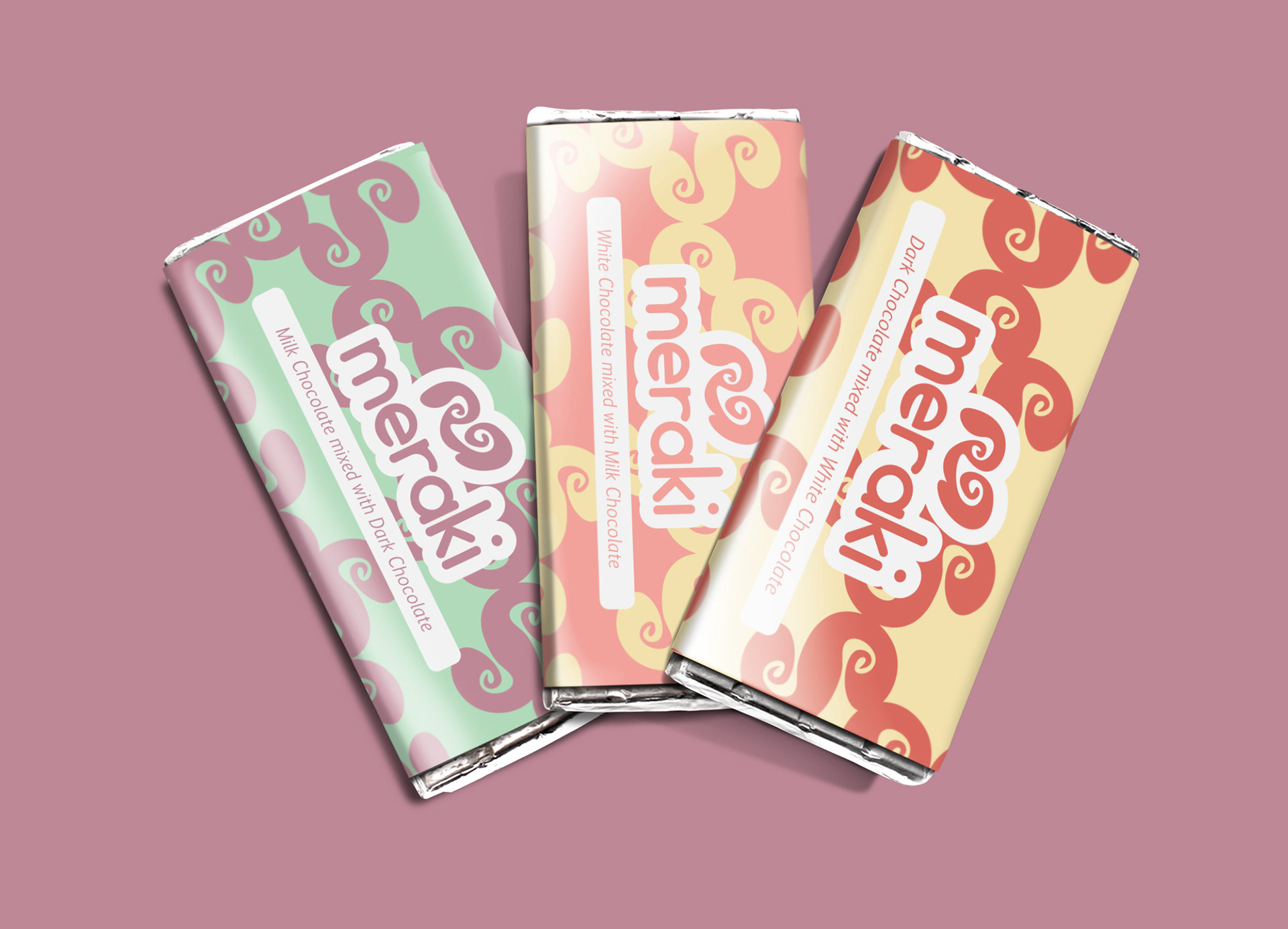
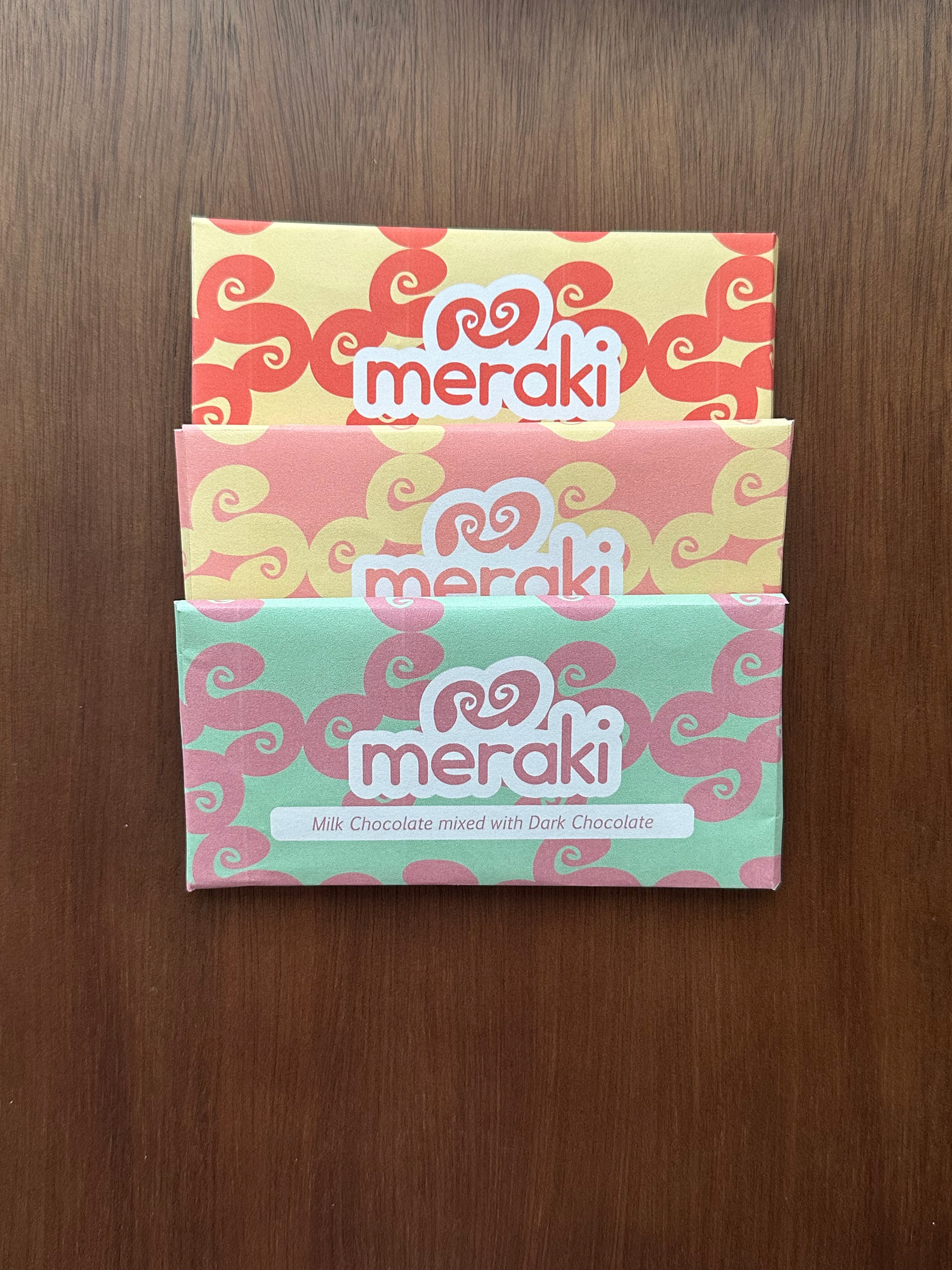
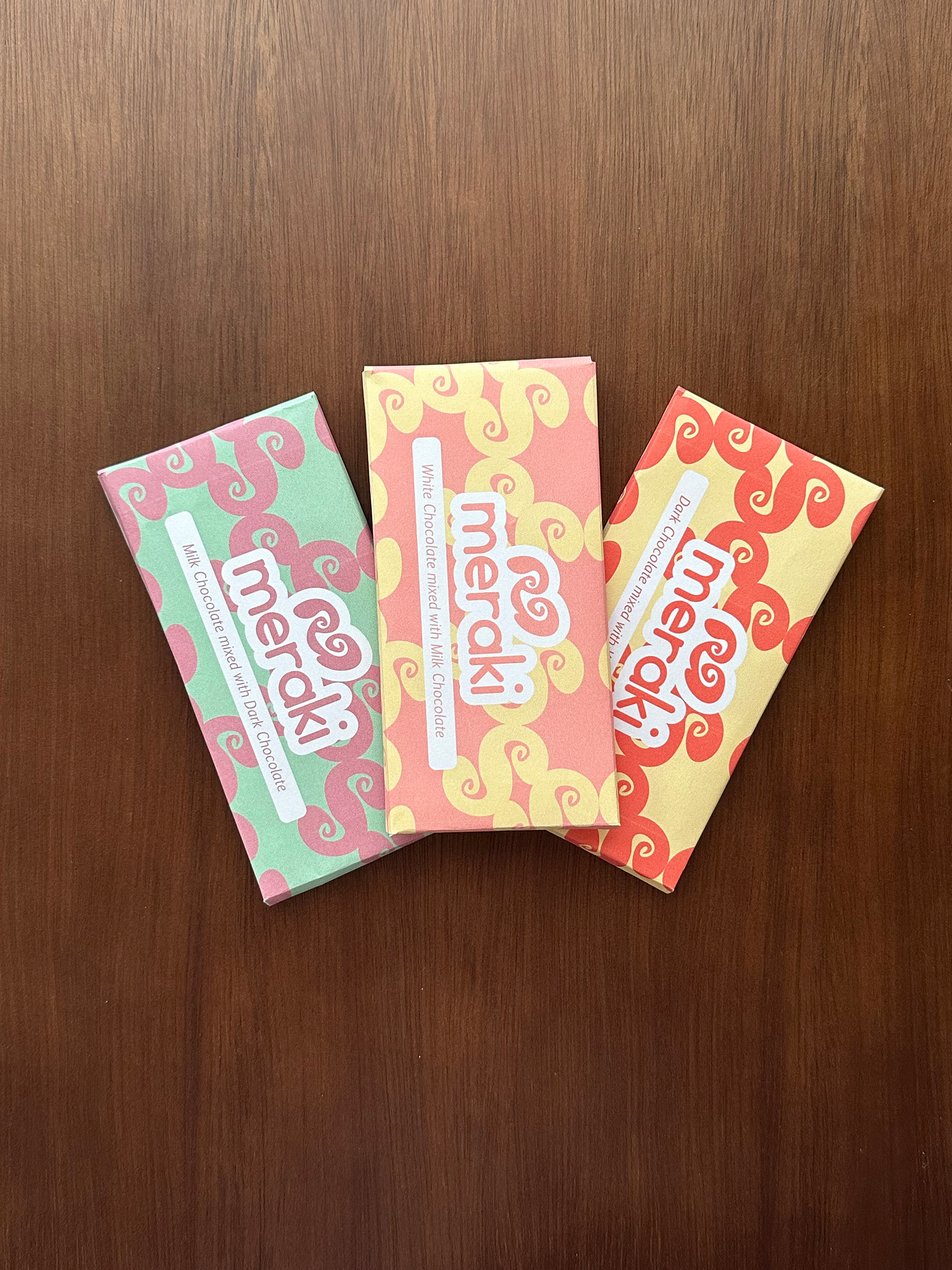
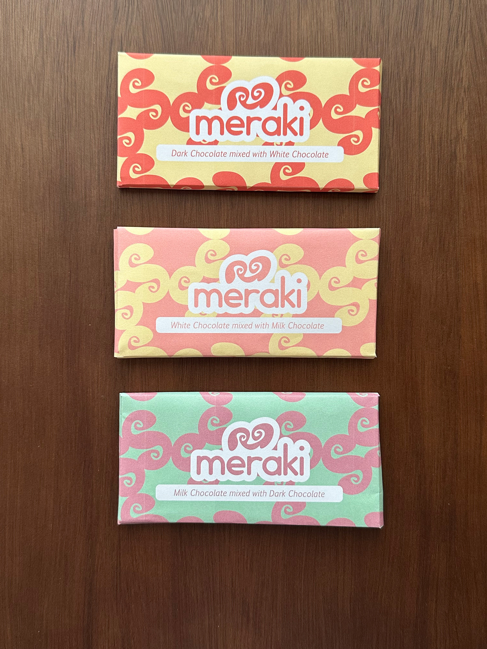
THE PRODUCT
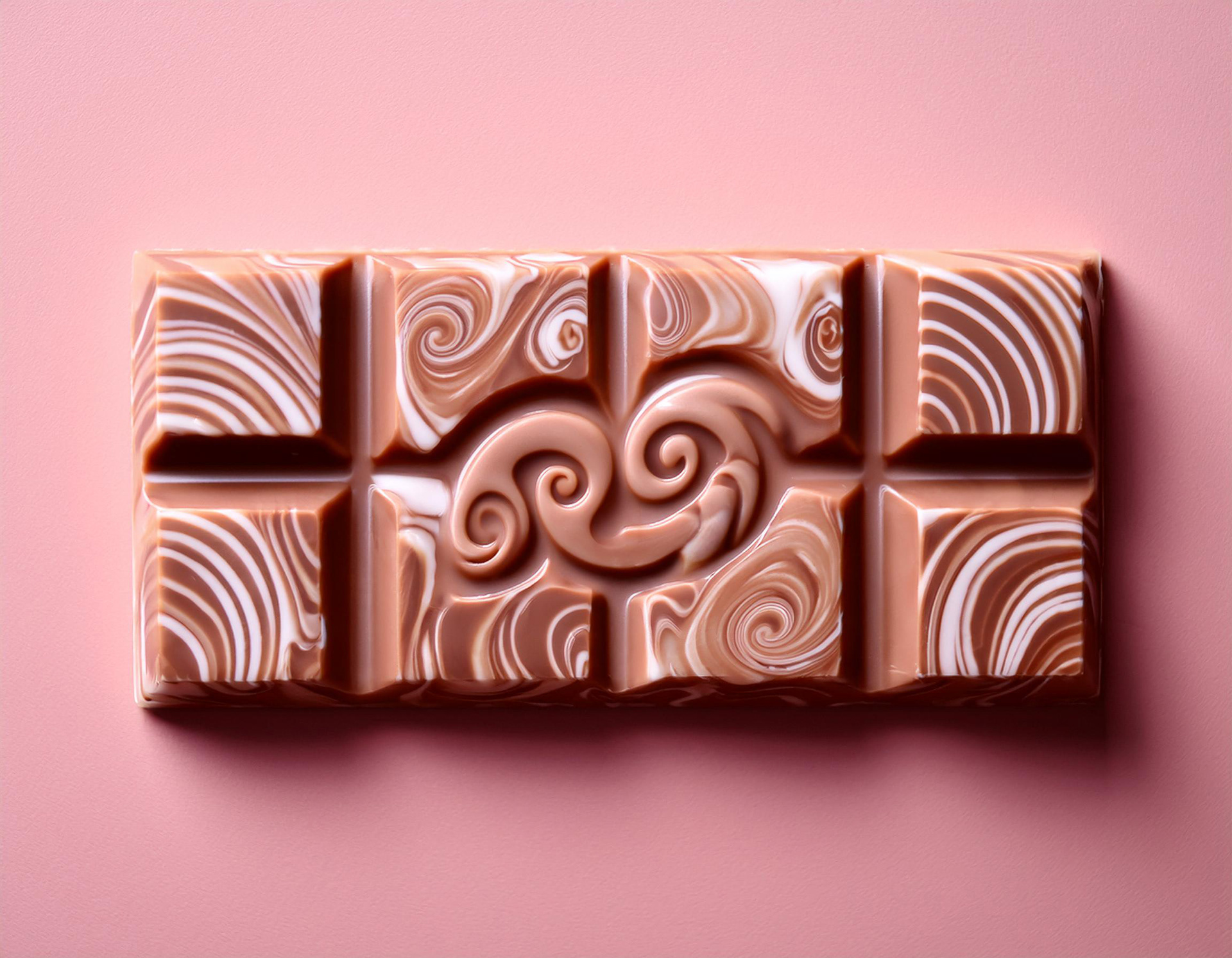
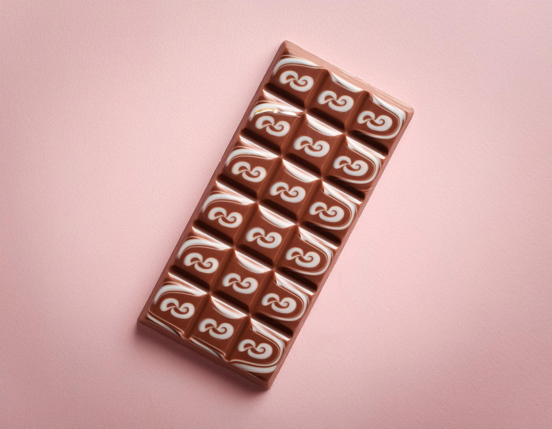
Meraki offers a range of marbled chocolate combinations:
White chocolate mixed with milk chocolate
Dark chocolate mixed with white chocolate
Milk chocolate mixed with dark chocolate
MARKET ANALYSIS
One of the influencing trends for the Marble Chocolate Market is that marble chocolate is gaining popularity among children and young adults across the globe.
THE MESSAGE
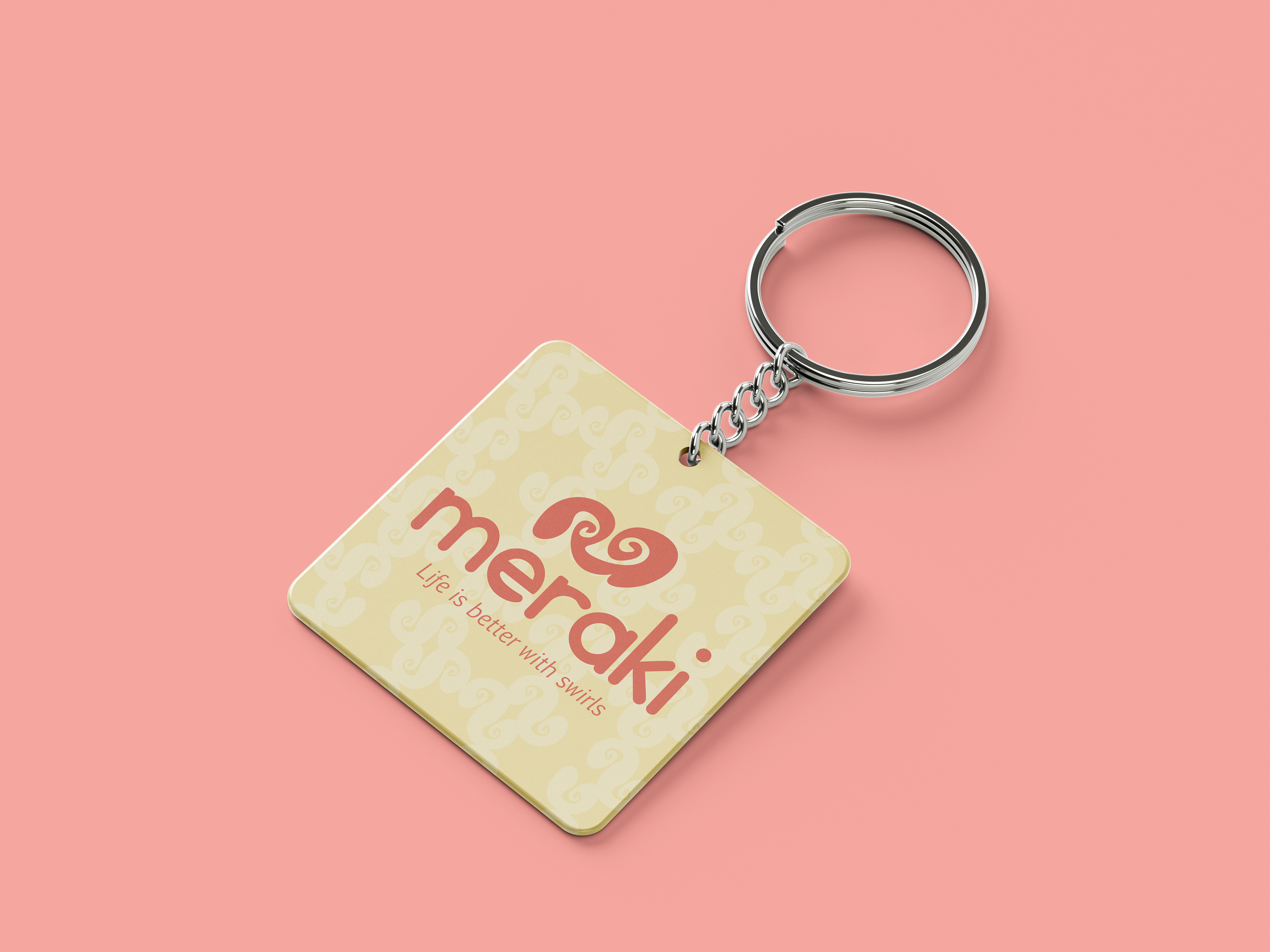
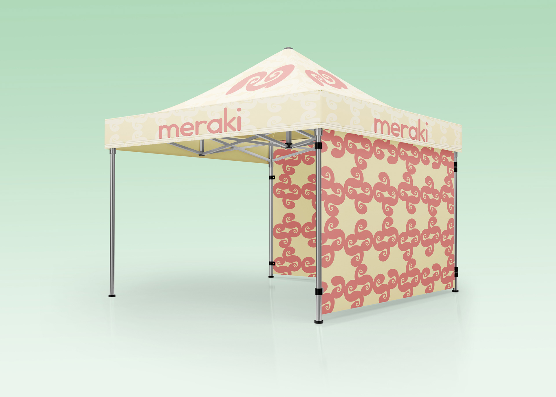
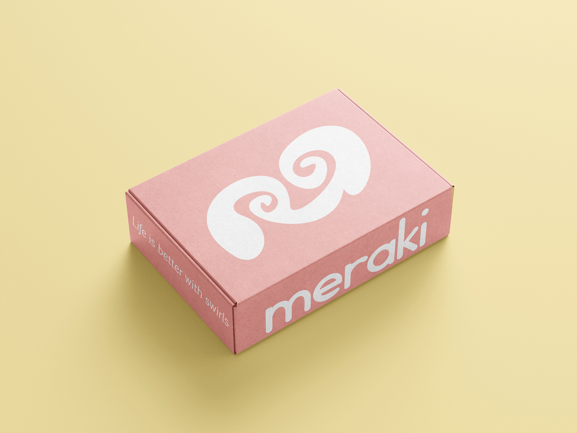
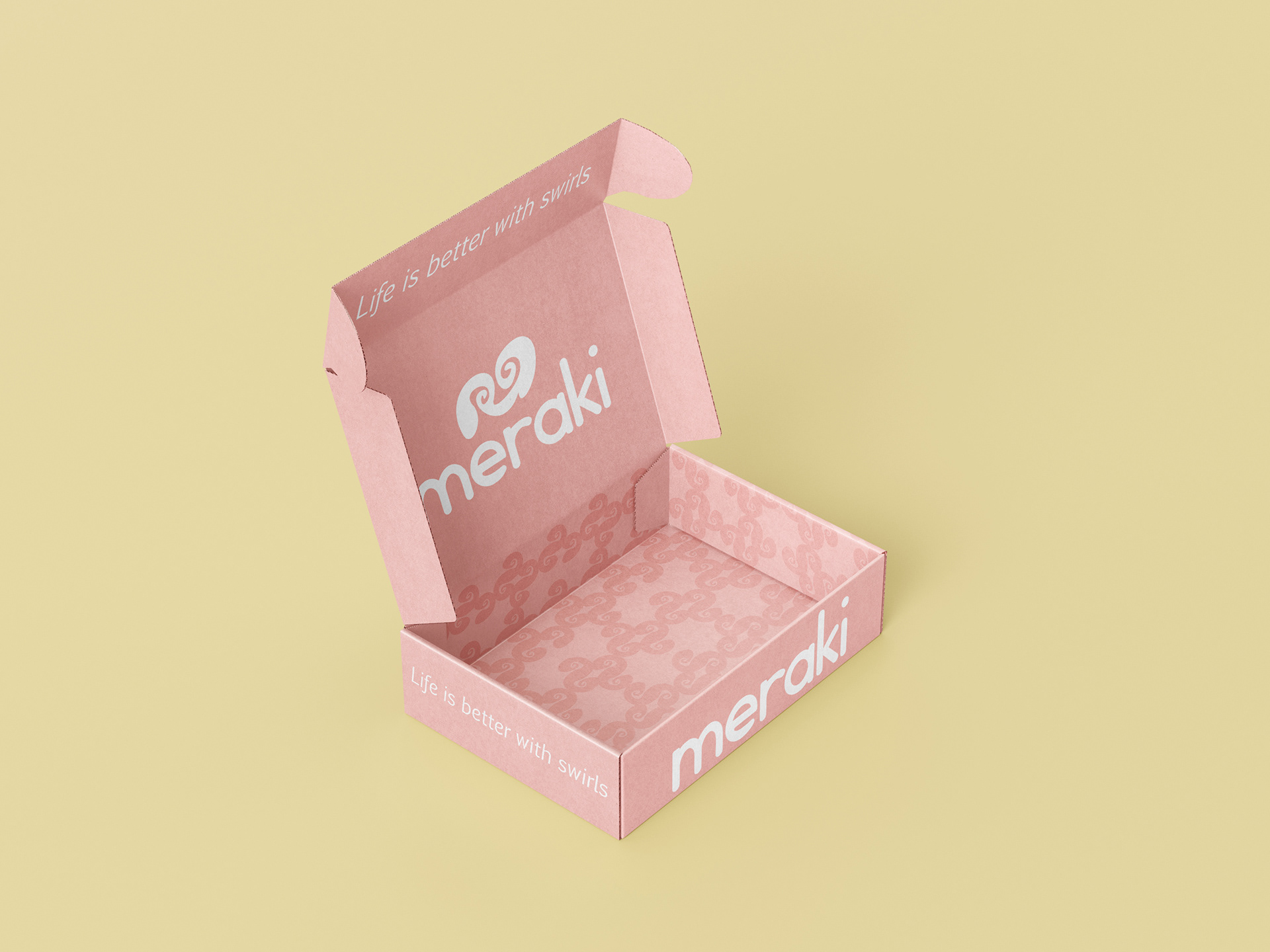
Meraki Chocolate is more than a brand of chocolate—it’s a commitment to the art of chocolate-making, the essence of flavor, and the power of passion. After all, life is better with swirls of chocolate.
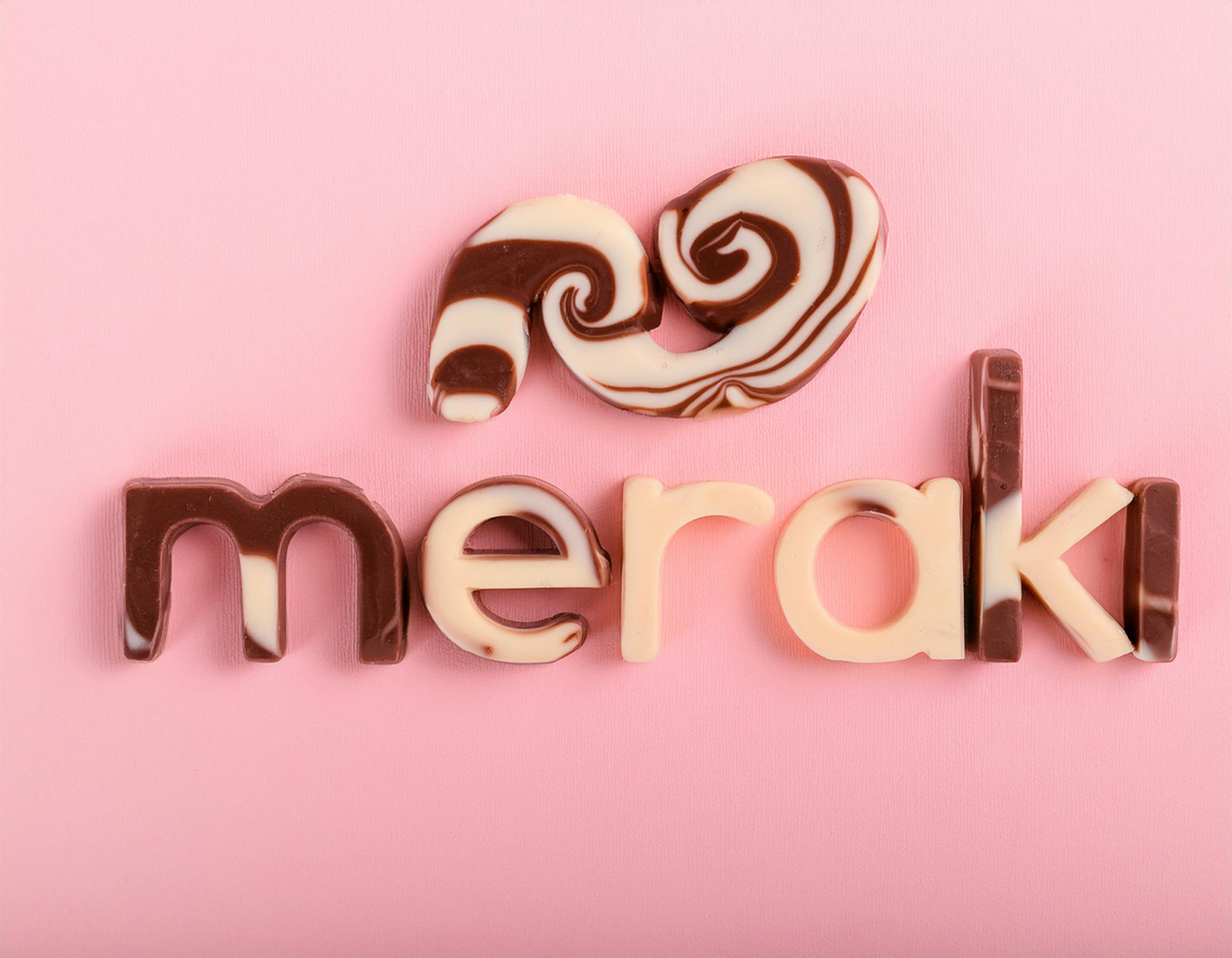
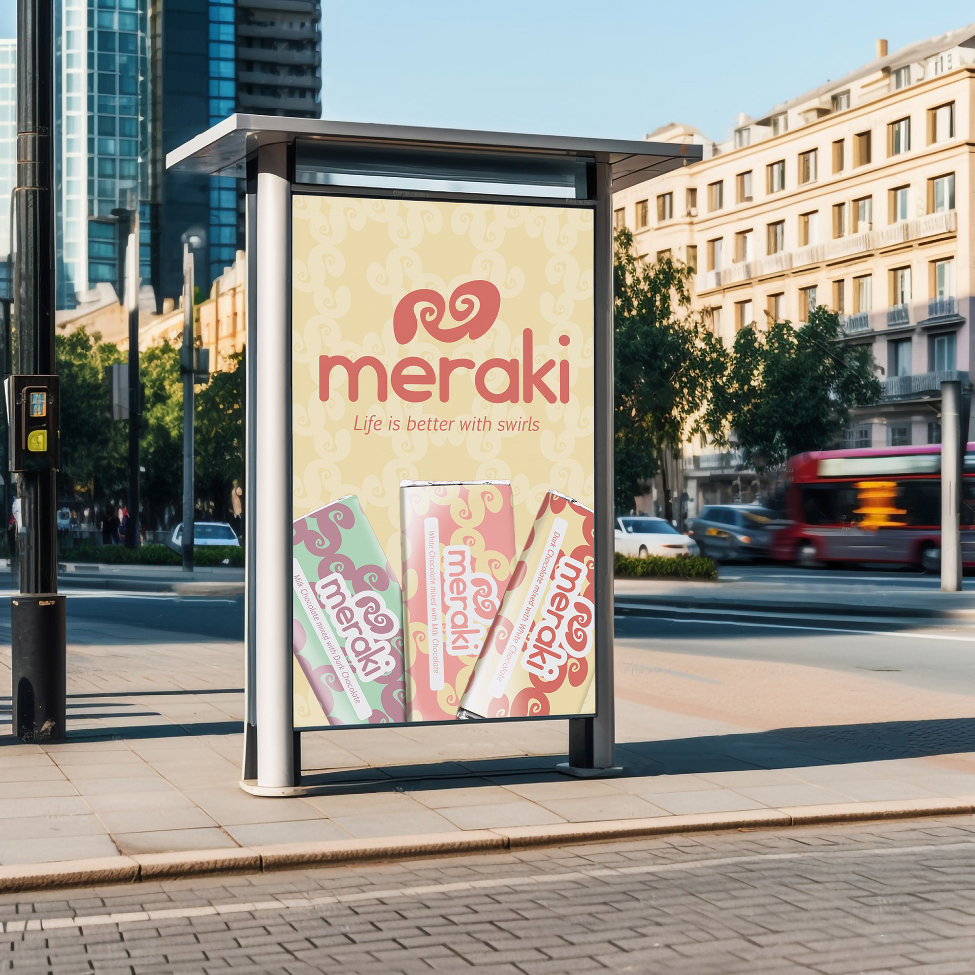
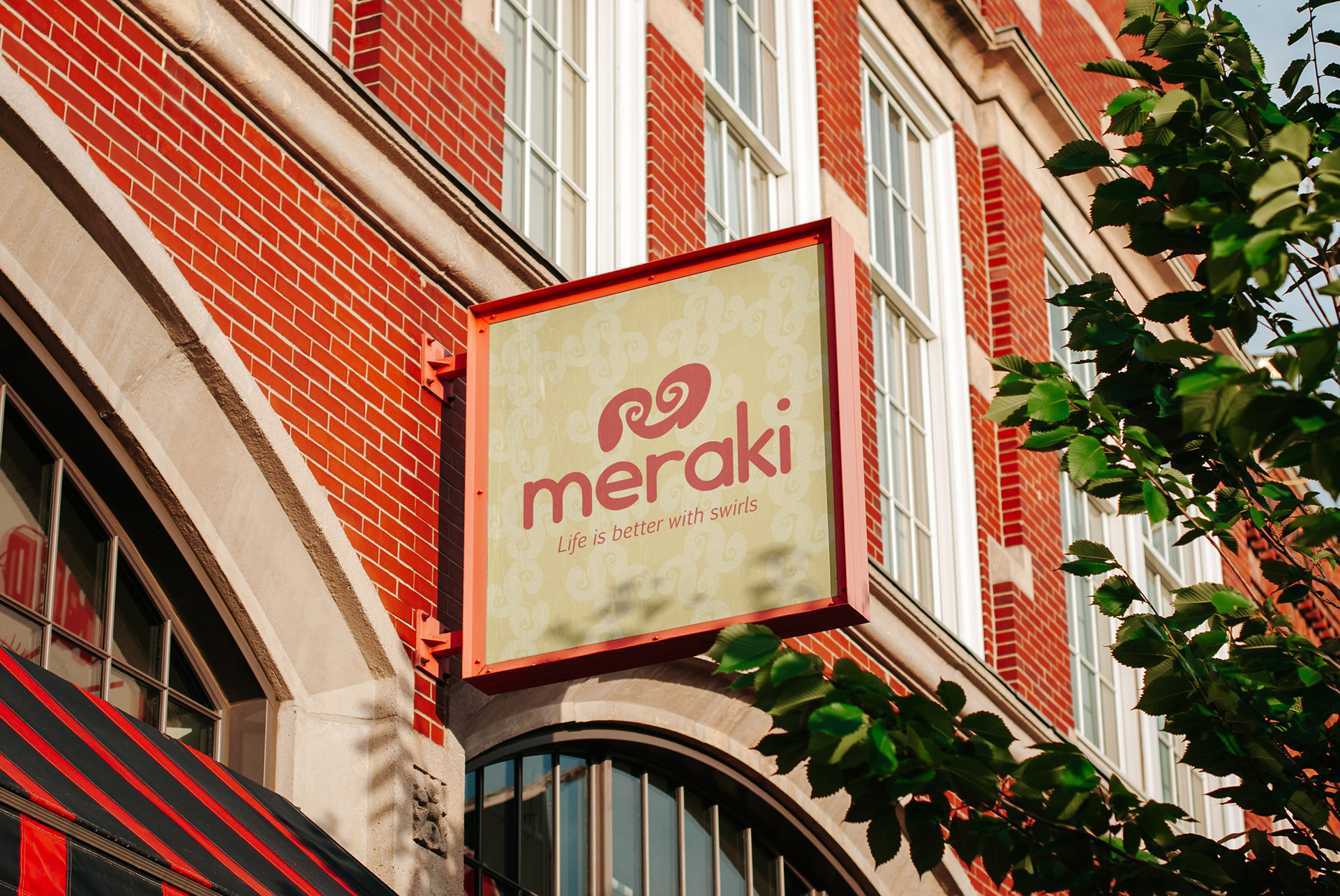
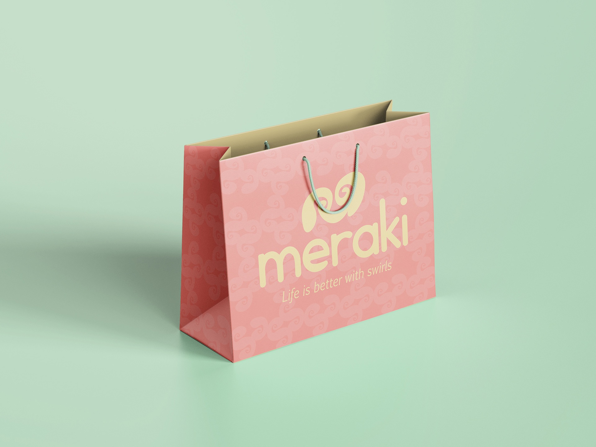
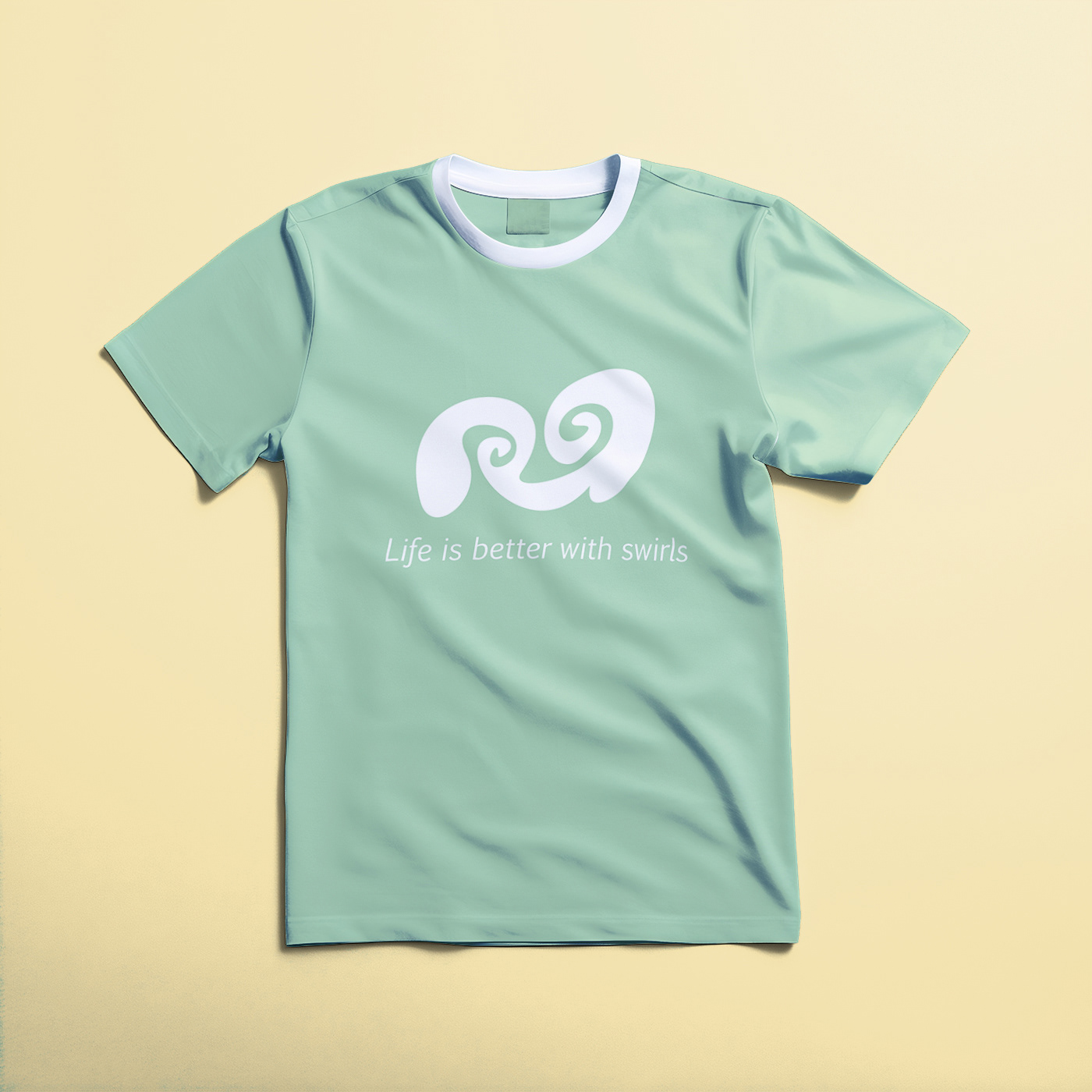
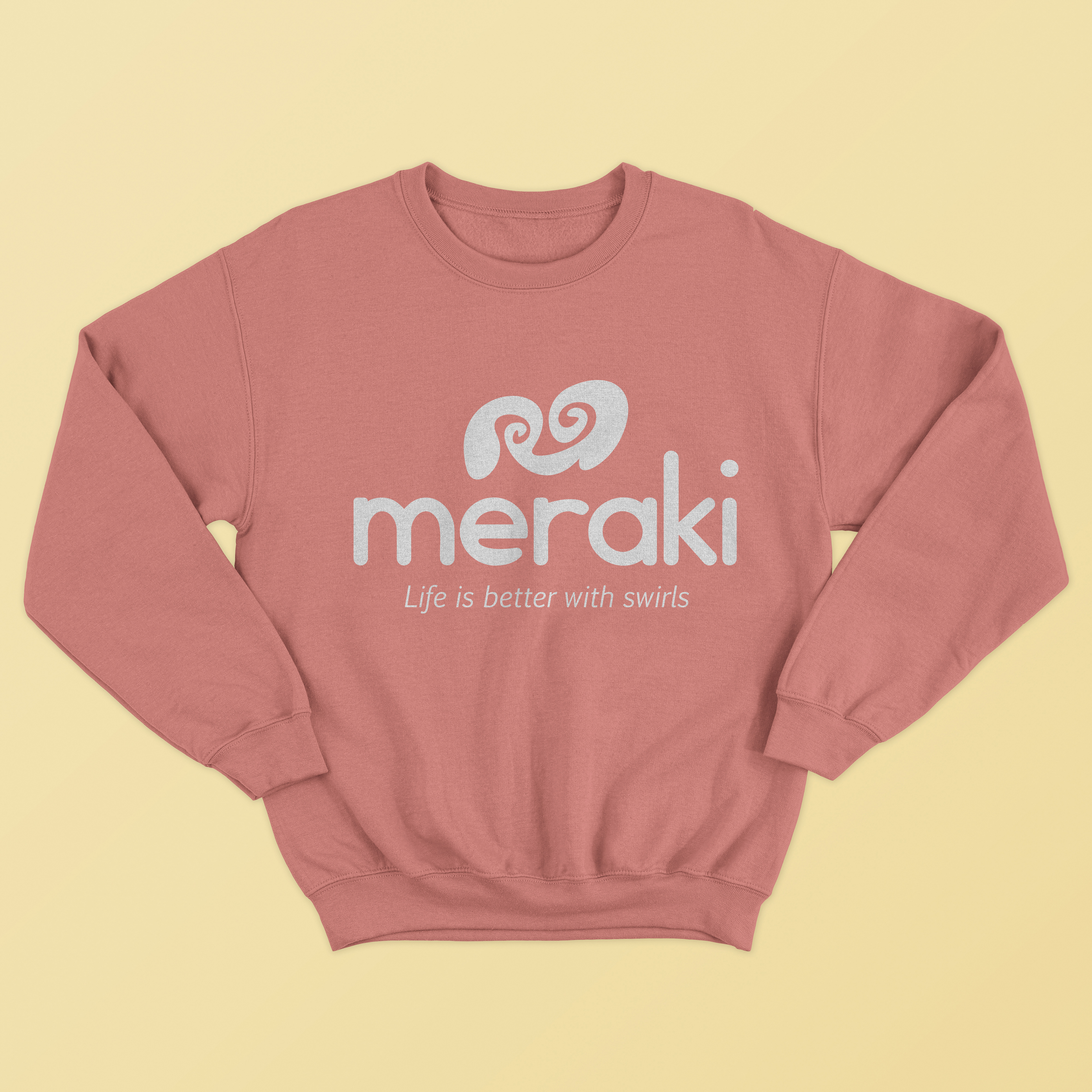
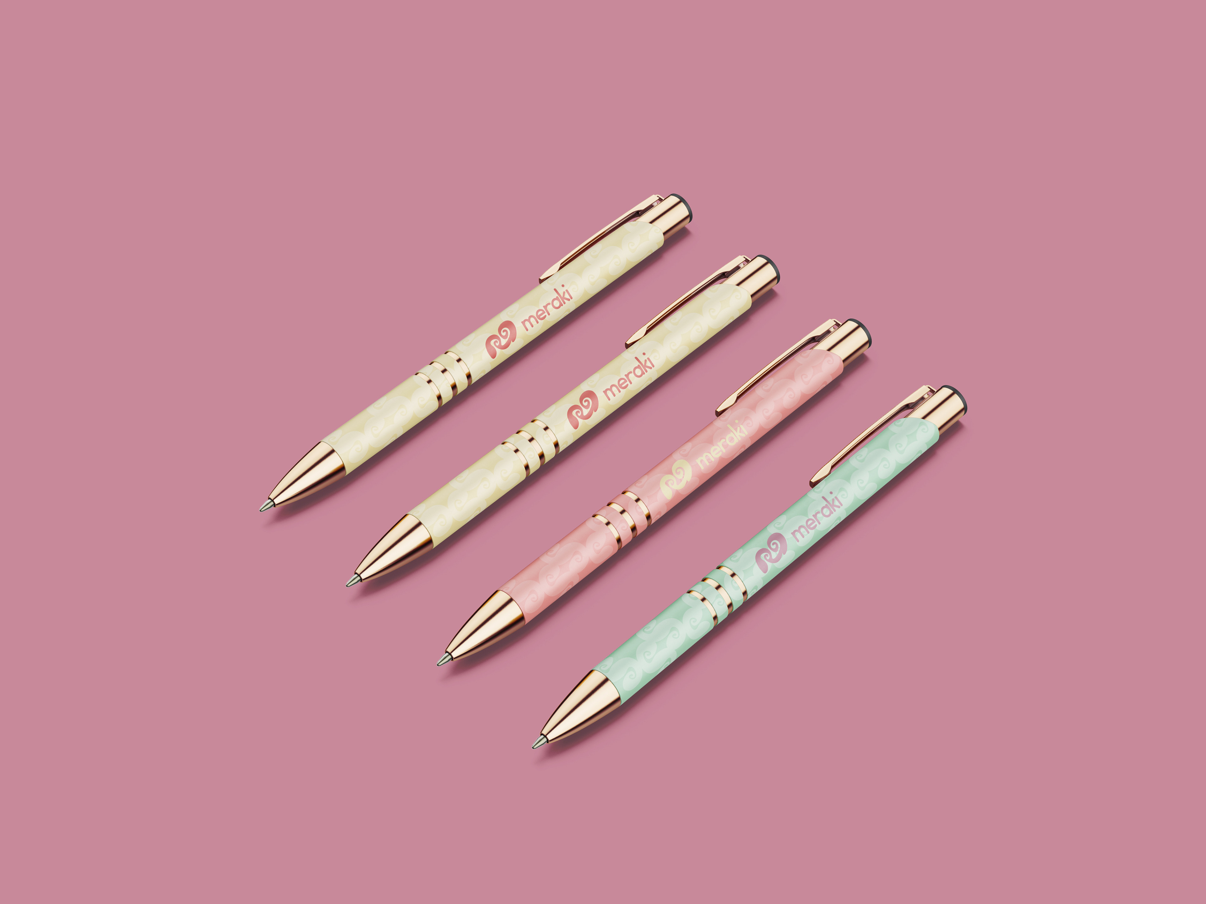
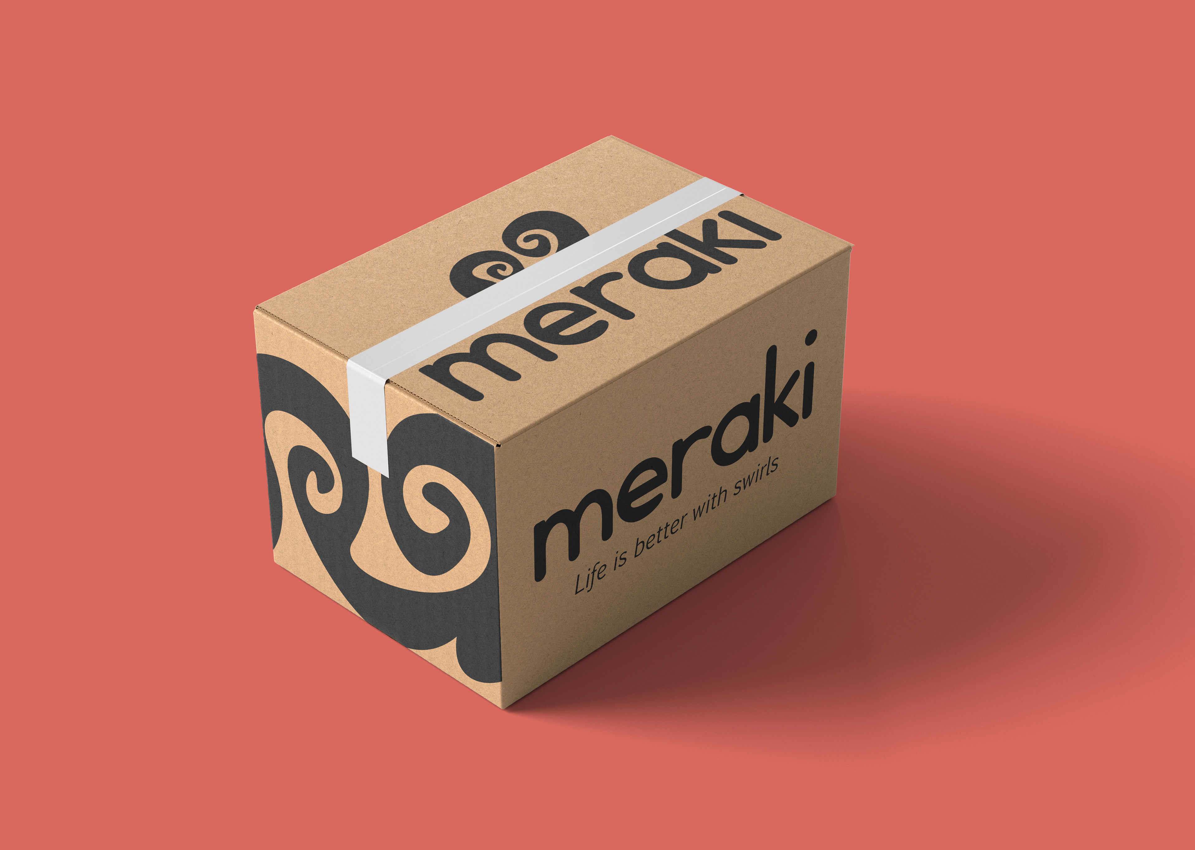
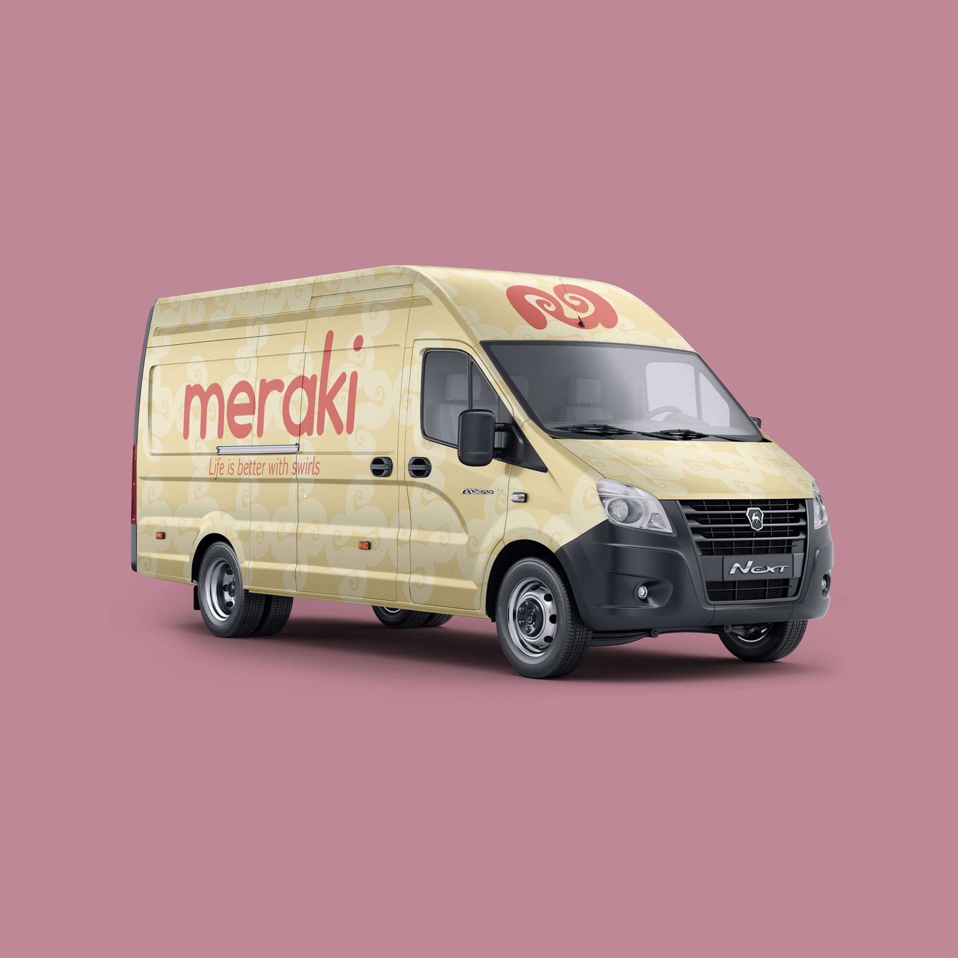
LOGO
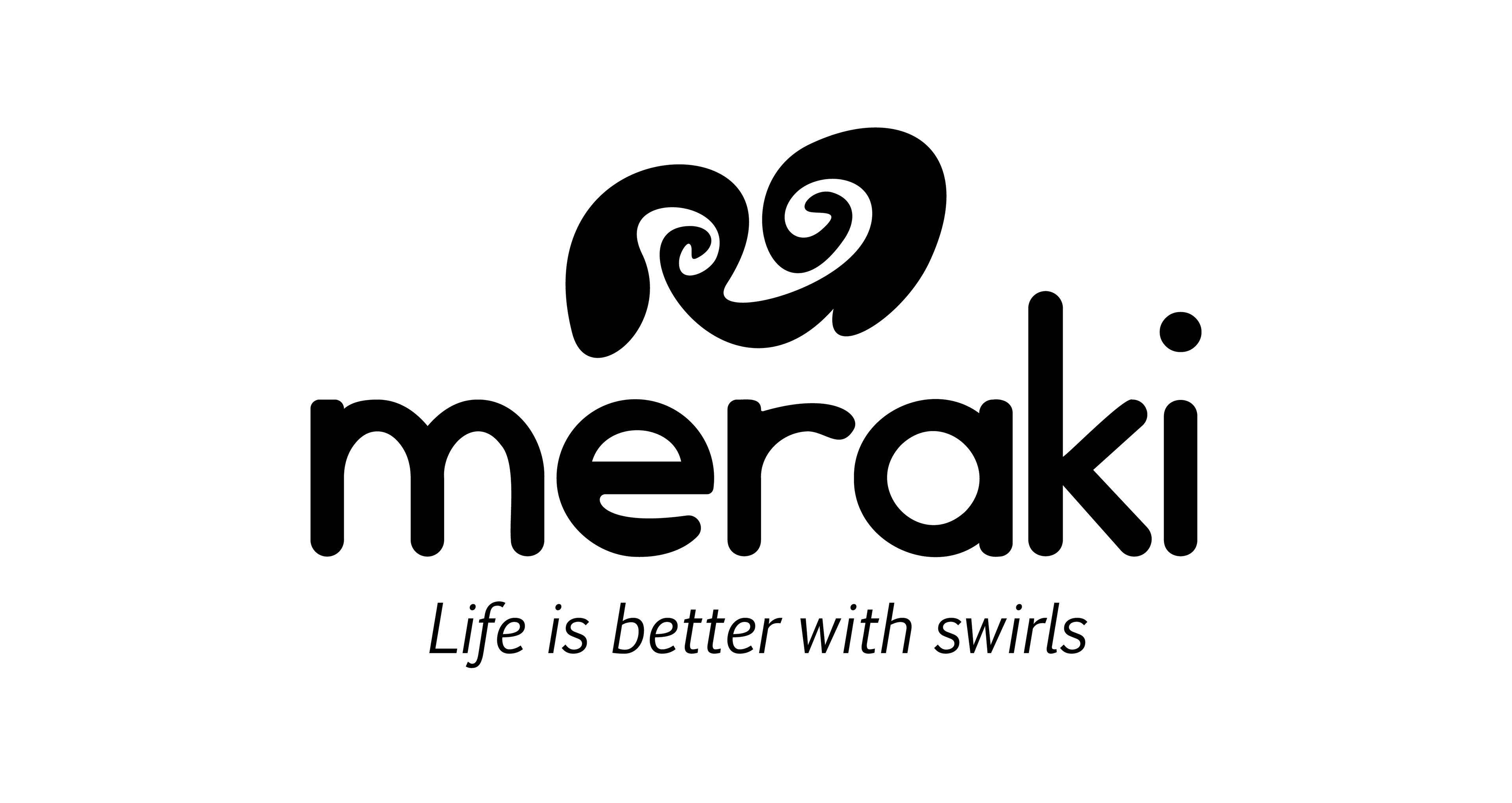
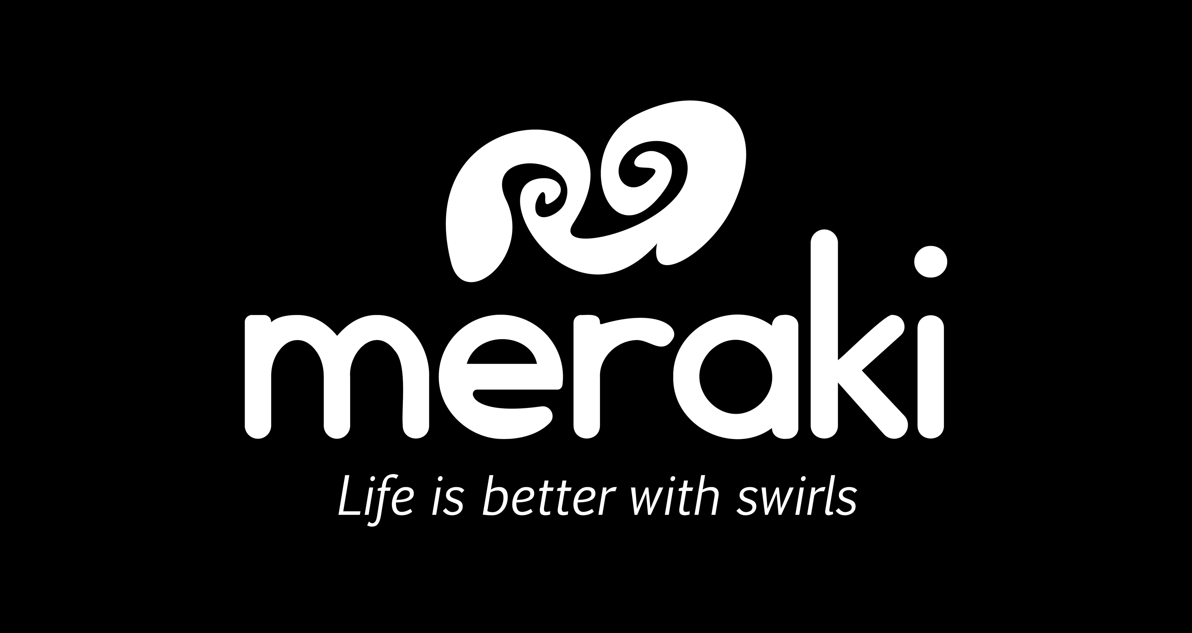
TYPOGRAPHY
I manipulated and adjusted an existing typeface (Geddes) to create custom typography for Meraki." It is all lowercase to convey friendliness. The icon is an "M" with swirls, symbolizing the swirls of marble chocolate and the tagline, "Life is better with swirls." The tagline is in the typeface Euphemia UCAS.
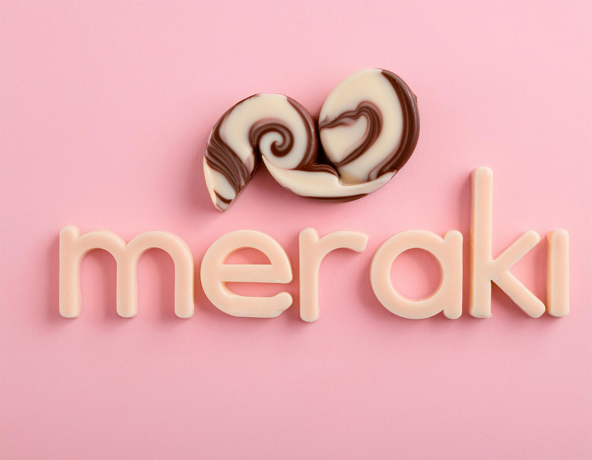
COLOR PALETTE
The bright, fun colors appeal to the target audience of children, young adults, and parents purchasing the product for their families.
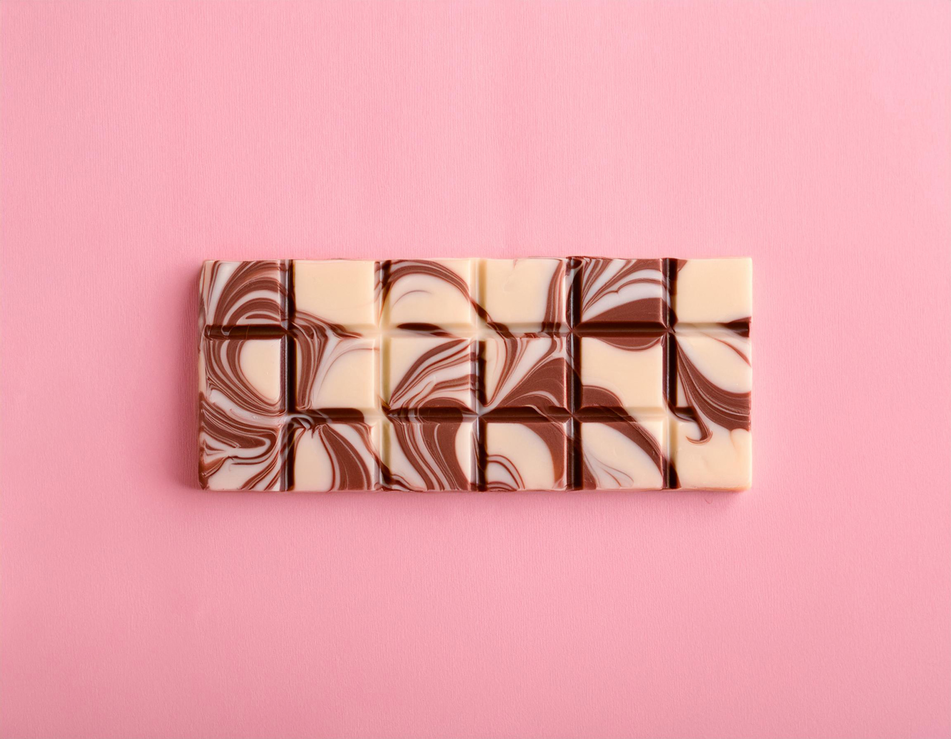
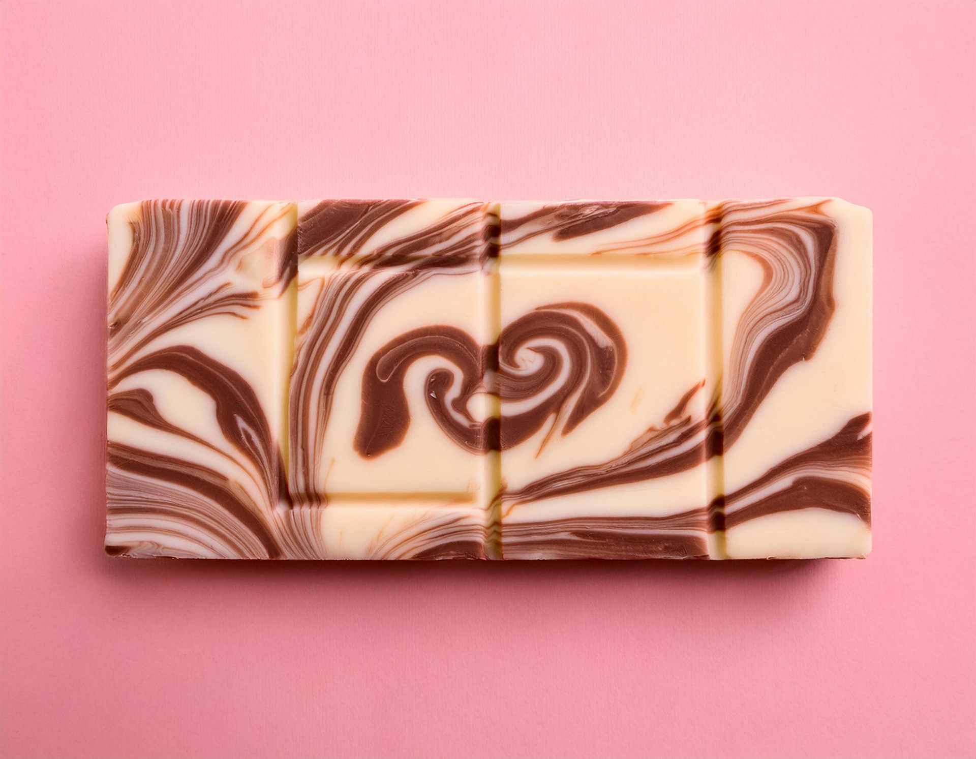
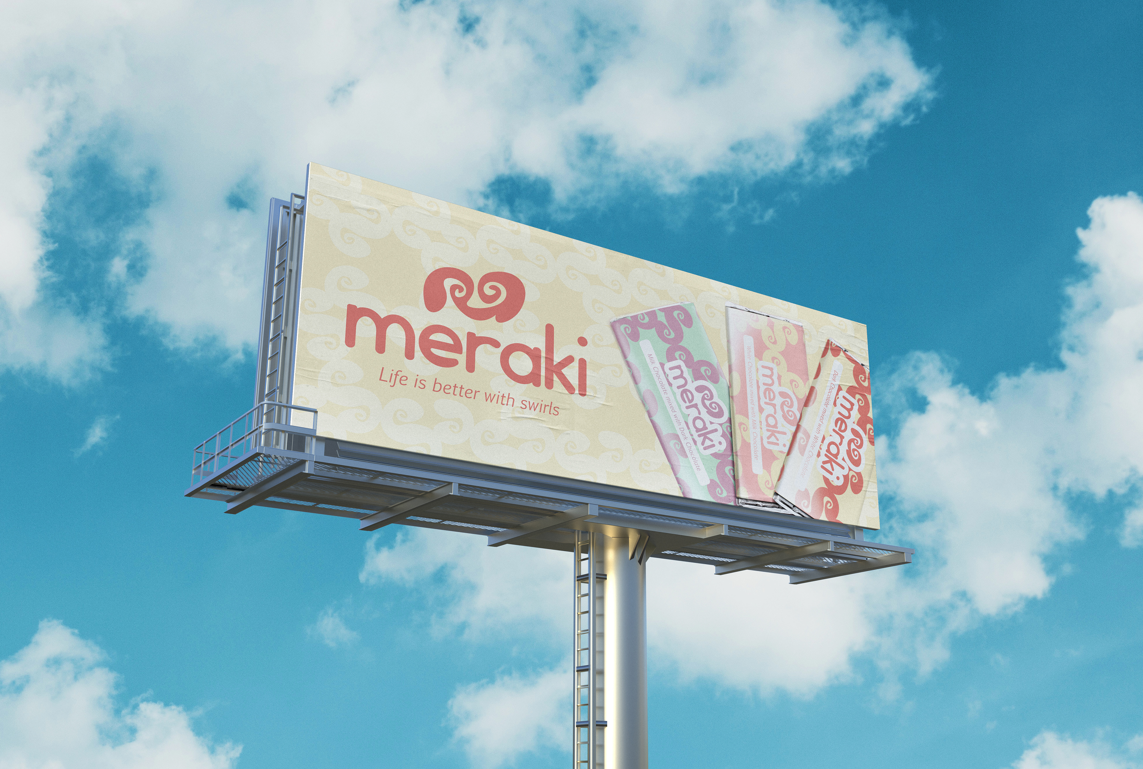
PRODUCT CONCEPTS
Using Adobe Firefly, I generated concept images of what the product would look like. The first two images would be used for advertising. The other images show how the marble chocolate bars would appear. The logo would be in the center of the bar, either swirled into the design or embossed. Additionally, the logo could be on each square of the bar.
Meraki is a fictitious brand.