

Toronto has deep historical roots, originally inhabited by the Seneca tribe and later settled by French traders in the 18th century. Known as one of the world’s multicultural cities, Toronto boasts over 80 ethnic groups and more than 100 languages. It is celebrated for its natural beauty, with over 1,600 parks, expansive green spaces, and its location on the edge of the Carolinian Forest zone. Public art is abundant throughout the city, featuring statues, murals, and sculptures that reflect its vibrant cultural diversity and rich history.
LOCATION
Southern Ontario, on the northwestern shore of Lake Ontario.
Covers an area of 630 square kilometers within the city and 5,903 square kilometers in the Toronto Region.
DEMOGRAPHICS
Toronto is Canada’s most populous city and a major multicultural hub.
ECONOMY
As a leading financial and commercial center, Toronto hosts the Toronto Stock Exchange and major national banks.
The city’s economy has transitioned from manufacturing to a focus on services, including finance, real estate, education, and tourism.

TARGET AUDIENCE
International sports enthusiasts
Athletes
Global viewers
Local Torontonians and Canadians to inspire pride, unity, and support for the city.
Seeking a strong visual identity representing the city’s vibrant, multicultural character and Olympic spirit.

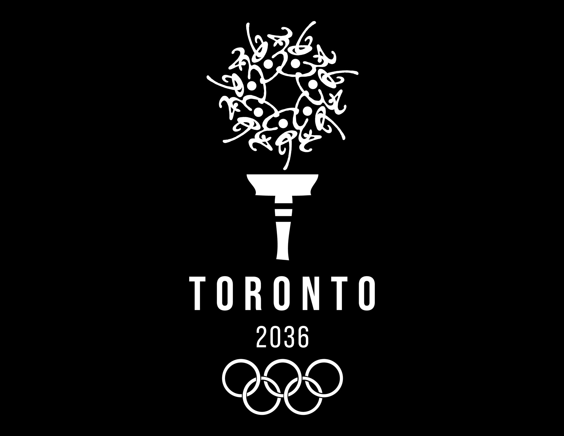
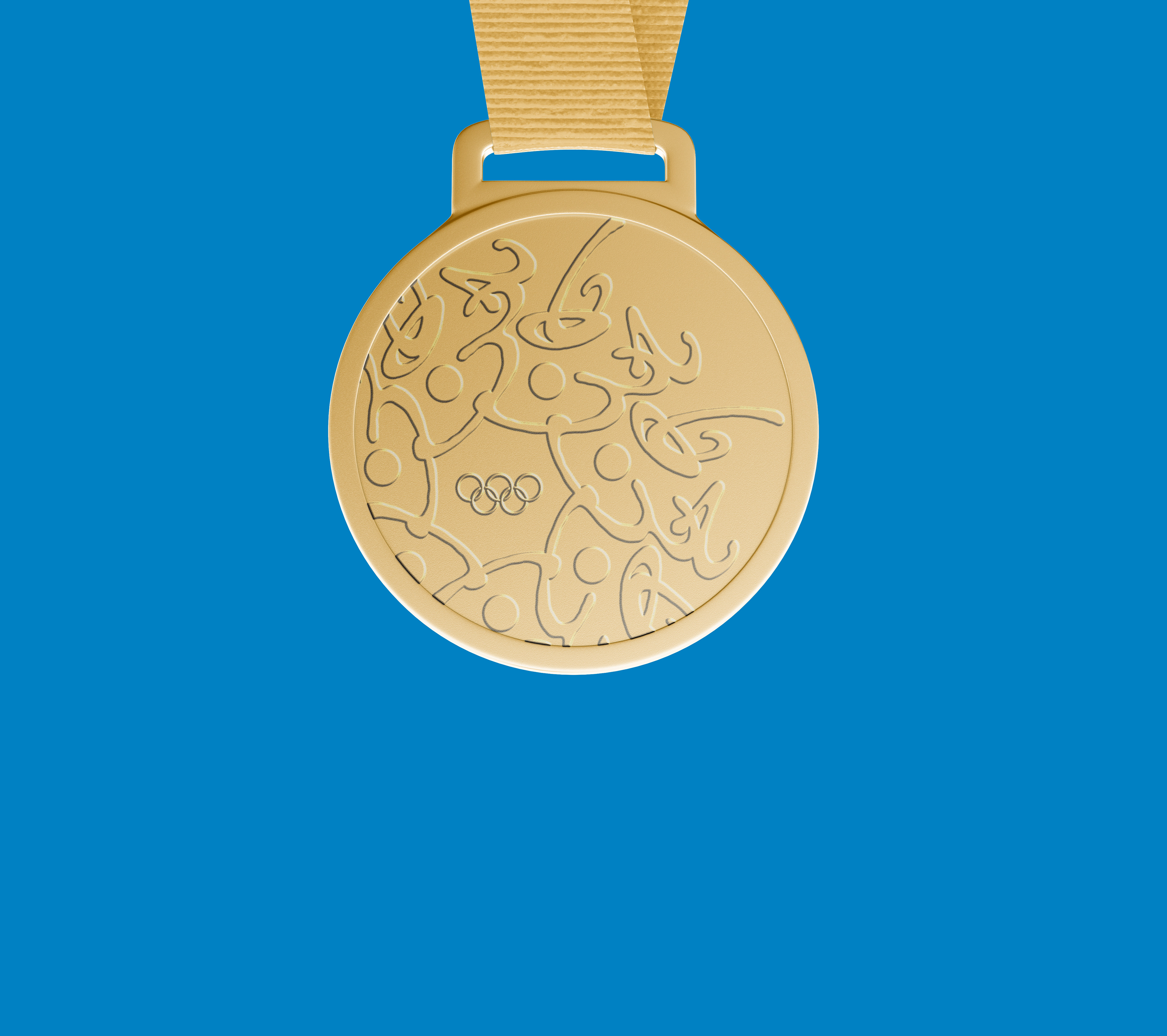
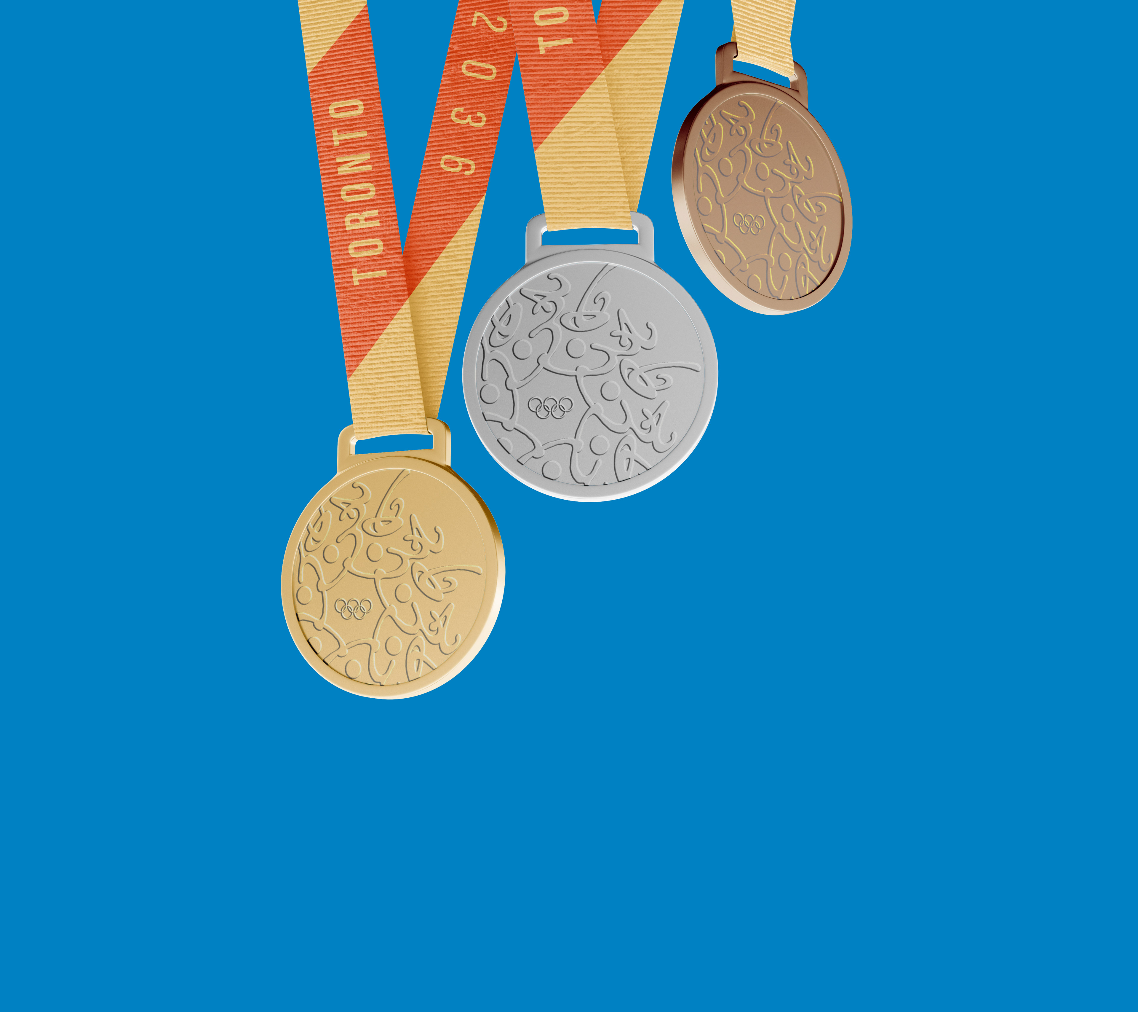
2036 Repeated
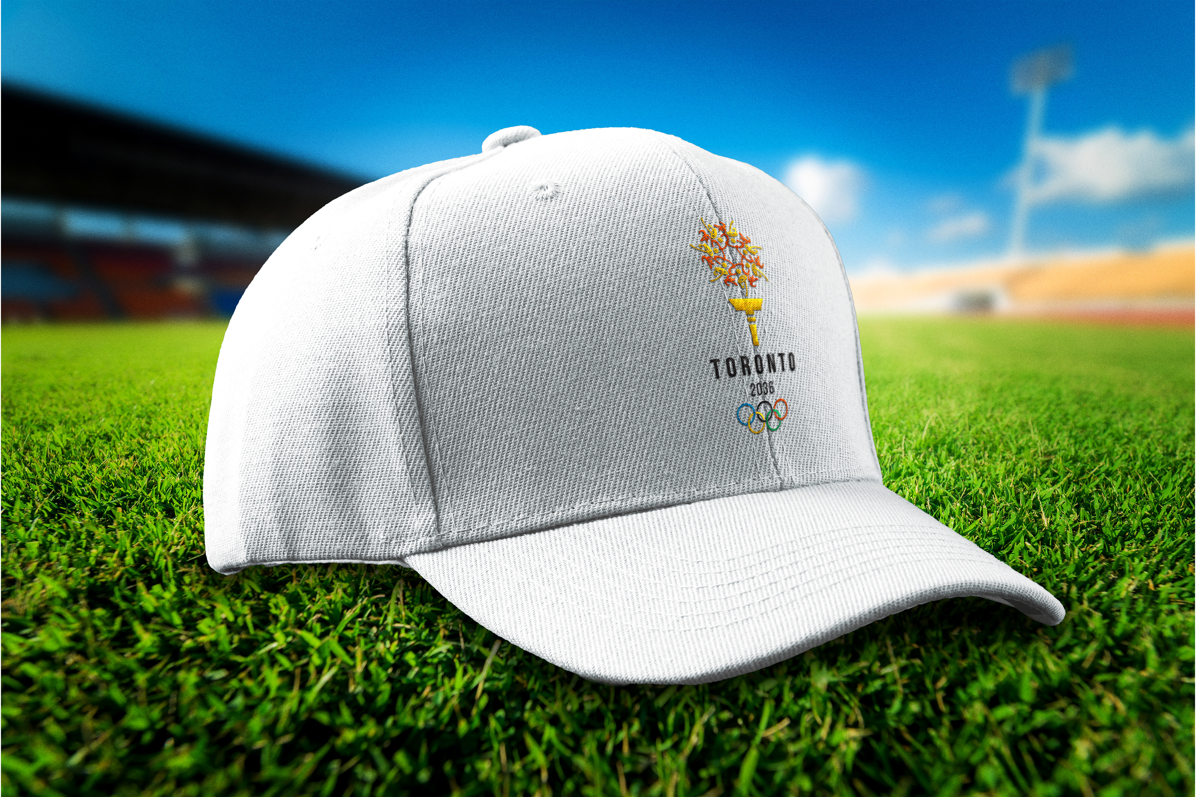
The year 2036 was repeated in a circular arrangement inspired by the Seneca Sunflower and the tribe’s traditional floral beadwork.
Olympic Flame
A torch handle beneath the flower transforms it into a symbolic flame, further connecting the design to the iconic Olympic torch.
Warm Colors
The logo features vibrant, warm colors and a dynamic sense of movement, embodying the energy of the Summer Olympics
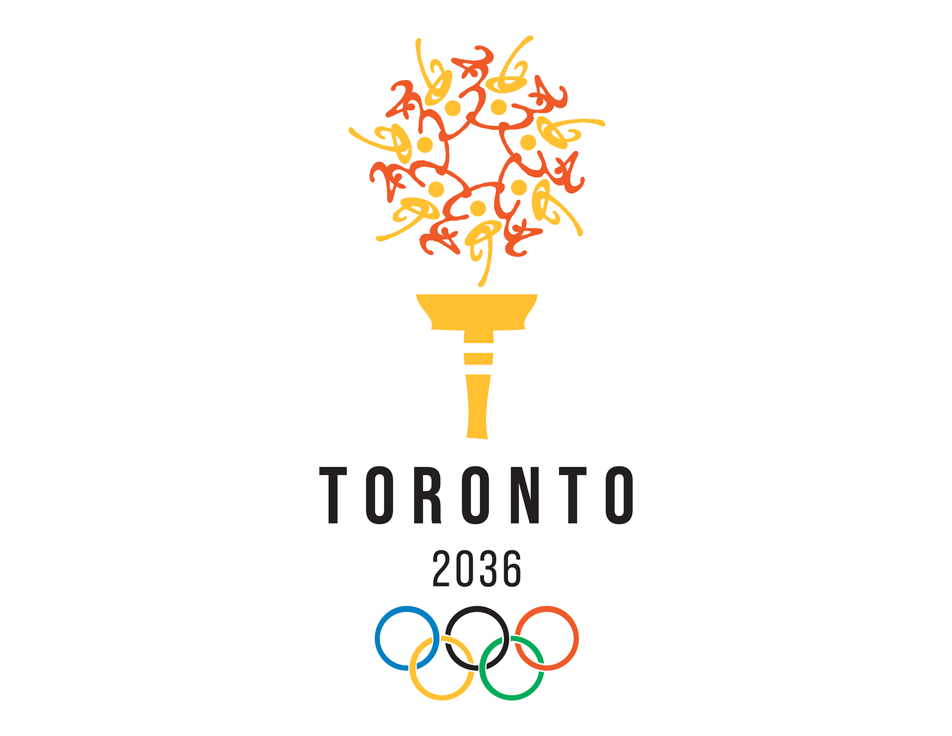
Hidden Athletes
The yellow pieces of the flower subtly resemble athletes in motion, reinforcing the Olympic spirit.
All caps
Using all caps for the typography represents the power and strength of athletes and the bold impact of the Olympic Games.
Typography
The typography features Bebas Neue Pro. This modern, bold, and clean typeface creates a strong contrast with the curved, energetic elements, enhancing readability, especially at smaller scales.

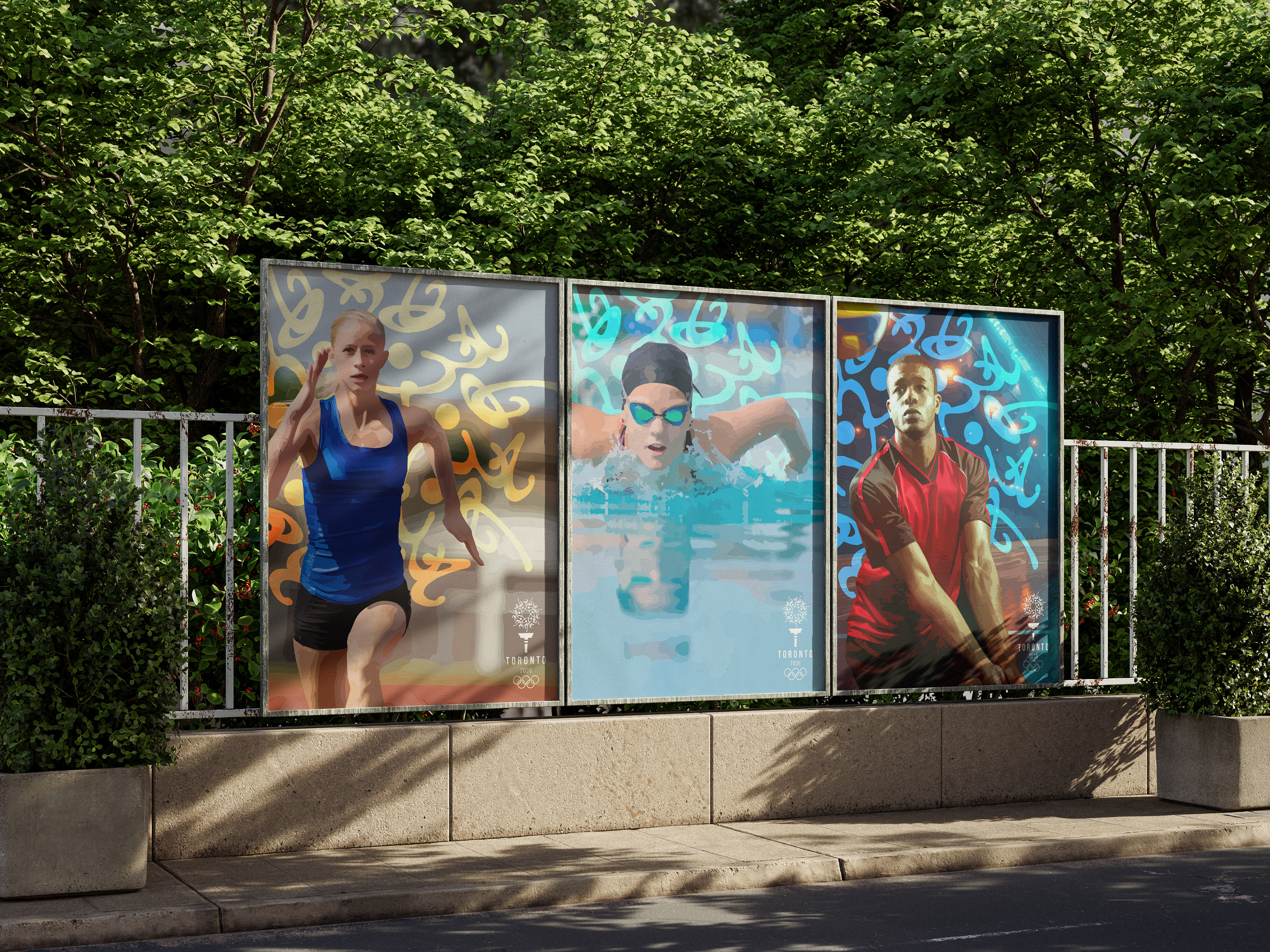
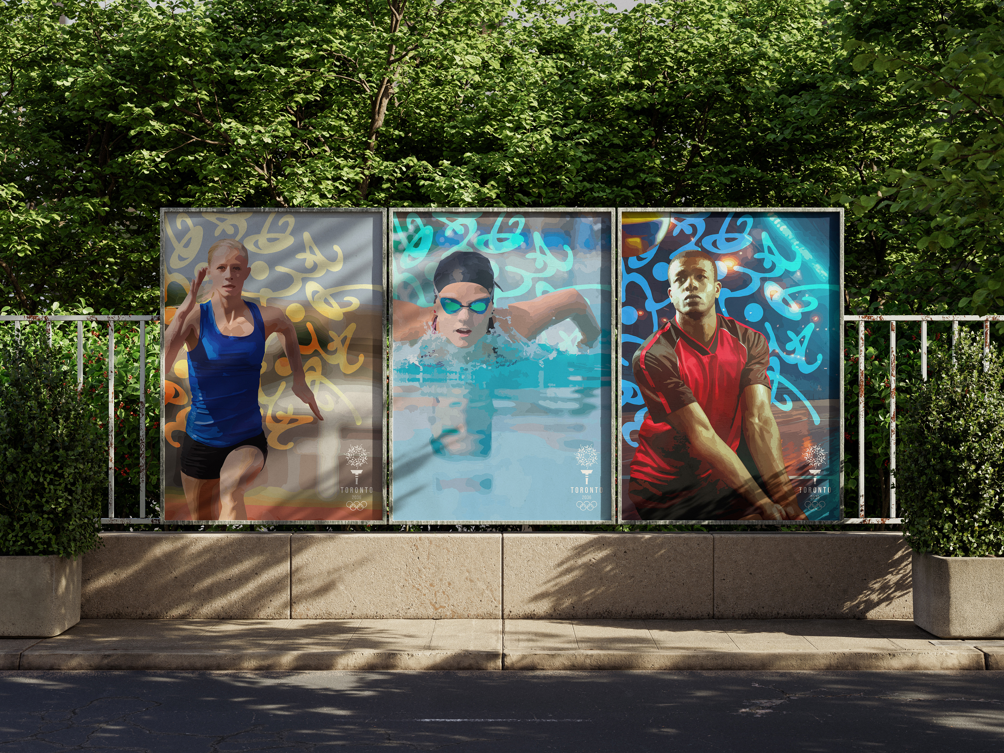
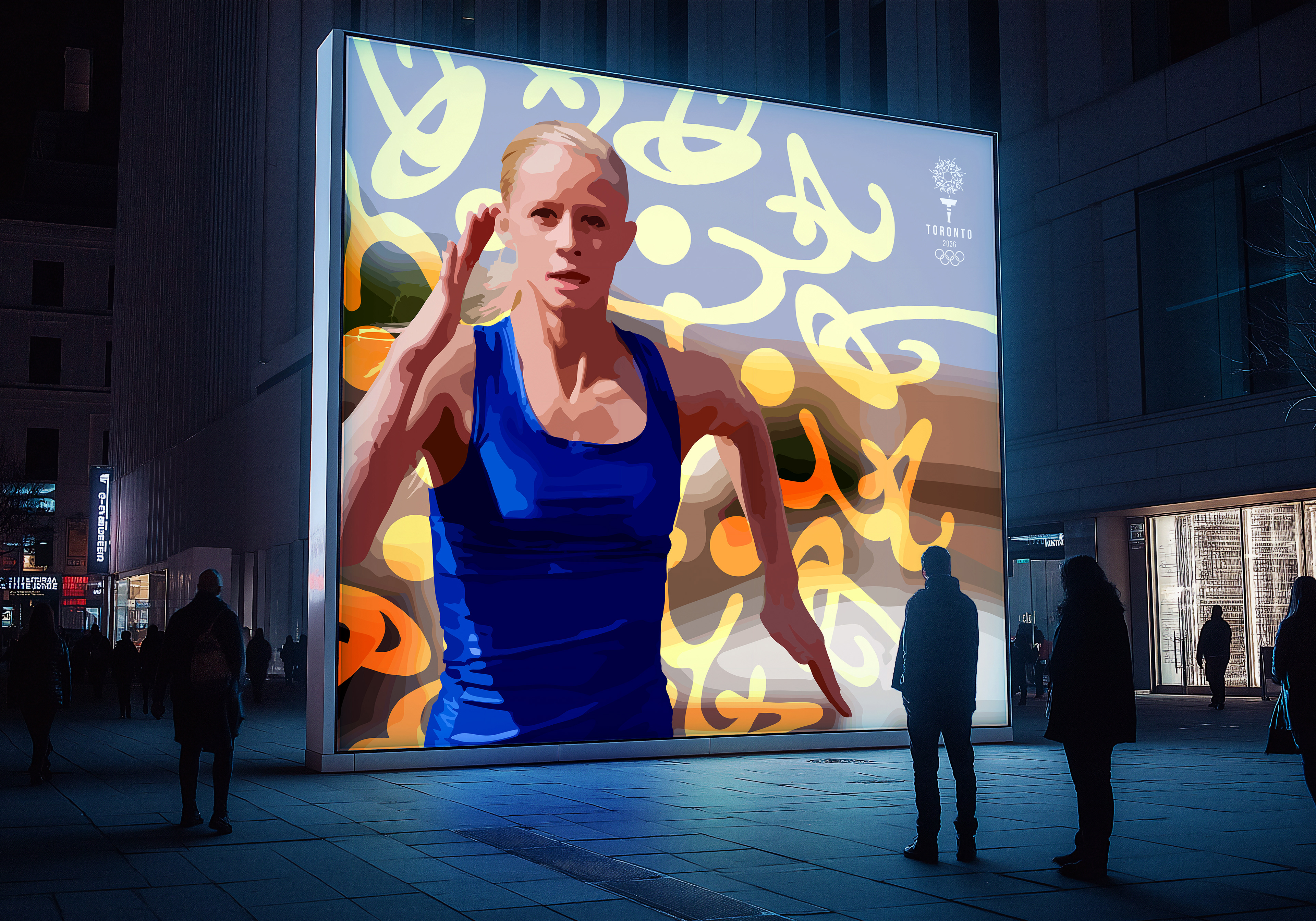
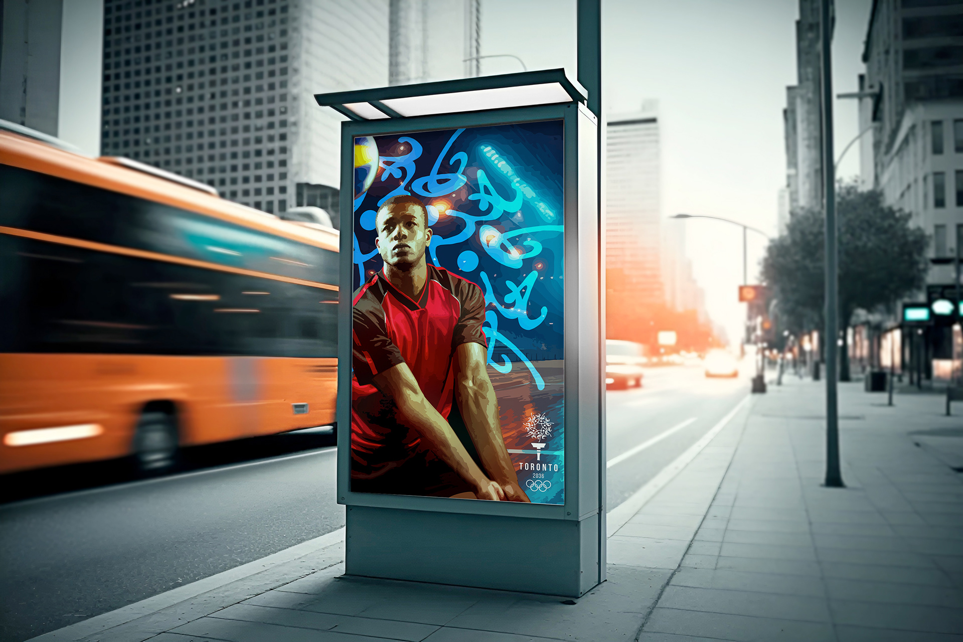
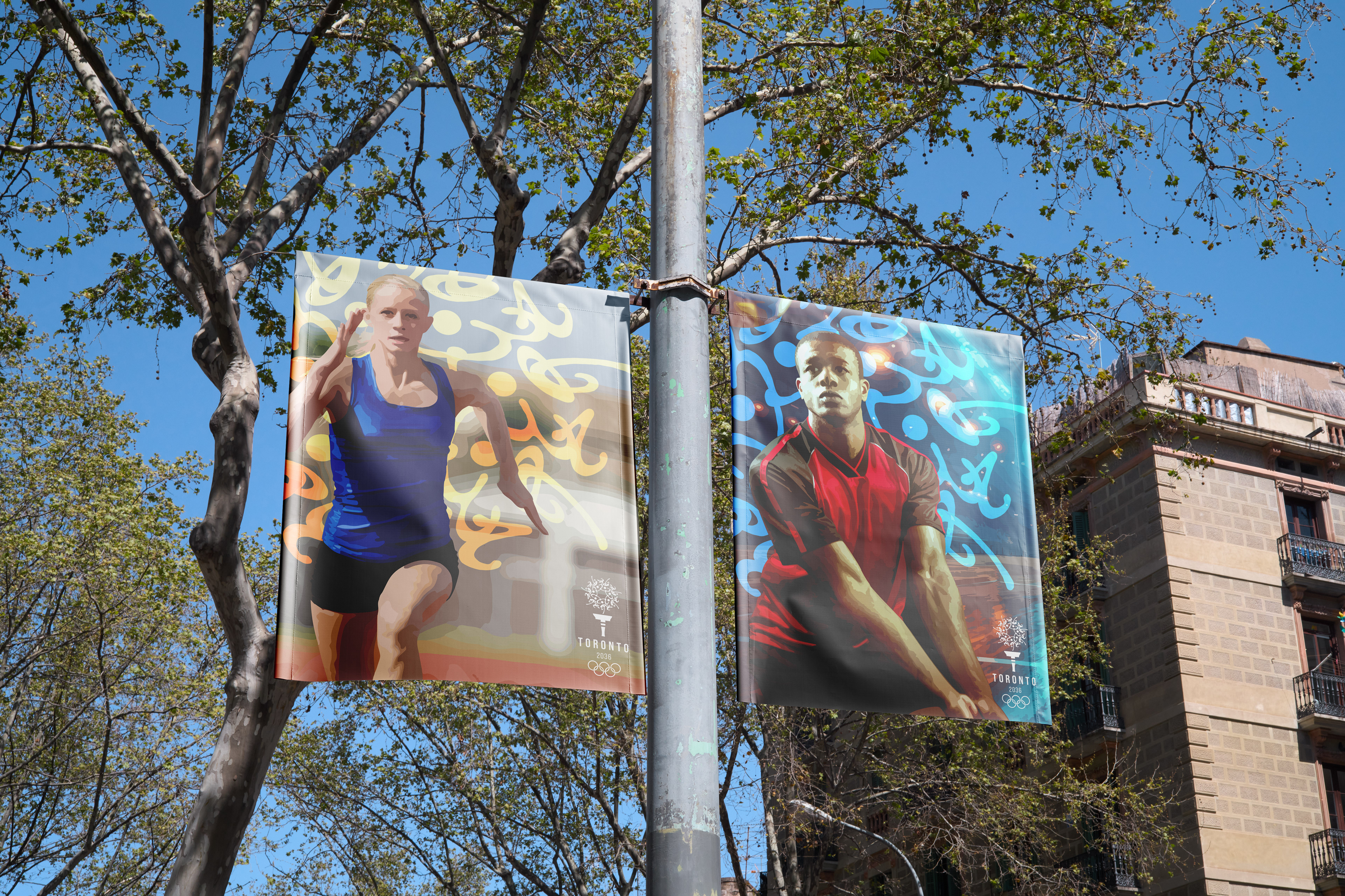
BANNERS
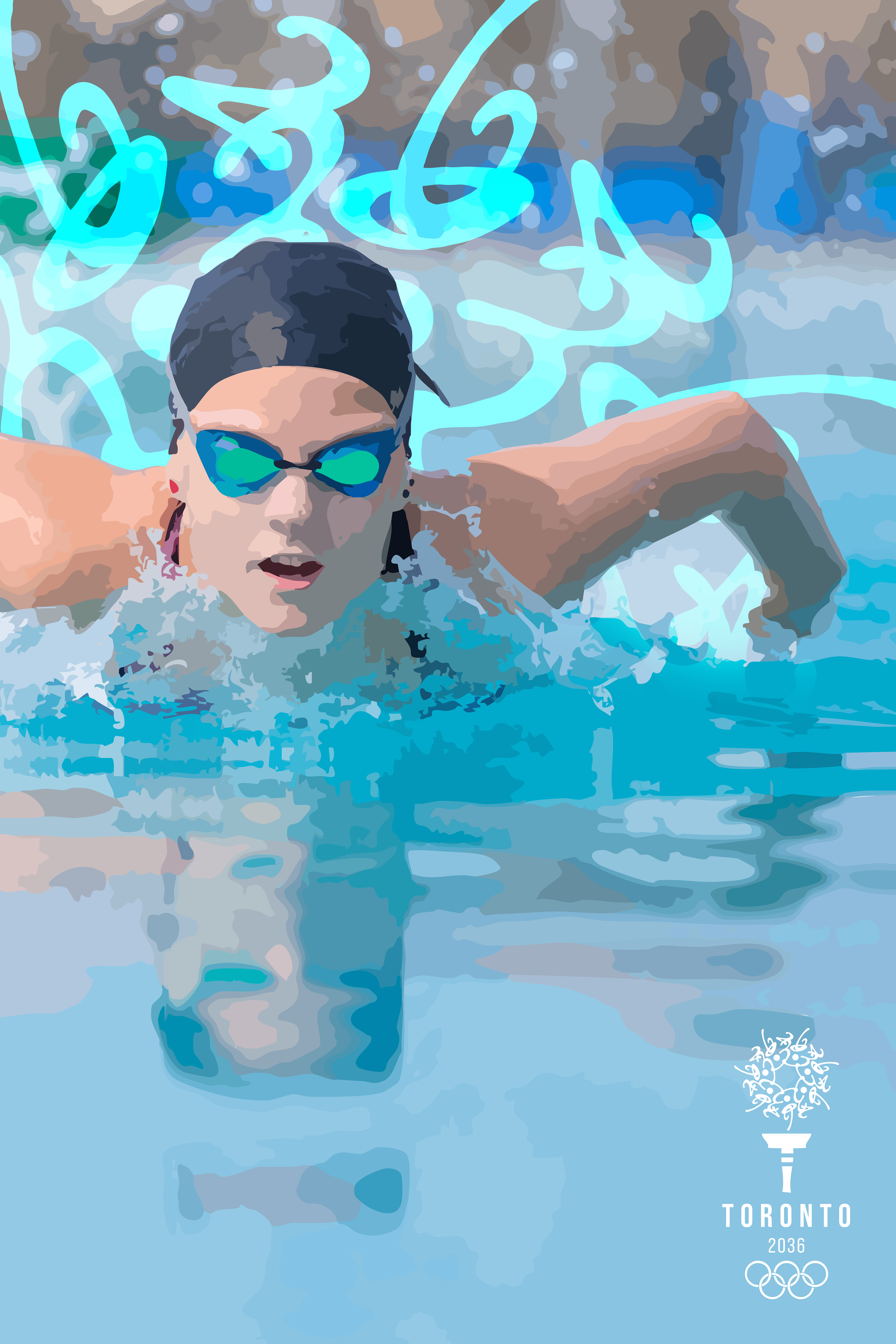
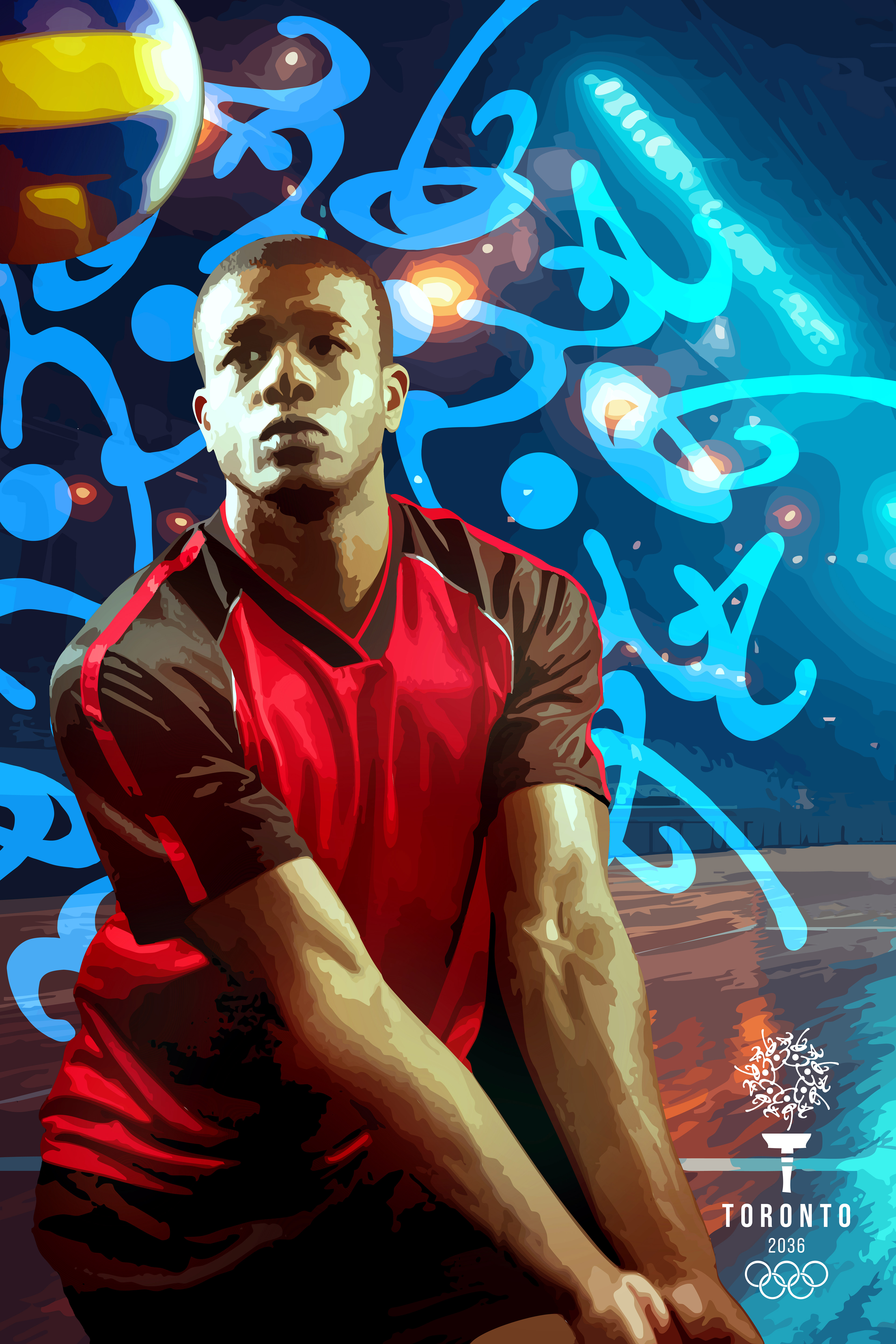
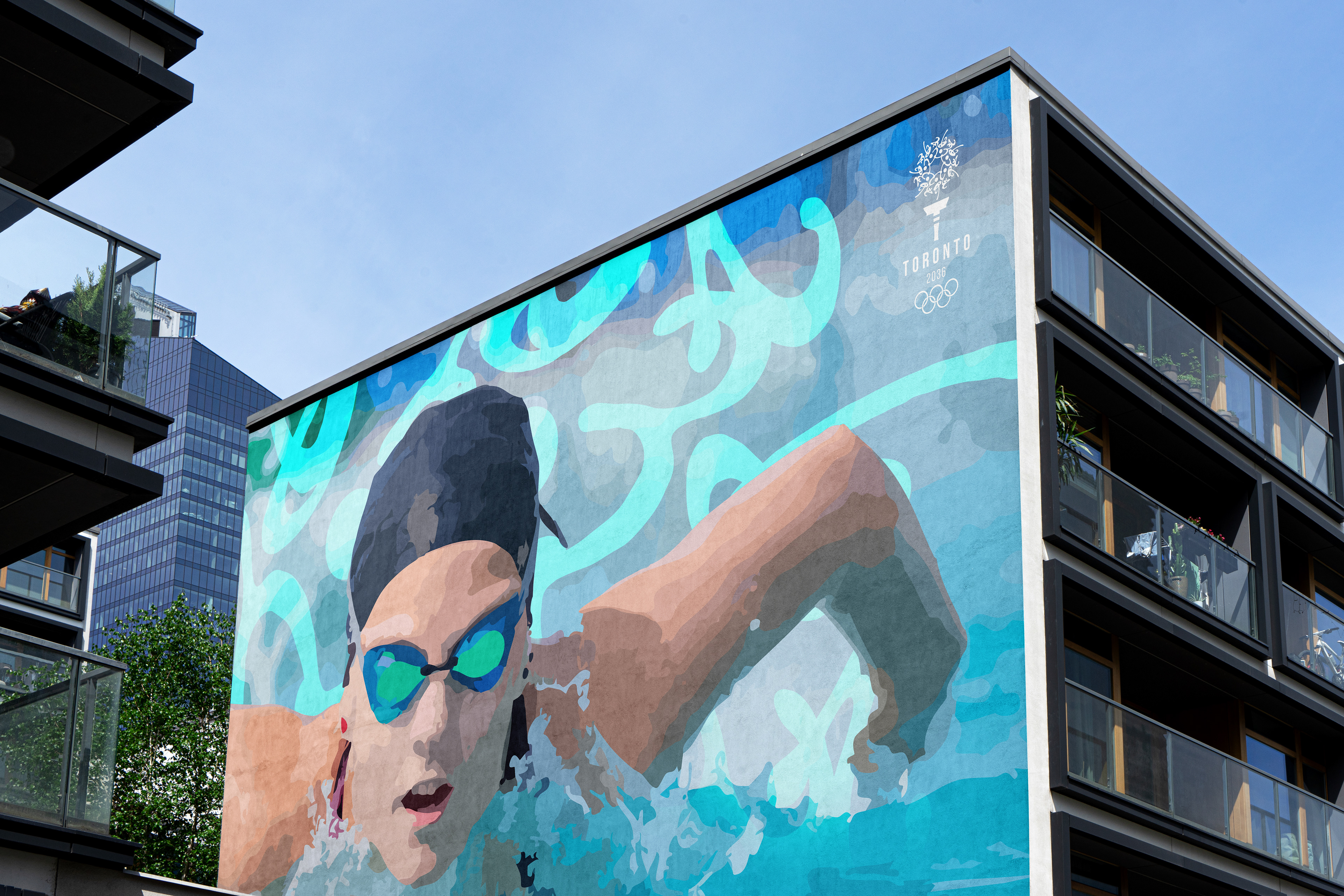
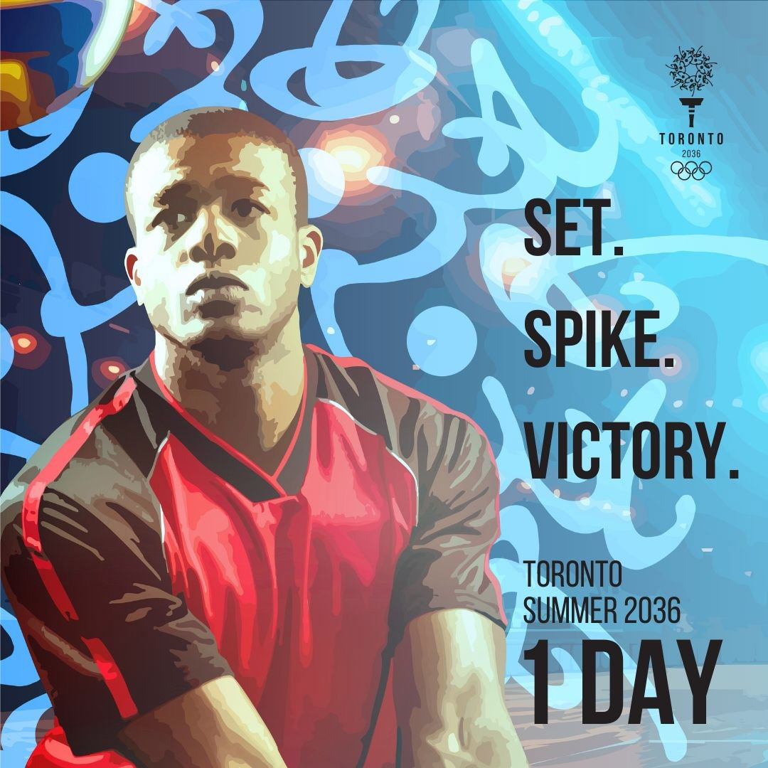
The Toronto 2036 Olympic banners showcase Athletics, Swimming, and Volleyball, each designed to capture the energy and excitement of the Games. The floral element from the logo was enlarged and placed behind the athletes, creating a sense of dynamism while honoring Toronto’s Indigenous roots. Vibrant and bold colors were chosen to reflect strength, passion, and movement, reinforcing the Olympic spirit. The athletes are depicted in action, all facing the camera for a cohesive, unified series. Each design balances modern aesthetics with cultural significance, ensuring a striking and meaningful visual identity for the Games.


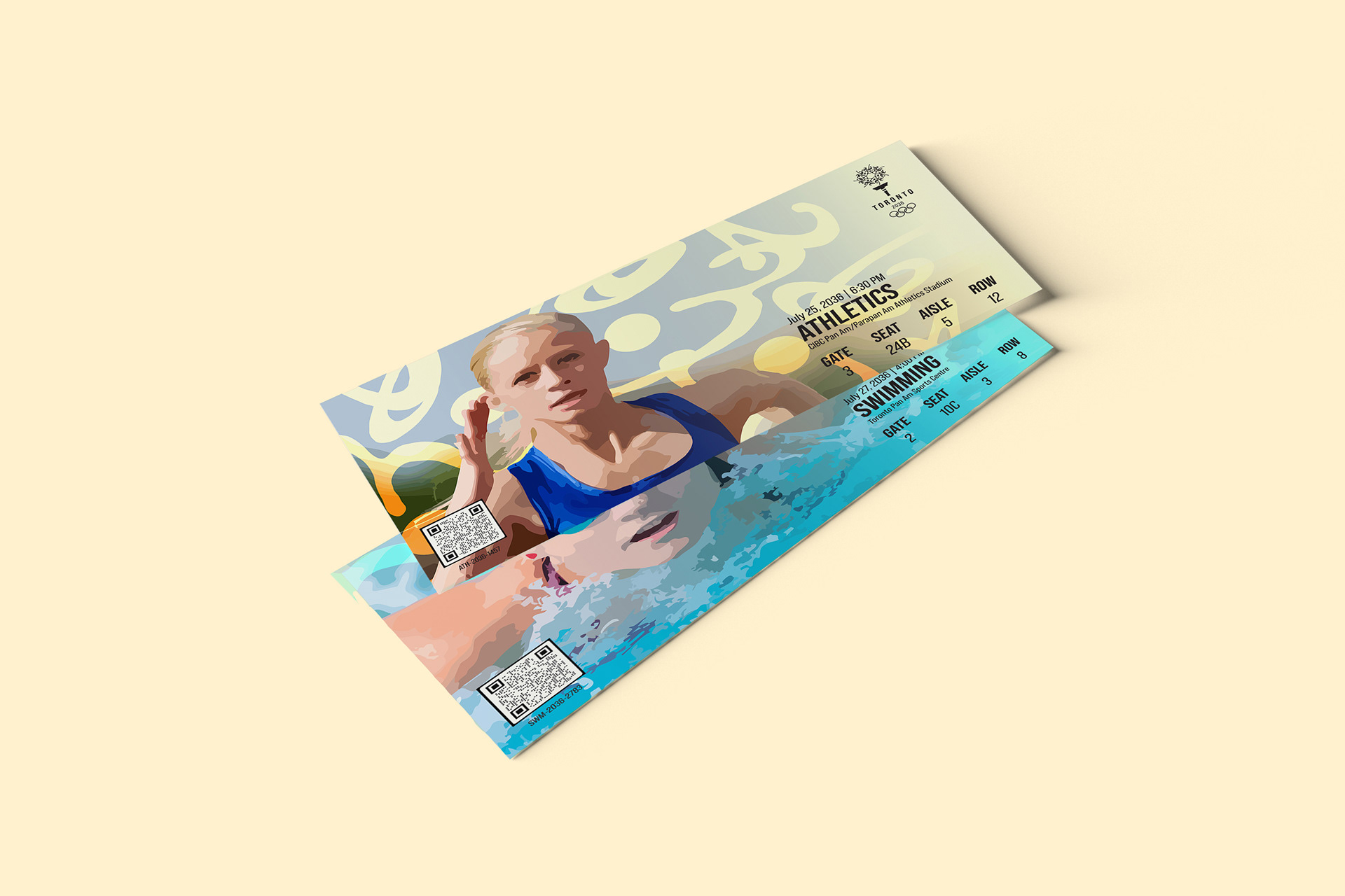


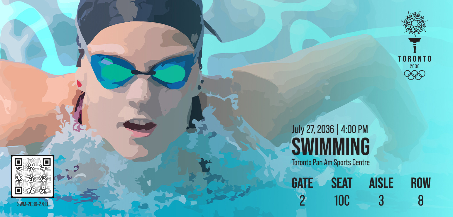

TICKETS
The ticket designs maintain a cohesive brand identity by incorporating the same images and graphic elements from the event banners. This consistency strengthens visual recognition and ties the designs together across different applications.
Each ticket includes a scannable QR code for seamless entry. The bold colors, dynamic imagery, and Indigenous-inspired floral patterns ensure the tickets not only serve a functional purpose but also act as collectible keepsakes that celebrate Toronto’s culture and Olympic spirit.
Scan the QR codes to visit the events’ associated pages on the Olympics website.


PROMOTION VIDEO
The promotion video showcases clips of athletes in action, capturing the energy and excitement of the Games. Yellow and orange bars swipe across the screen as transitions, reinforcing the vibrant brand identity and the spirit of competition.

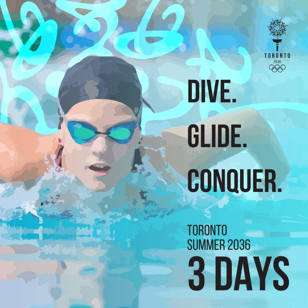
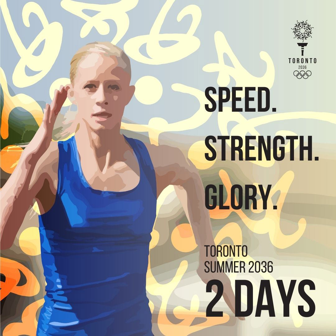


SOCIAL MEDIA
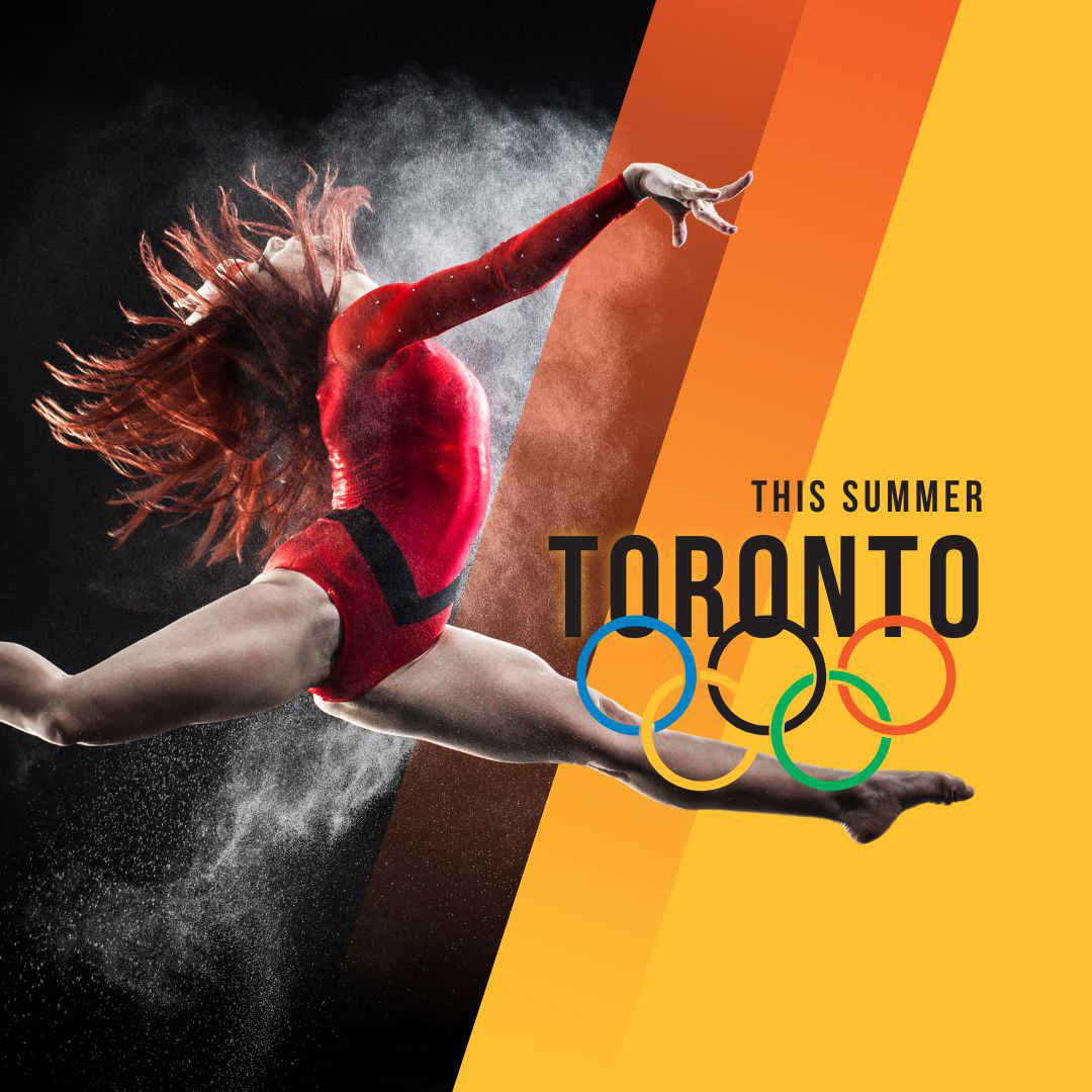
The social media campaign includes two sets of posts to generate excitement for the Games. The first set is a countdown campaign. The second set includes teaser posts for the 2036 Toronto Olympics, featuring the tagline “This Summer.” The yellow and orange bars create a dynamic and energetic visual style.
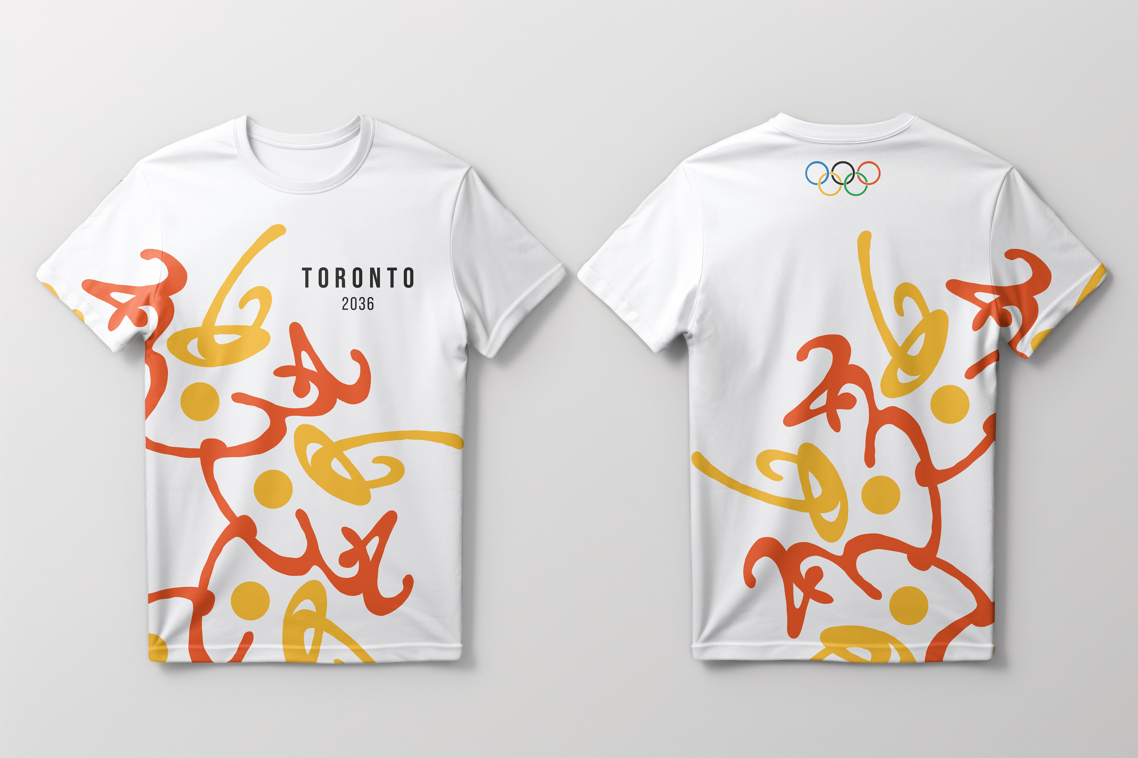
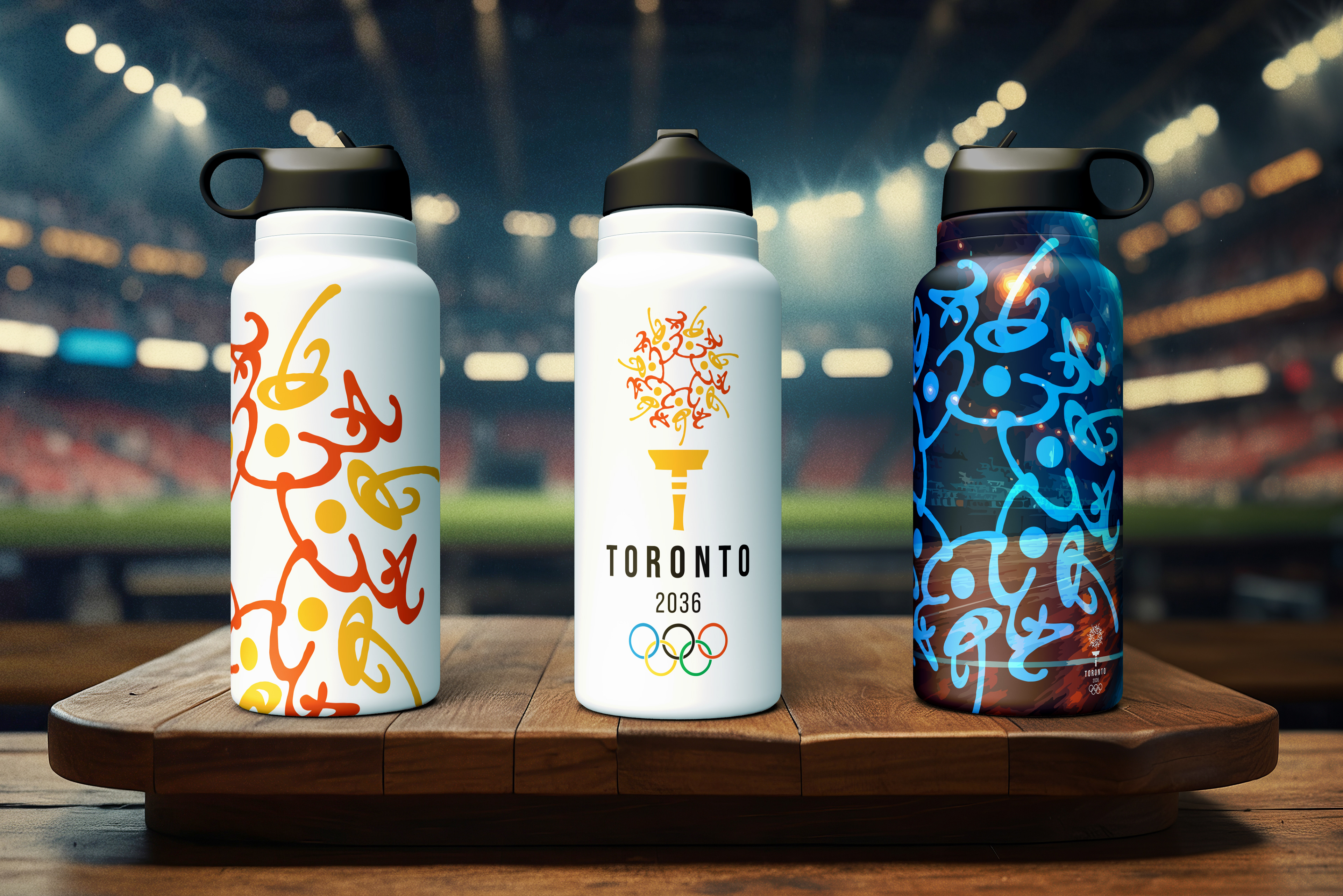
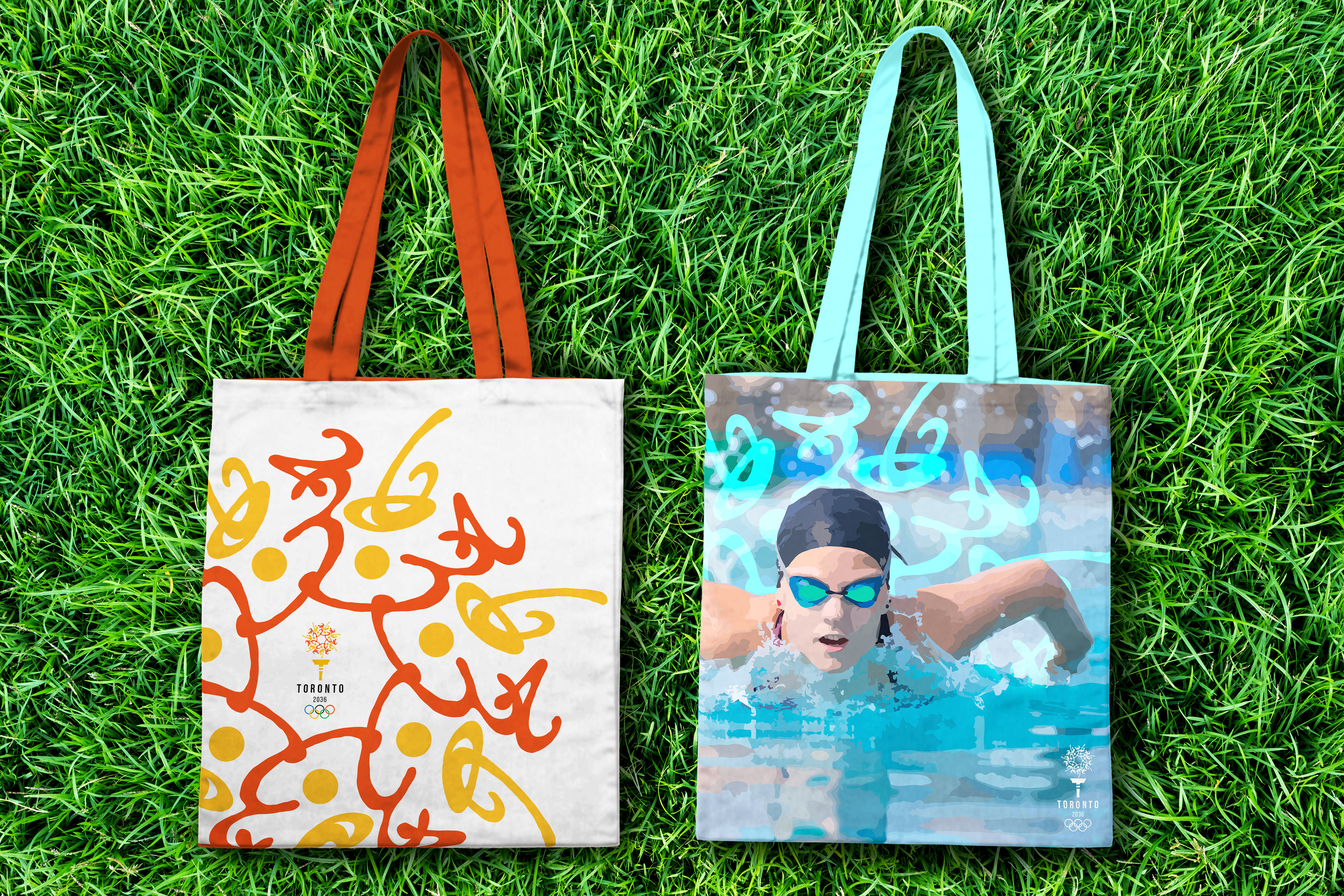
The Toronto 2036 Summer Olympics brand identity is a cohesive and dynamic visual system applied across multiple platforms, including a logo, banners, environmental graphics, tickets, a promotion video, social media, medals, and merchandise. Each design element—such as the floral icon, vibrant yellow and orange colors, and Indigenous-inspired motifs—creates a unified and meaningful representation of Toronto’s culture, history, and Olympic spirit. From digital promotions to physical keepsakes, every application reinforces the city’s energy, diversity, and passion for sports.
This project is not affiliated with the Olympics.